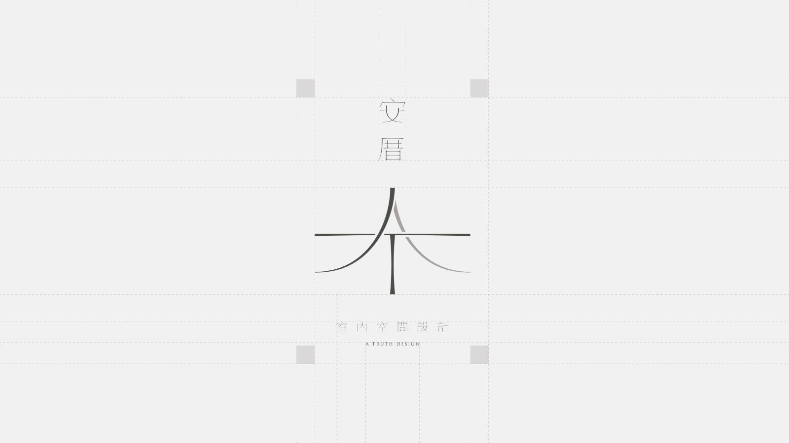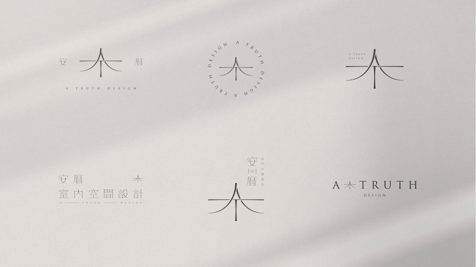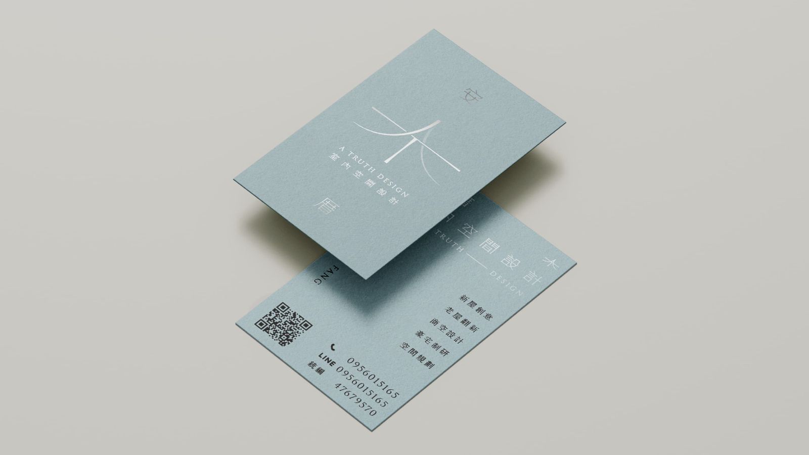
安厝室內空間設計 a Truth Design
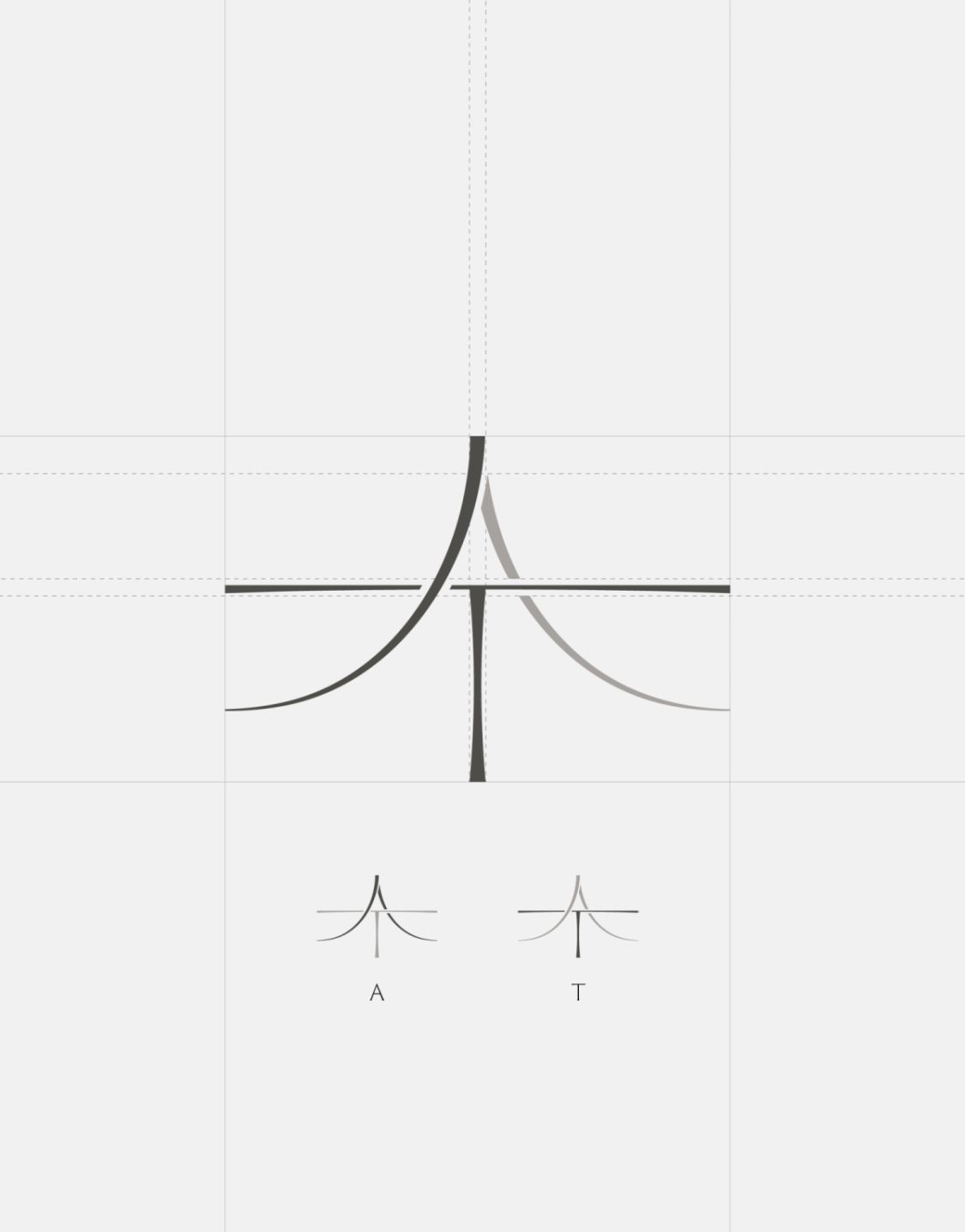
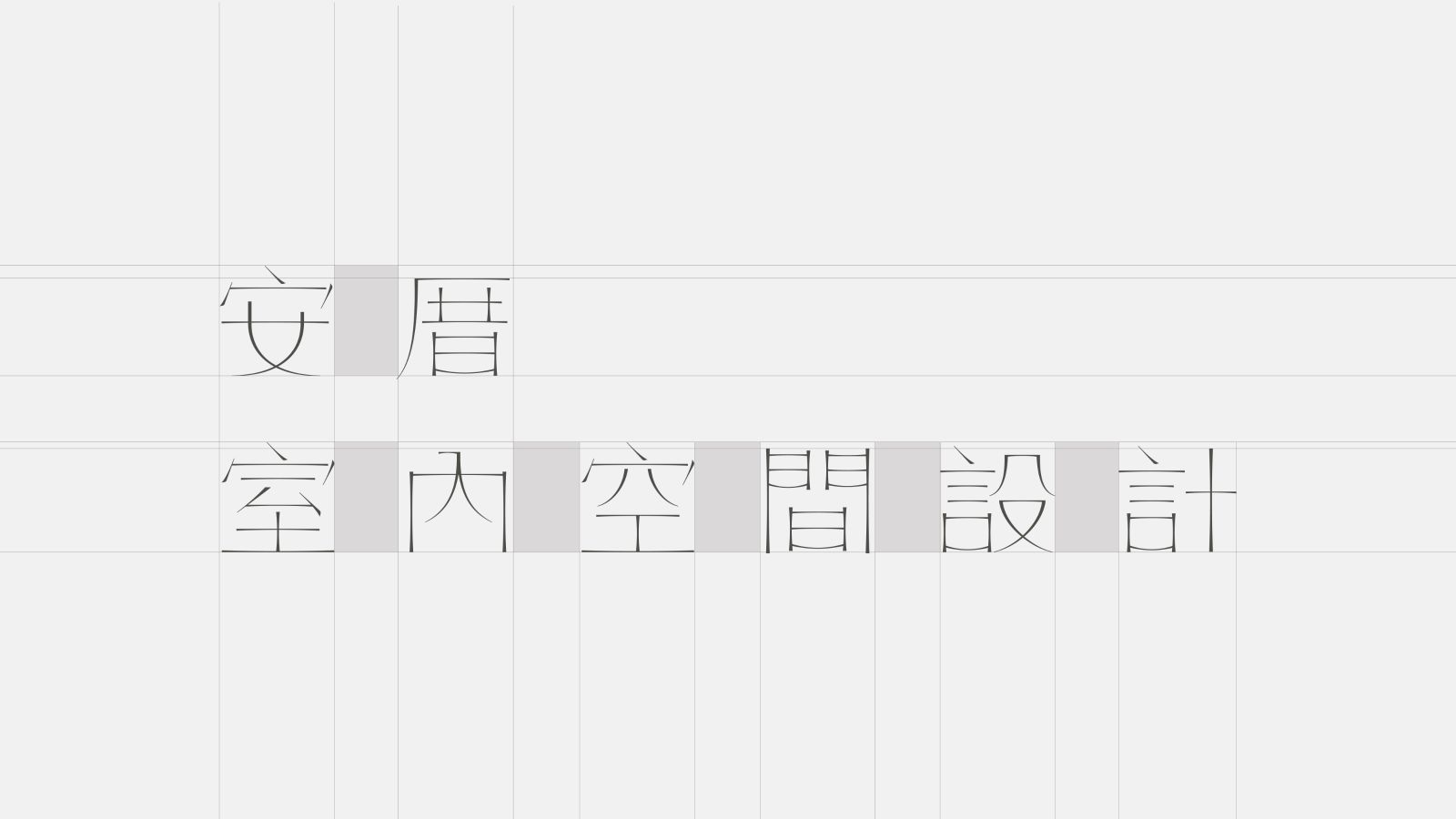
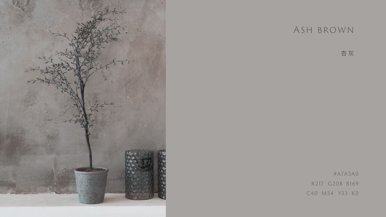
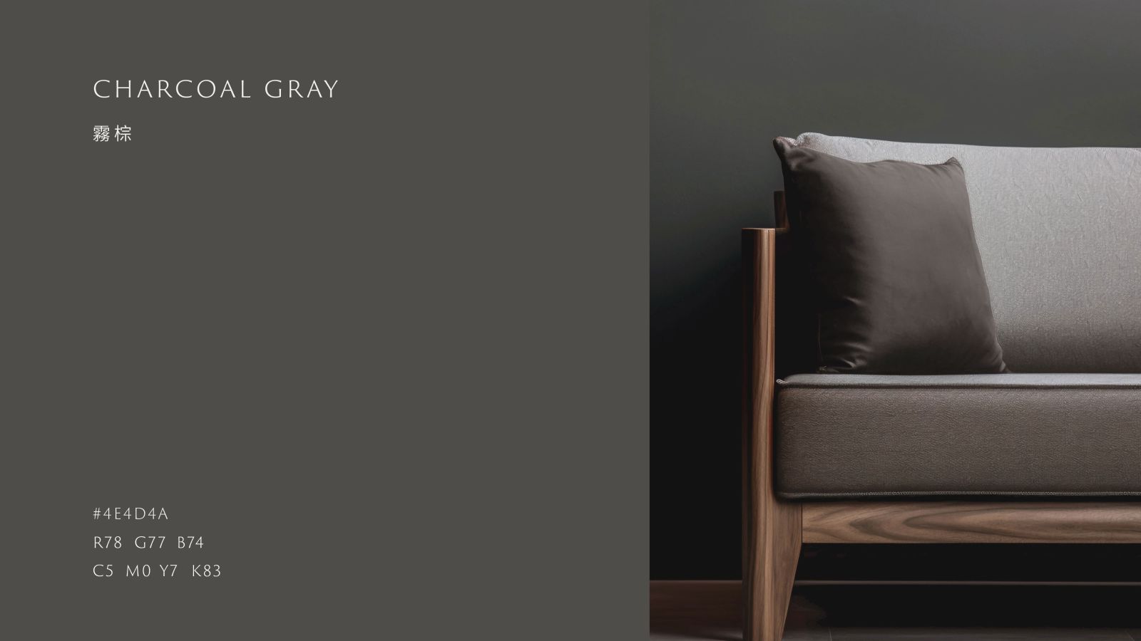
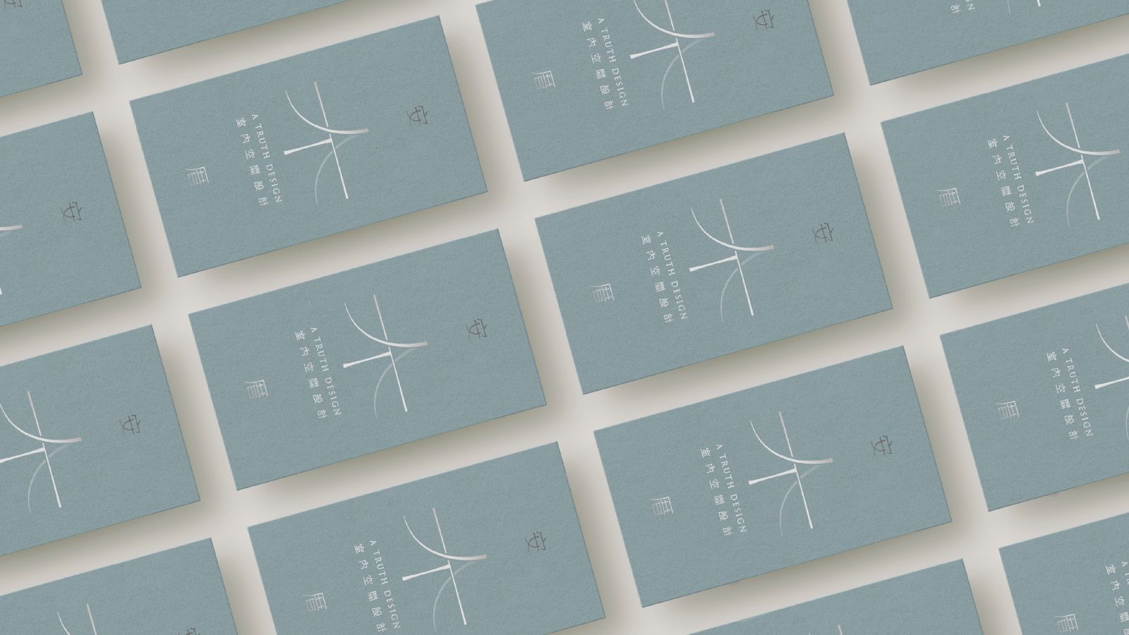
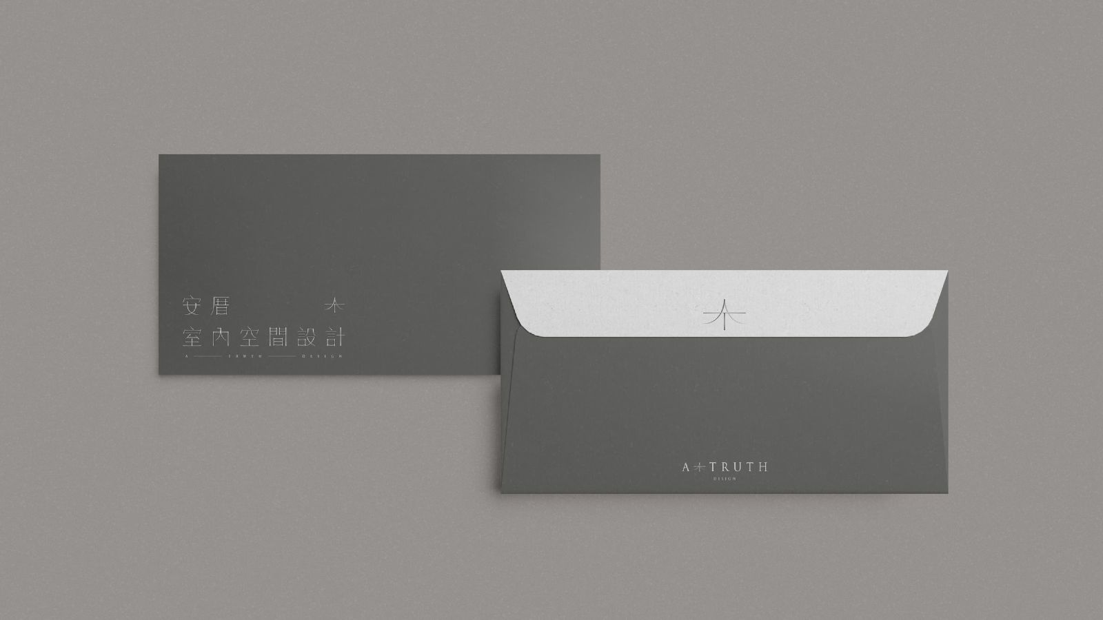
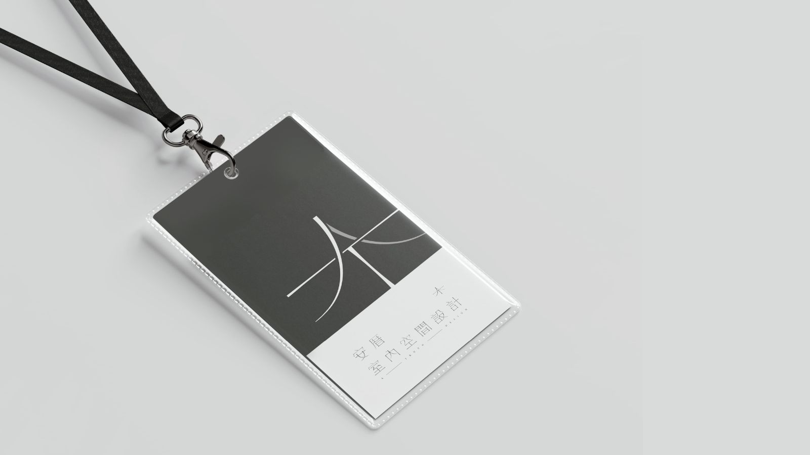
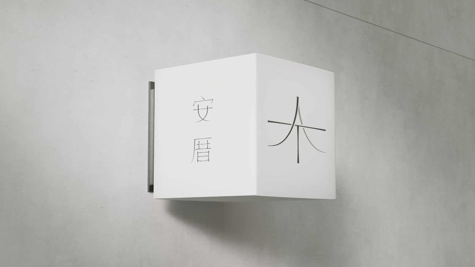
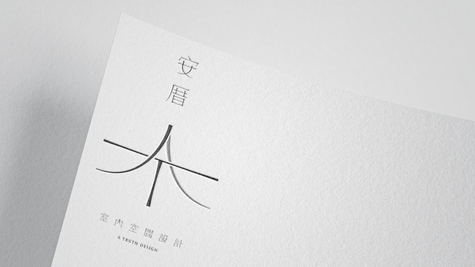
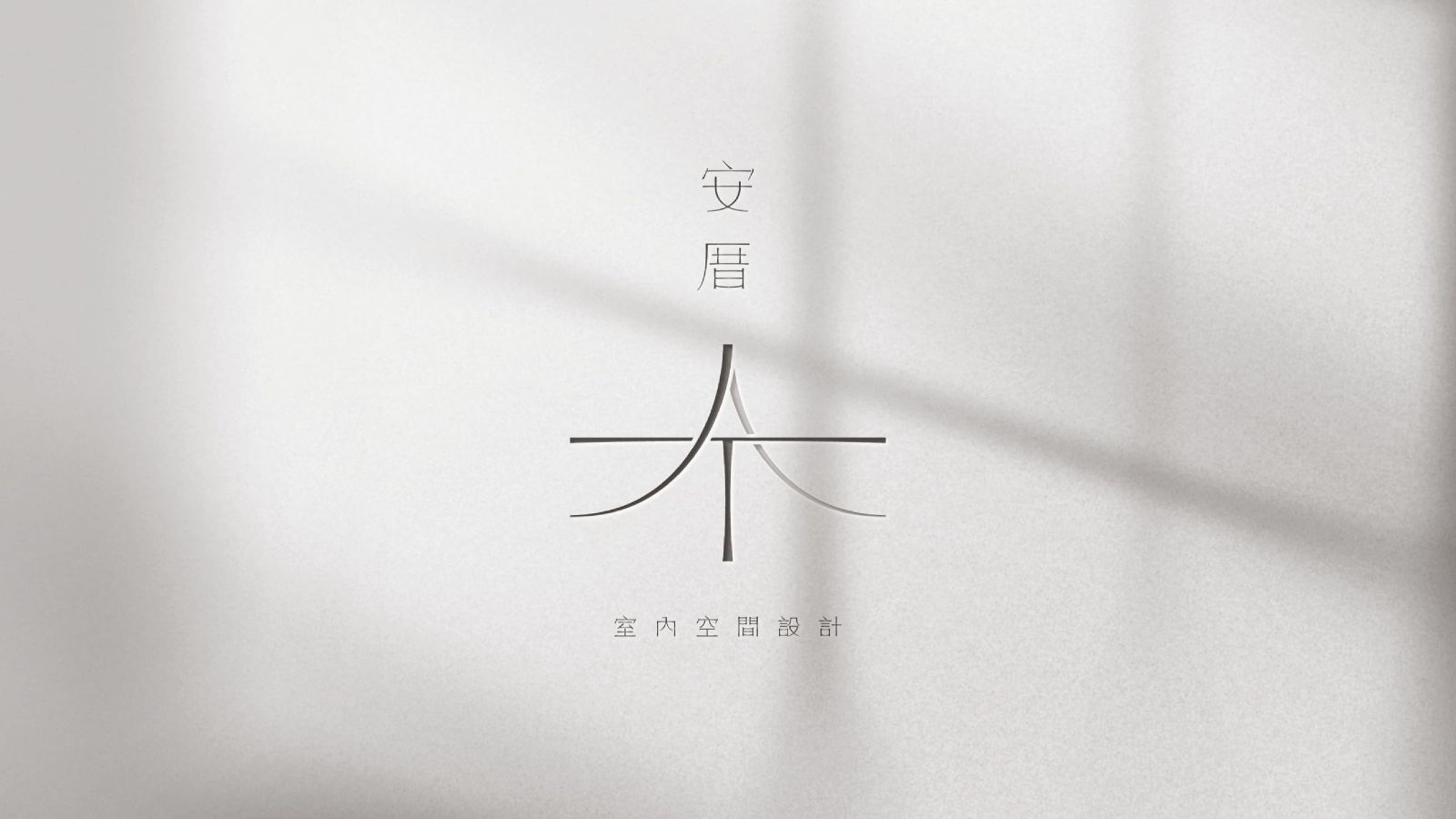
商標整體以品牌英文名稱縮寫「AT」為設計主軸。以柔和、纖細、富有彈性感粗細變化的筆畫造型繪製圖標與中文標準字。大量的留白與截斷設計產生了足夠的空氣感與舒適的空間距離。圖標則以歐文字母「AT」作為骨架,結合中文字型筆畫為圖標與標準字帶來視覺一致性,提升品牌的品牌獨特性,並運用不同明度的,為圖標添增「空間」之概念,呼應品牌行業。中文標準字以擁有寬鬆中宮的明體字型作為骨架,輕盈的字重雖輕巧但結合寬鬆的中宮後寬大的骨架使字型更為穩重,並簡化傳統筆畫造型為視覺帶出簡約質感現代風格。標準色以杏灰搭配霧棕,柔和的低飽和米系使整體視覺帶來柔和簡約質感氛圍。
The logo design centers around the initials “AT”, representing the brand name. The visual identity features soft, delicate strokes with flexible contrast in weight, creating a sense of elasticity and elegance. Generous spacing and intentional breaks throughout the design provide a breathable, comfortable composition.
The symbol draws from the Latin letters “A” and “T”, blending seamlessly with the stroke characteristics of the Chinese logotype to ensure visual harmony and brand consistency. A layered use of brightness levels further enhances the idea of “space,” echoing the brand’s field of work.
The Chinese logotype is based on a Ming-style typeface with wide inner spacing. While the strokes are light, the generous structure conveys a sense of stability. Traditional stroke forms are simplified, resulting in a modern and minimal aesthetic.
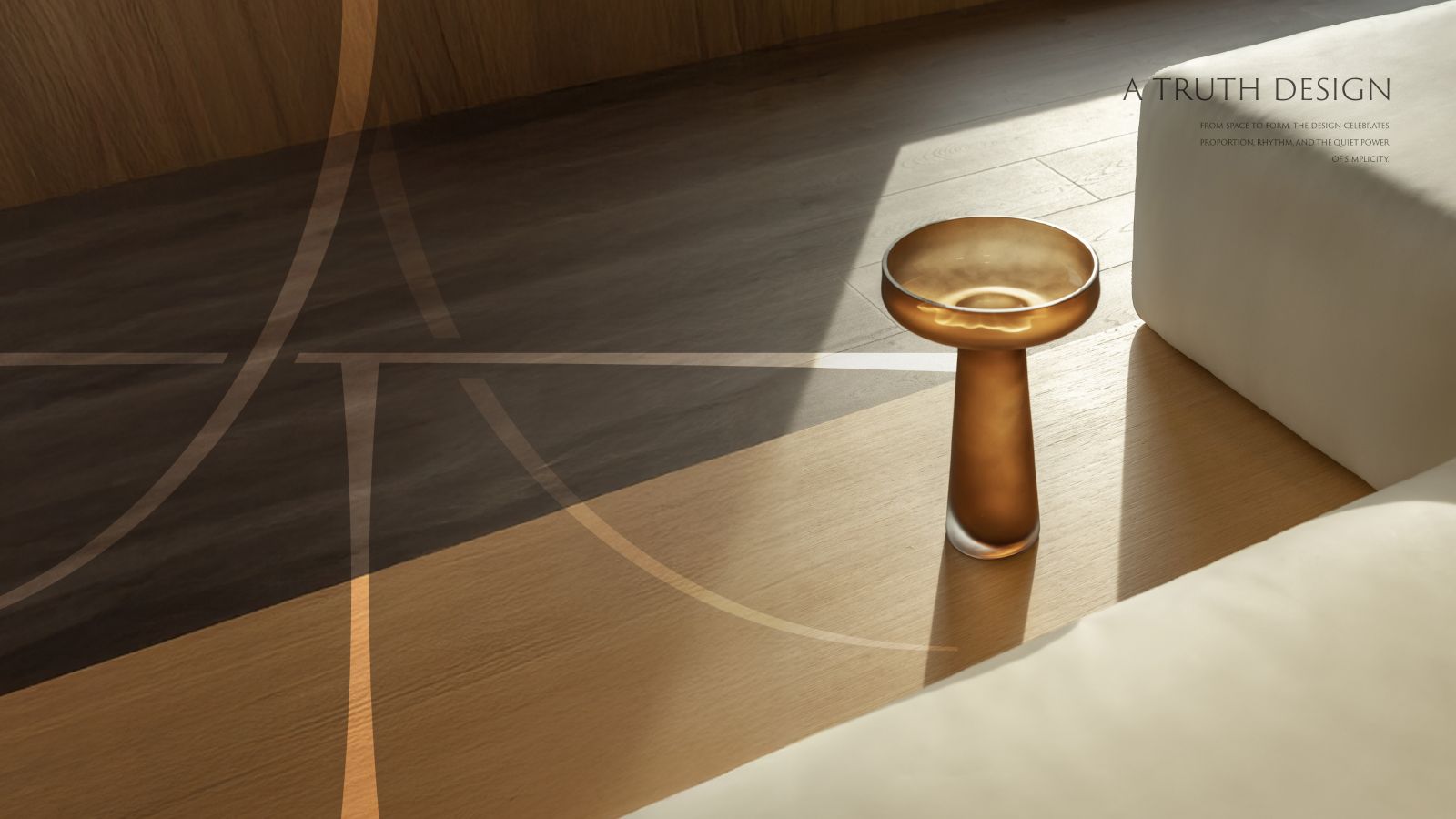
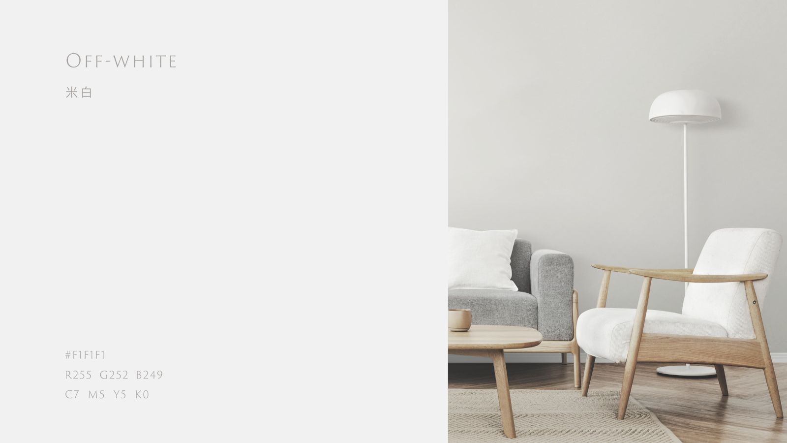
The primary color palette combines almond grey and misty brown—low-saturation beige tones that together evoke a soft, refined, and understated visual atmosphere.
Design Agency | Fecina
Art Director | Evelyn
Executive Director | Evelyn
Project Manager | Yi Ying
Graphic Design | Hsin Tung