方三空間設計制作 BLANK³ DESIGN
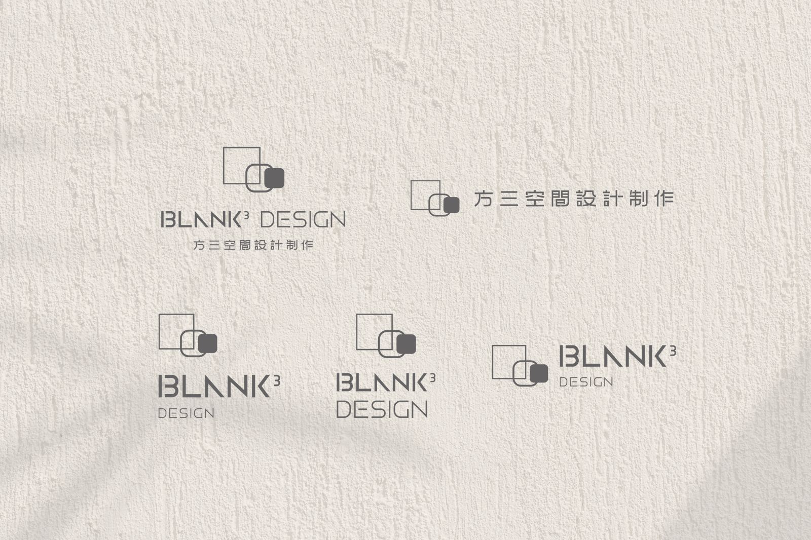
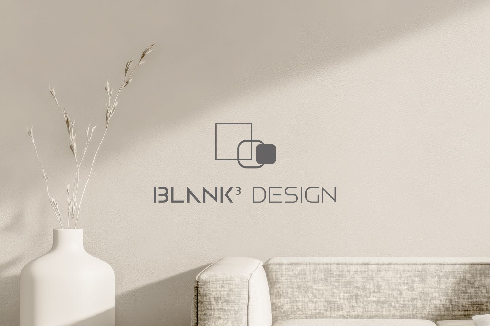
標準字設計以簡約質感風格為核心,運用原圖標不同粗細的線條與多種矩形形狀的相互呼應
展現空間設計的元素,透過俐落的角度與線條,增添現代感並彰顯設計的結構美學
部分字母的筆劃利用分段與適度簡化,營造空間感並使整體視覺更具流暢性與易讀性
「BLANK³」與「DESIGN」的粗細對比不僅強調主副視覺的層次,展現穩重與平衡的風格
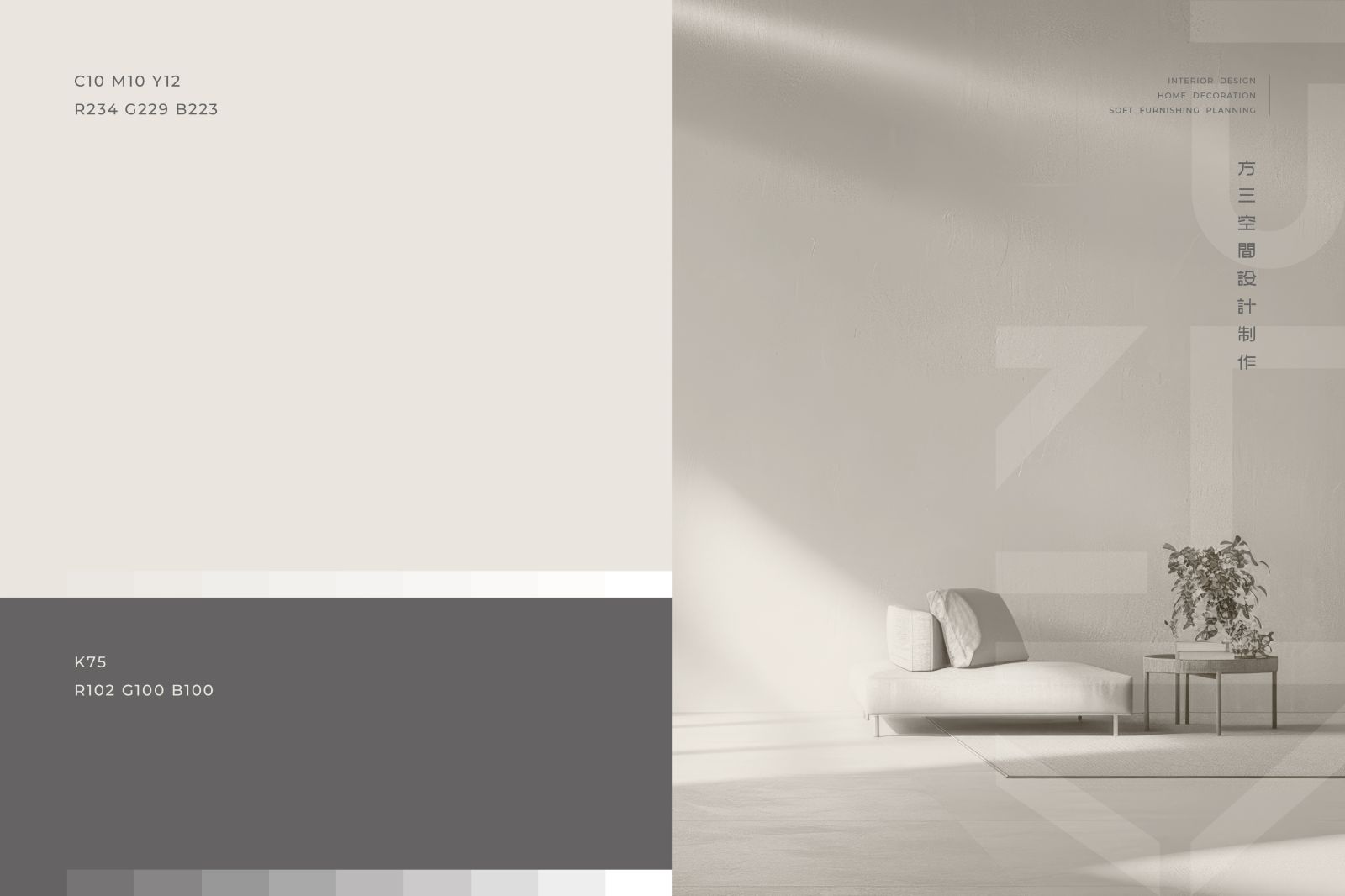
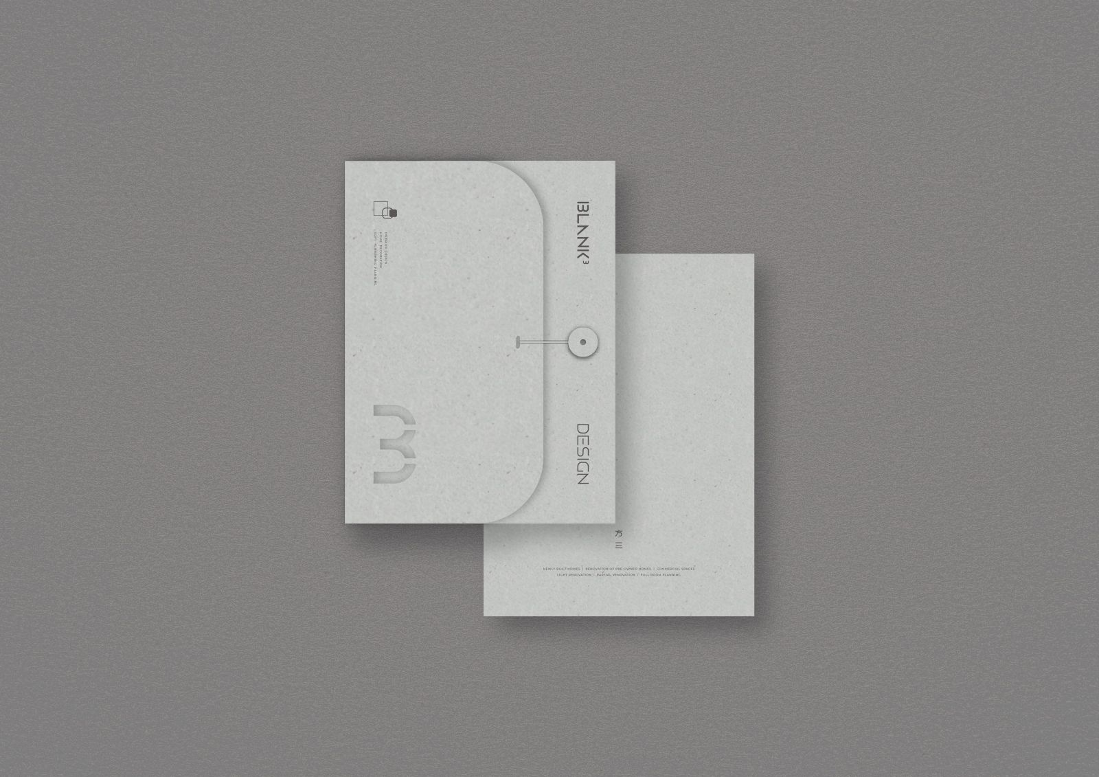
標準色以淺卡其色與墨灰色作為搭配,呈現質感、專業的視覺感受
The standard font design is based on a simple and textured style.
It uses lines of different thicknesses in the original icon and various rectangular shapes to echo each other,
showing the elements of space design. Through sharp angles and lines,
it adds a sense of modernity and highlights the structural aesthetics of the design.
The strokes of some letters are segmented and moderately simplified to create a sense
of space and make the overall vision more fluent and easy to read.
The contrast between the thickness of "BLANK³" and "DESIGN" not only emphasizes the level of the main and secondary visuals, but also shows a stable and balanced style. The standard color is matched with light khaki and dark gray to present a textured and professional visual experience.
