協助建立商標、品牌、名片、包裝等形象設計,集結設計菁英,服務專業安心交付

法西納設計有限公司

© 2024 Fecina Ltd.


發電雞寵物零食設

Solar Chicken Pet Treats Design


圖像設計以「發電雞」為主角,插畫風格傳遞品牌注重健康天然與溫暖陪伴的理念。透過不同的配色與圖像細節,對應各款產品的質地與製程方式,讓角色與商品形成視覺上的聯繫。

從扎實的肉丁、酥脆的雞片到輕盈的凍乾,三種不同口感的設計,提供飼主依照毛孩的喜好自由挑選,兼顧實用性與趣味性。

品牌標準色系以柔和的紫米色、淡藍與青綠為主,搭配跳色插圖與手寫感字體,營造出活潑親切的日常風格,讓每一次餵食都充滿溫度與期待。


Through varied color palettes and graphic details, each product visually reflects its unique texture and preparation method, building a direct connection between the character and the treat.

From dense diced meat to crispy chicken chips and airy freeze-dried bites, the three distinct textures offer pet owners flexible choices based on their furry companion’s preferences—balan

cing both functionality and fun.

The brand’s standard color palette consists of soft purple-brown, light blue, and mint green, paired with playful illustrations and handwritten-style typography. Together, they create a che

erful and approachable everyday aesthetic, making each feeding moment feel warm and full of delight.


Design Agency | Fecina
Art Director | Evelyn
Executive Director | Evelyn
Project Manager | Yi Ying
Graphic Design | Hsin Tung


標準字設計

Logotype Design


本次「Chicken」產品系列標準字,

以塗鴉感手寫字體呈現,呼應整體包裝的手繪插畫風格,

傳遞自然、親切、充滿童趣的品牌個性。

字體筆觸仿如蠟筆或炭筆,保留筆劃粗細與墨痕的隨性質地,

使標準字不顯生硬,反而強化了產品

「為毛孩打造、充滿溫度」的品牌調性。

大小寫字母穿插運用,增添視覺上的趣味感,

也模擬孩童塗鴉時的隨興自由,

與包裝中可愛雞隻插畫風格相呼應。

整體設計簡單卻富含識別性,

提升系列商品在寵物零食市場中的辨識度與親和力。


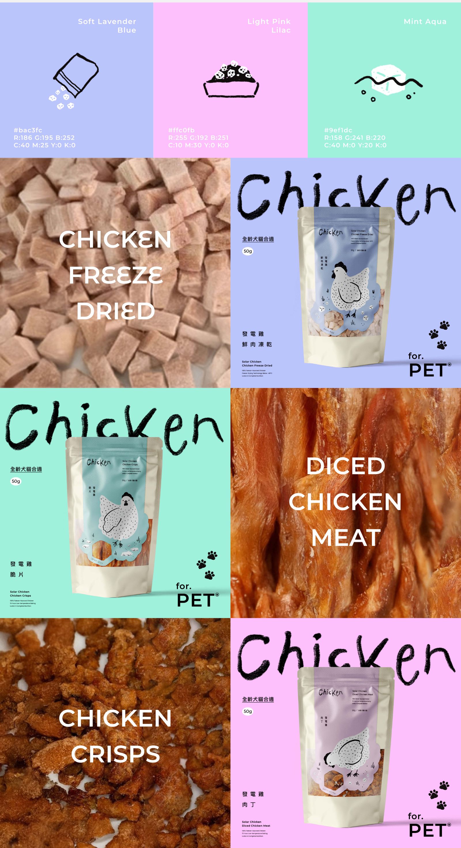
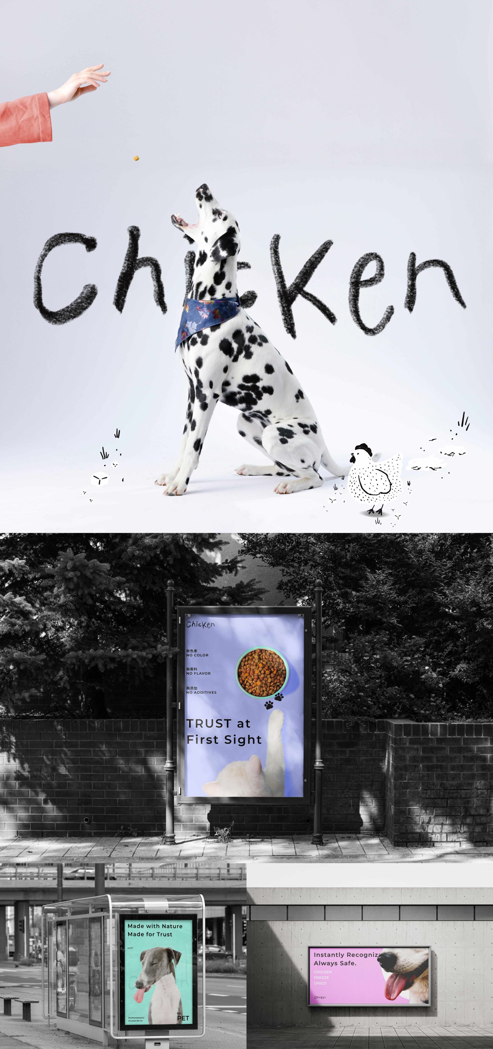
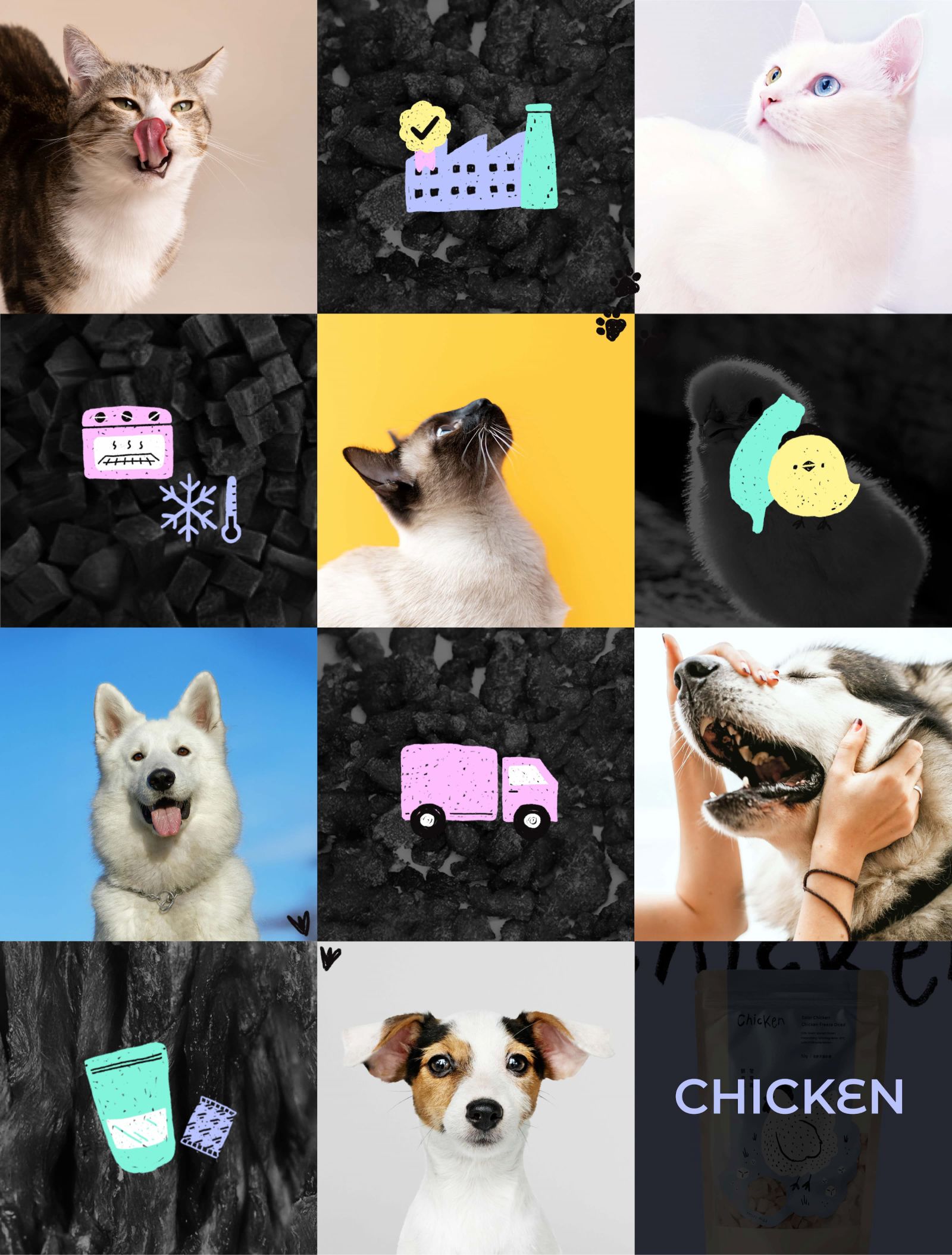
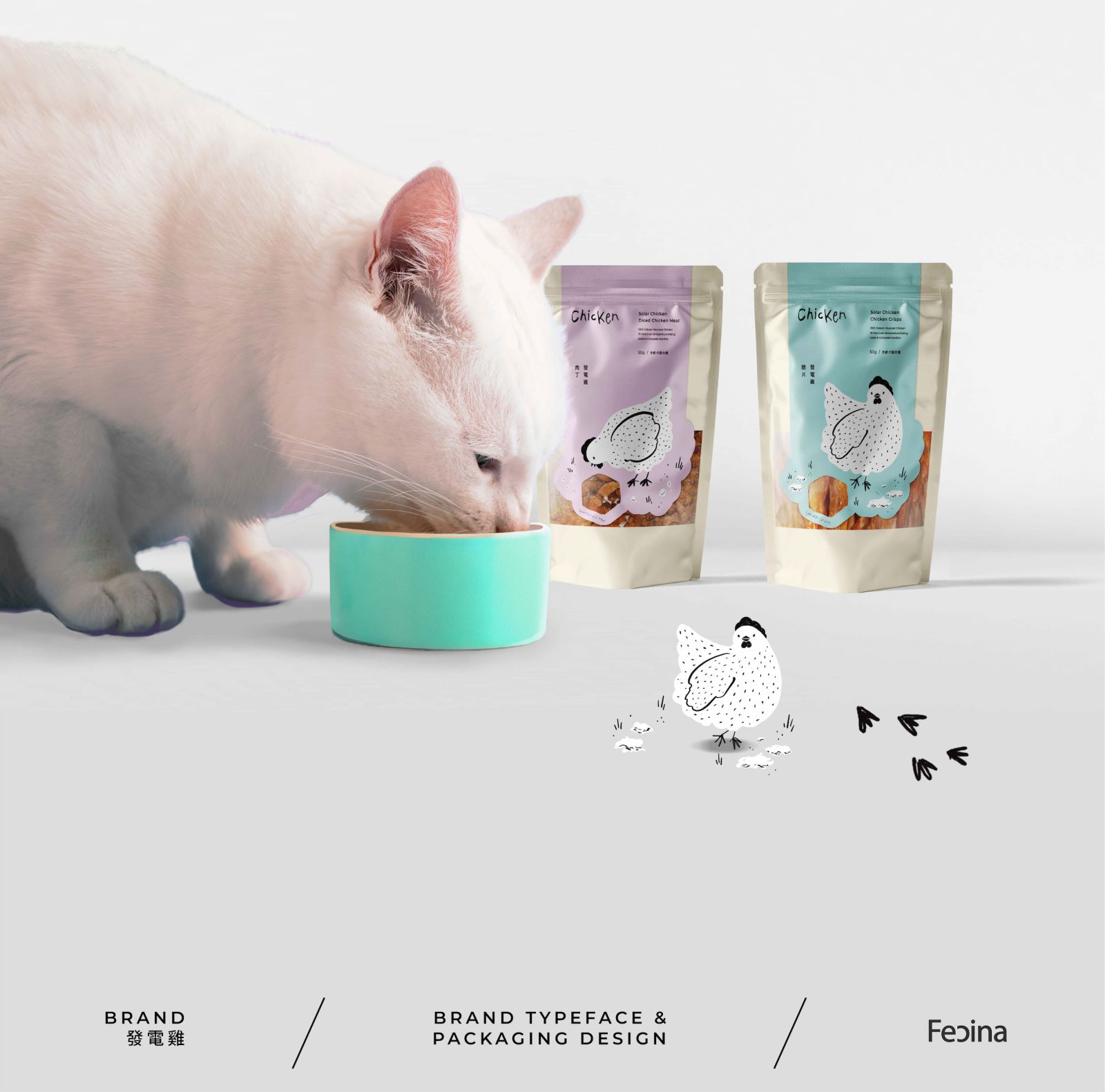
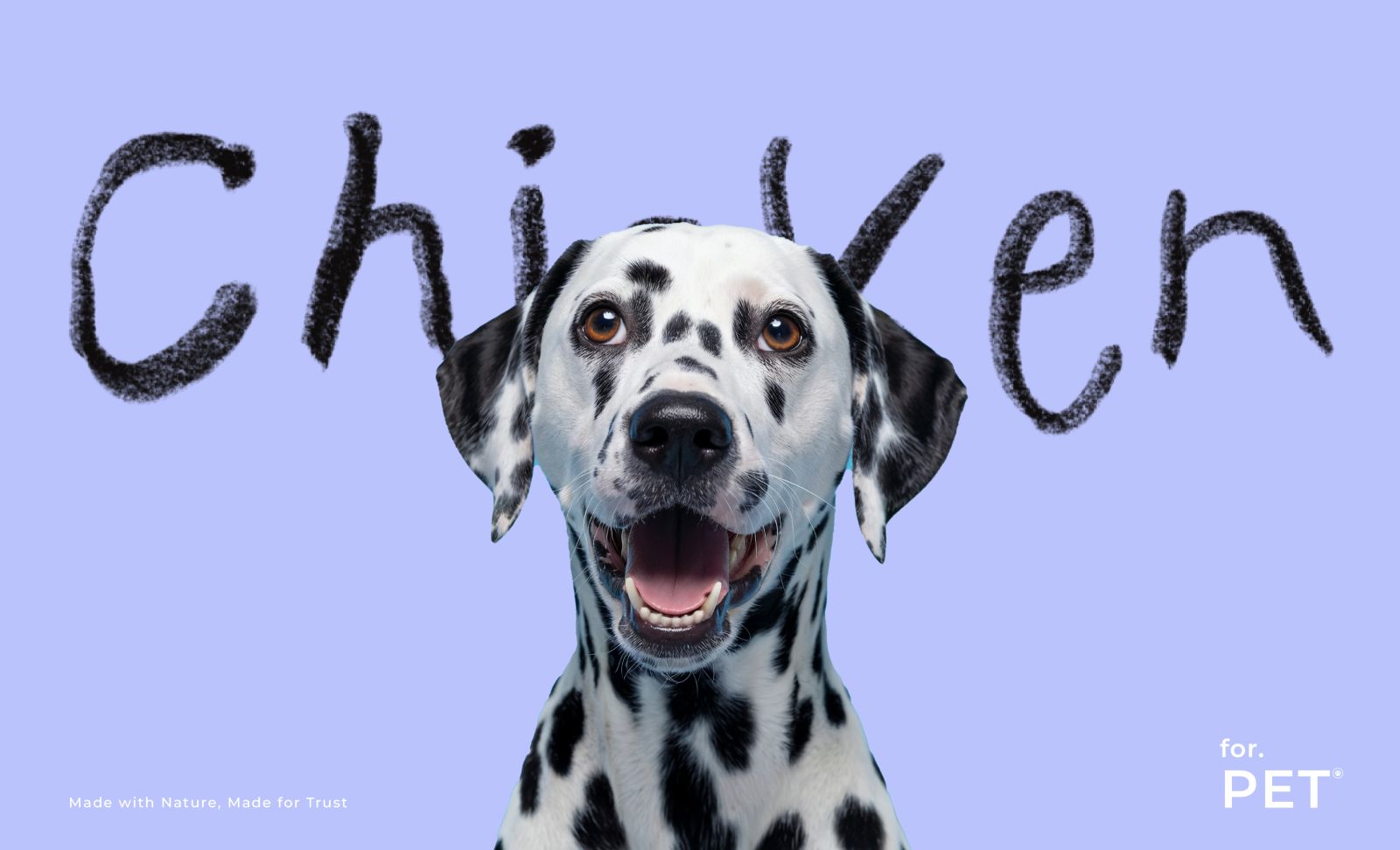
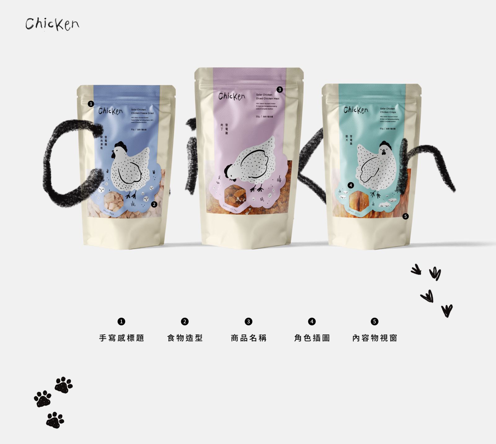
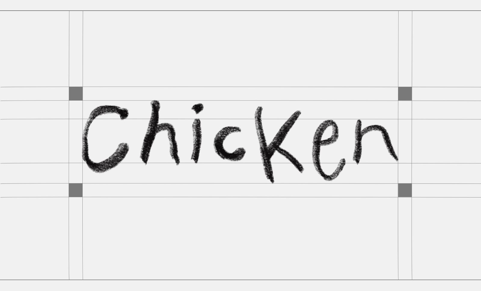
The logotype for the “Chicken” product series adopts a playful, hand-drawn style to echo the overall illustrated, doodle-inspired packaging design. This approach conveys a brand personality that is natural, friendly, and full of childlike charm.

The strokes of the lettering resemble crayon or charcoal textures, retaining variations in thickness and ink marks to create an organic, spontaneous feel. This softness counterbalances the rigidity often seen in standard typefaces and enhances the brand’s warm, pet-centered identity — one that feels lovingly crafted for furry companions.

The mix of uppercase and lowercase letters adds visual playfulness, mimicking the carefree expression of a child’s drawing, and ties in with the adorable chicken illustrations on the packaging.

Simple yet distinctive, the design strengthens recognition and relatability in the pet treat market, making the product line more approachable and memorable.