渡邊珈琲製造所
わたなべ コーヒー
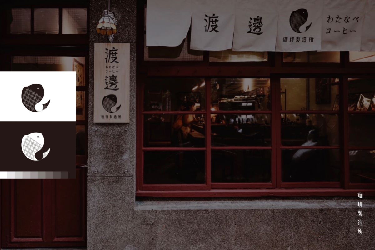
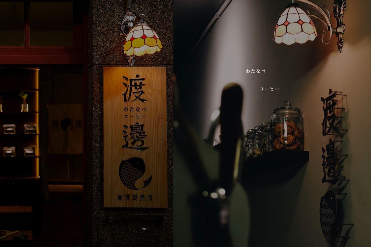
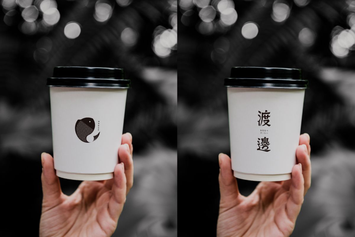
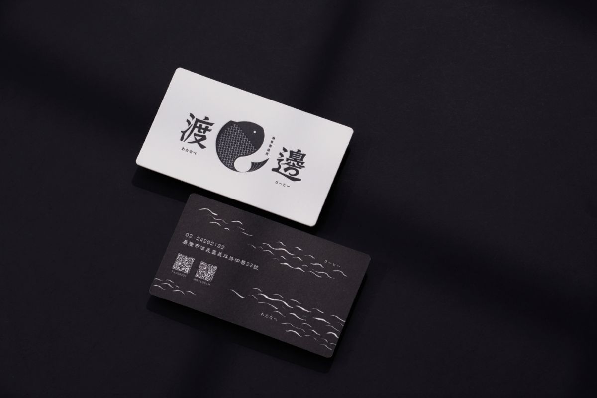
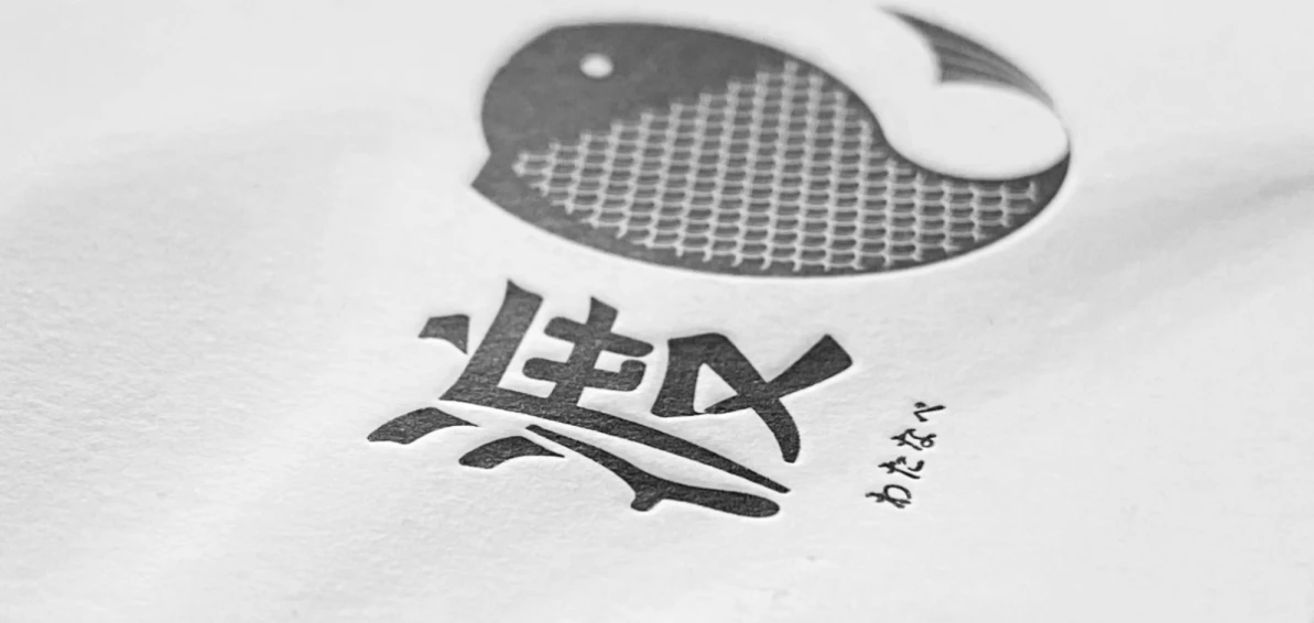
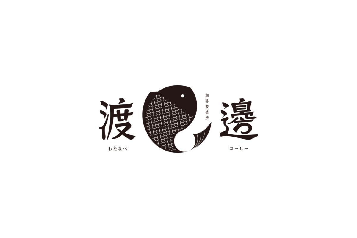
渡邊二字以書法字做呈現,在筆畫中加入裝飾筆觸,視覺上更加自然
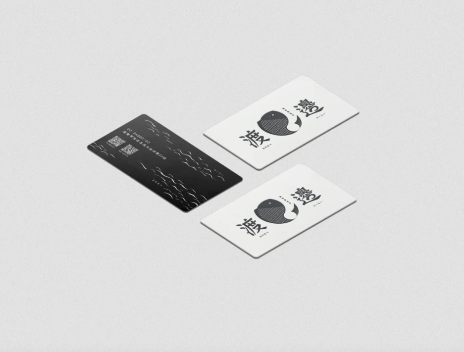
顏色的部分以淺灰色搭配黑色,更具日式質感及簡約感
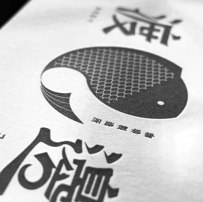
圖標以魚的形態形成一個圓,整體風格柔和具親民感
The word "Watanabe" is presented in calligraphy, and decorative strokes are added to the strokes to make it more natural visually.The color part is light gray with black, which has a more Japanese texture and simplicity.
The icon forms a circle in the shape of a fish, and the overall style is soft and user-friendly.
