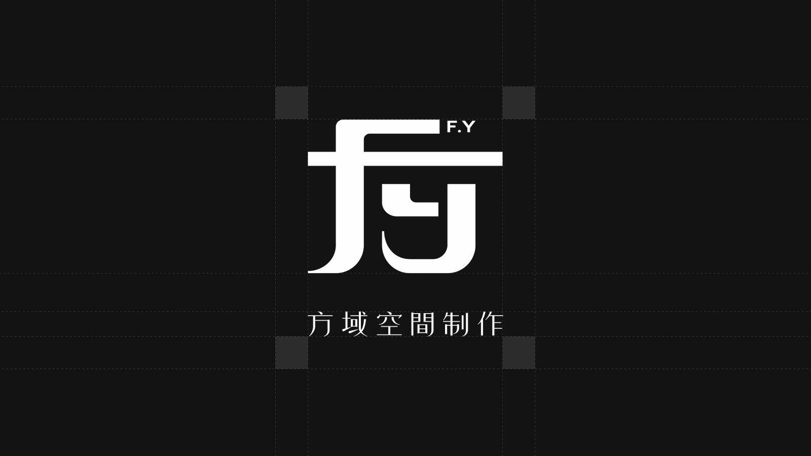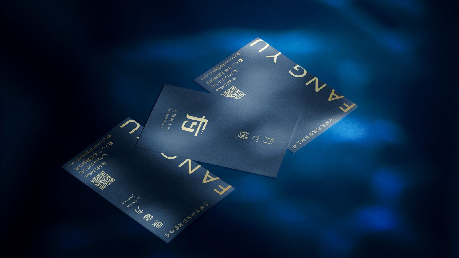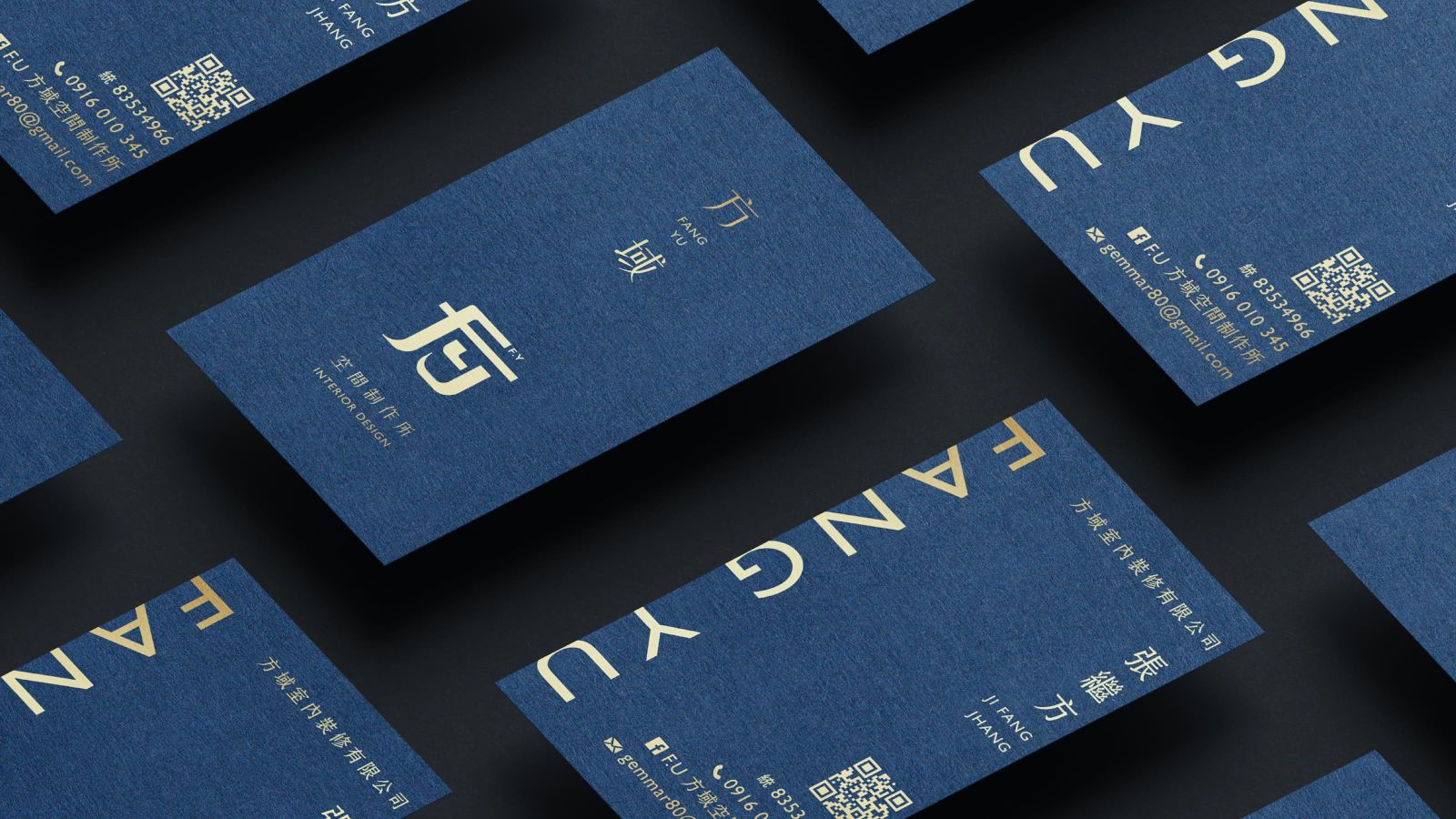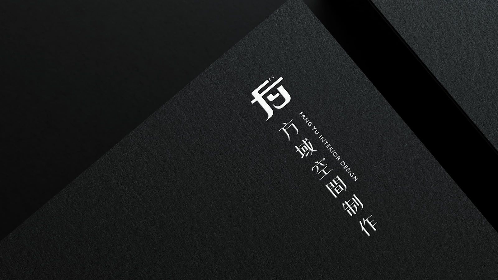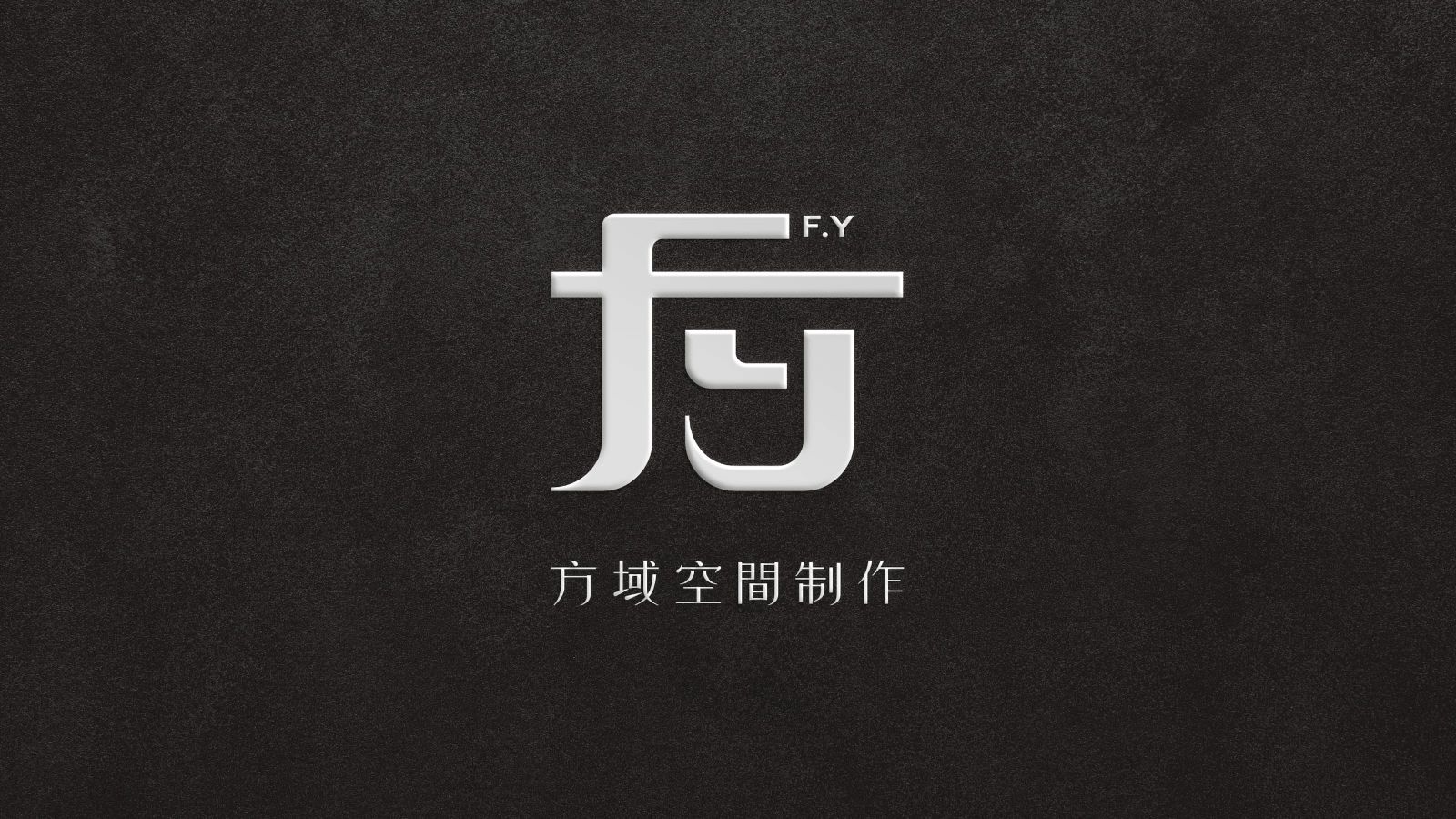
方域空間制作 FANG YU INTERIOR DESIGN
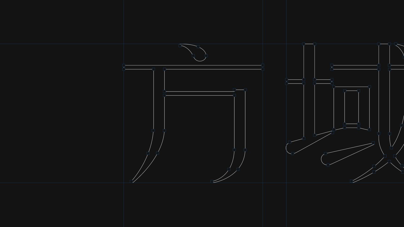
圖標以品牌首字「方」為設計核心,融合英文 F 與 y 的筆畫,轉化為兼具現代感與識別度的抽象符號
透過線條的交錯與延伸,形成「方」字形體,展現結構與造型上的設計思維
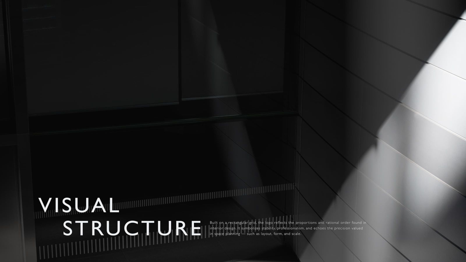
整體以矩形構圖排列,傳遞室內空間設計中常見的比例感與理性秩序,象徵穩定、專業的品牌價值
並呼應空間製作對「方正」、「格局」、「尺度」的精準要求
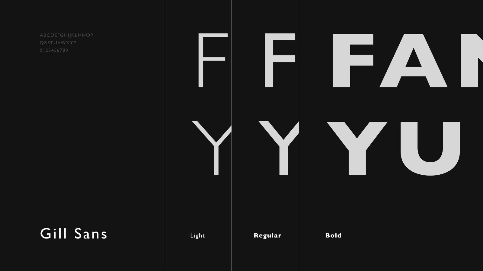
標準字選用具現代氣息的宋體襯線字型為基礎,筆畫收放之間展現內斂節制之美,營造品牌溫潤而理性的調性
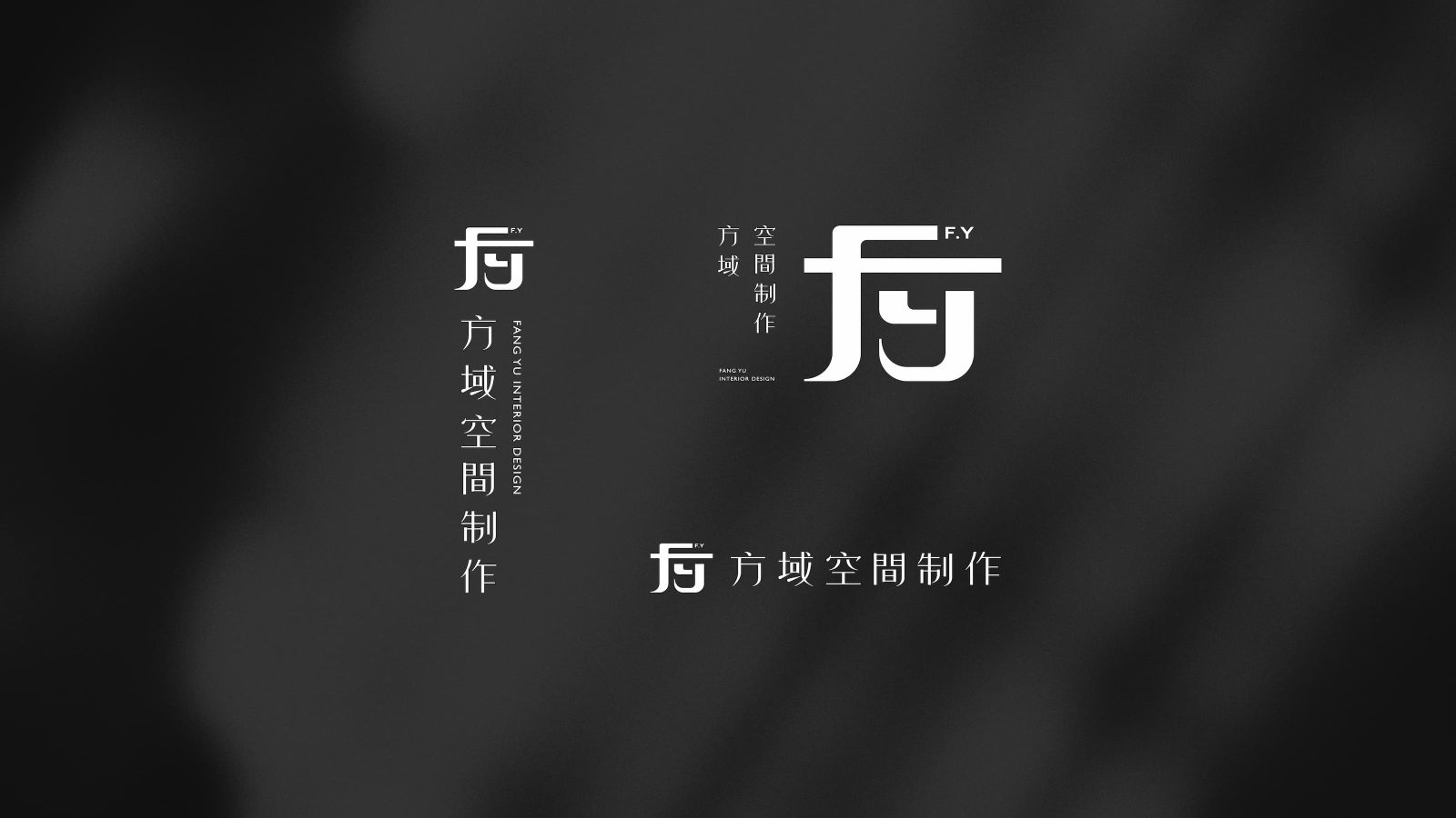
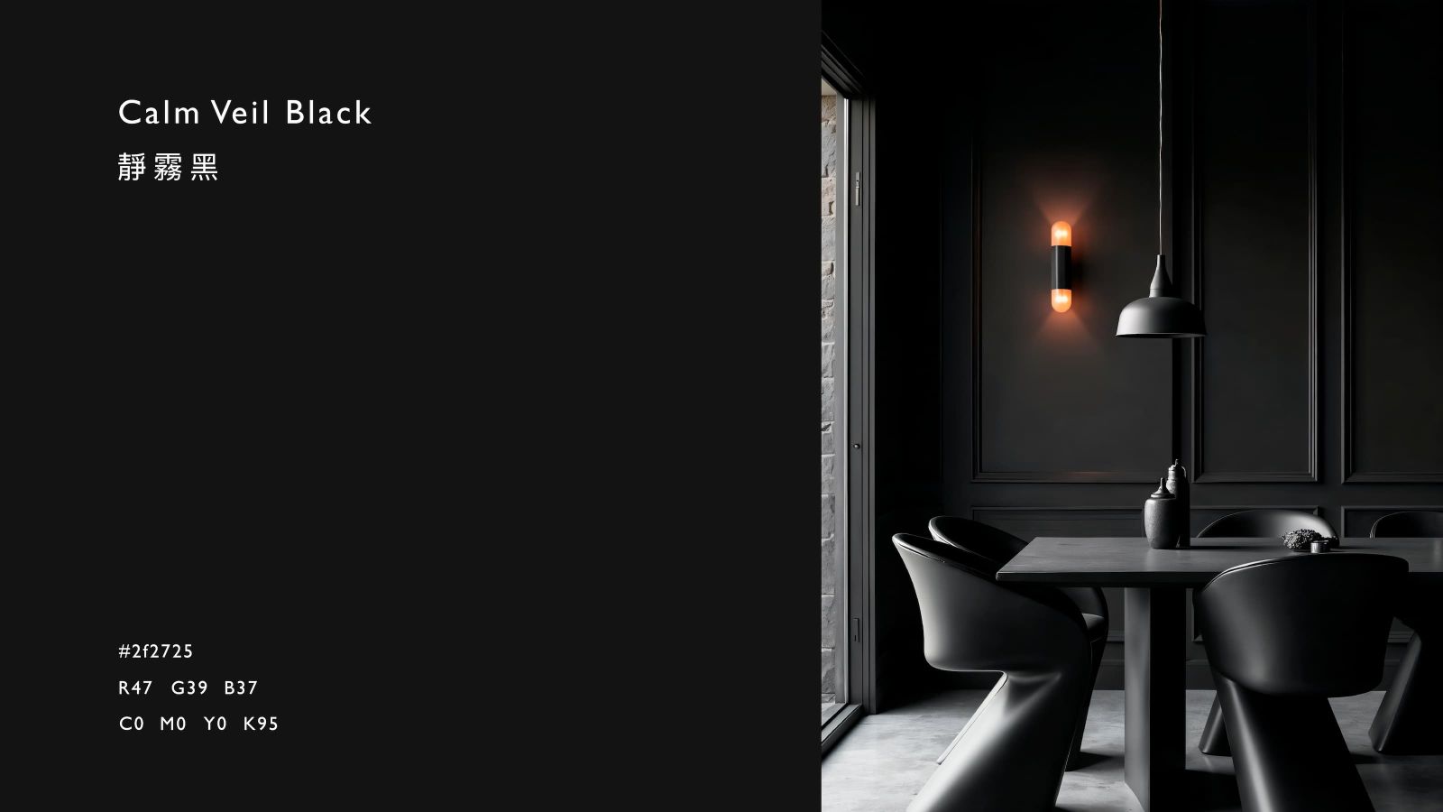
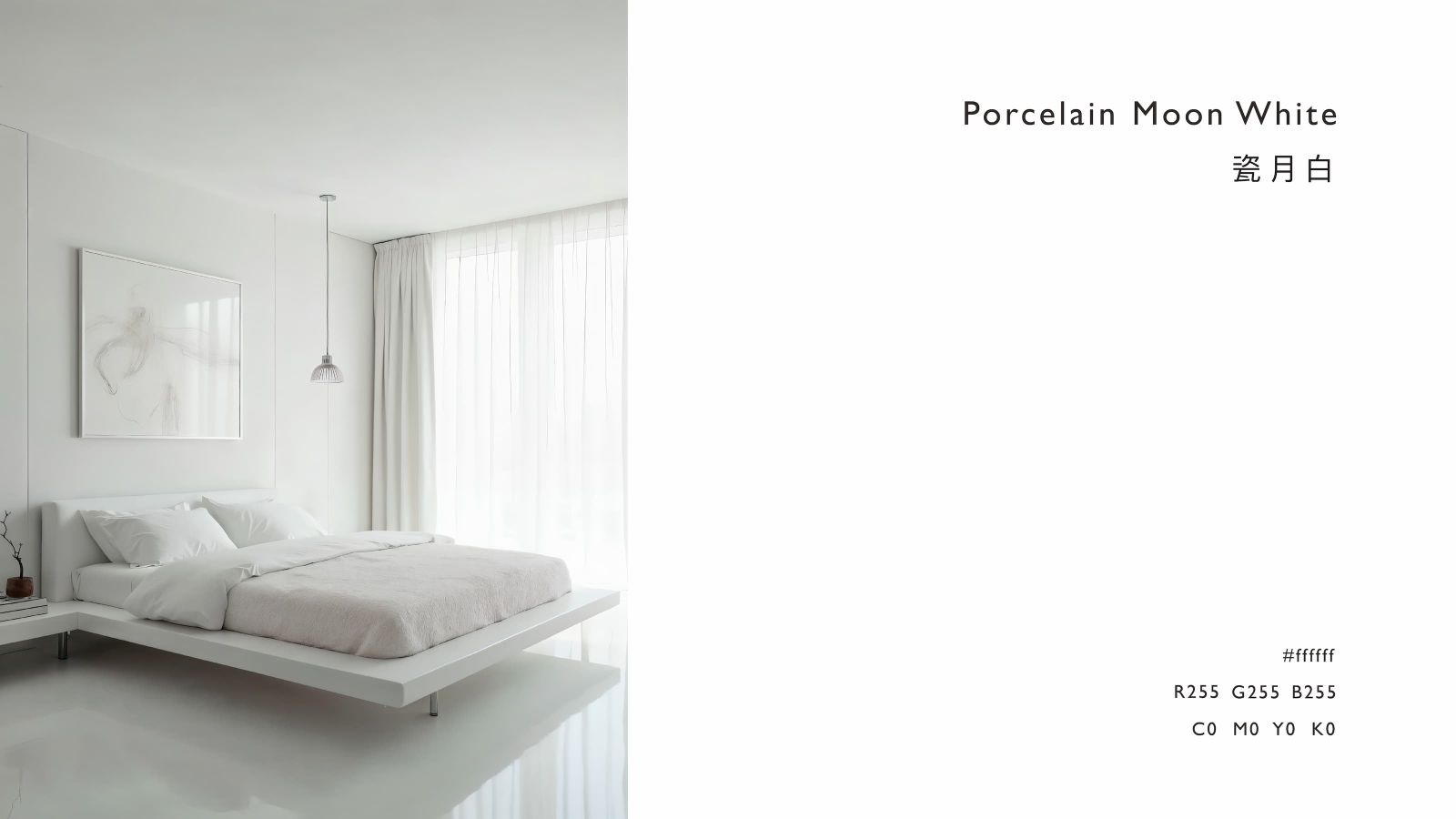
標準色以霧黑與純白為主,塑造簡約俐落的視覺印象,凸顯空間設計對質感層次與專業格調的追求
營造穩重而安定的氛圍
The logo's design centers around the brand's initials, "Fang," integrating the strokes of the English letters "F" and "Y," creating a modern and recognizable abstract symbol. The interweaving and extension of lines create the "Fang" character, conveying not only the integration of Chinese and English but also the design's structural and formal approach. The overall rectangular composition evokes the sense of proportion and rational order common in interior design, symbolizing the brand's stable and professional values and echoing the precise requirements for "squareness," "structure," and "scale" in spatial design.
The standard typeface is based on a modern Song-style serif font. The restrained and controlled aesthetic of the strokes creates a warm and rational brand identity. The standard color palette, primarily matte black and pure white, creates a clean and simple visual impression, highlighting the design's commitment to texture and professionalism, creating a stable and reassuring atmosphere.