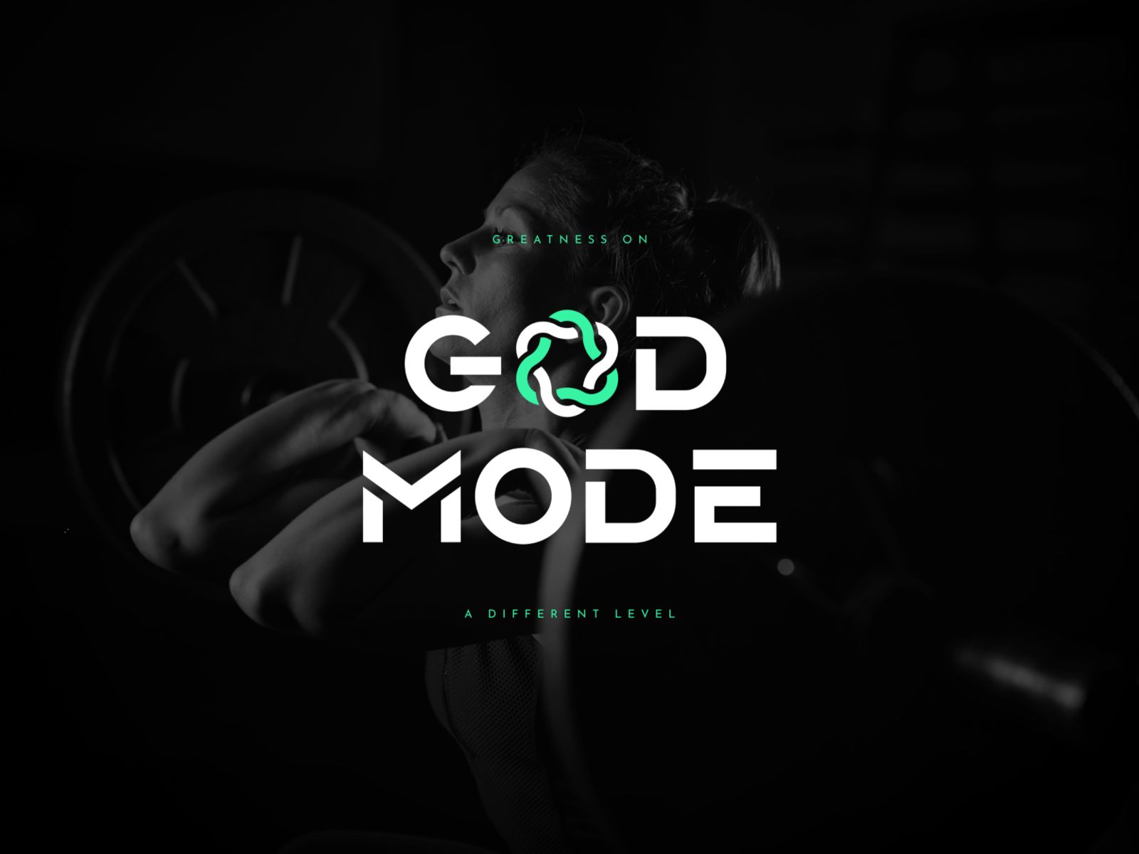
GOD MODE
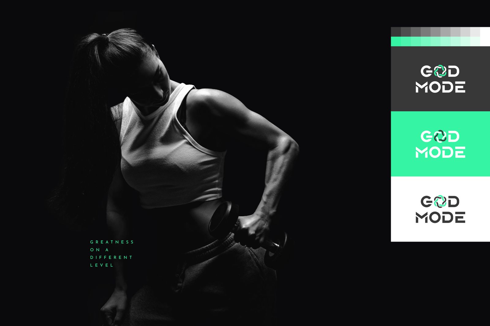
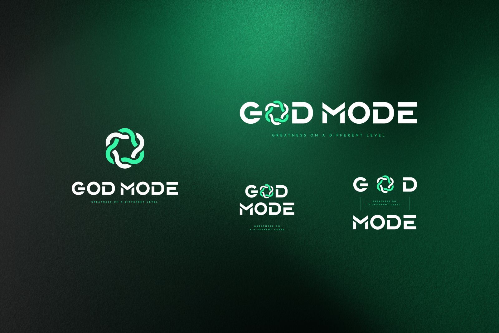
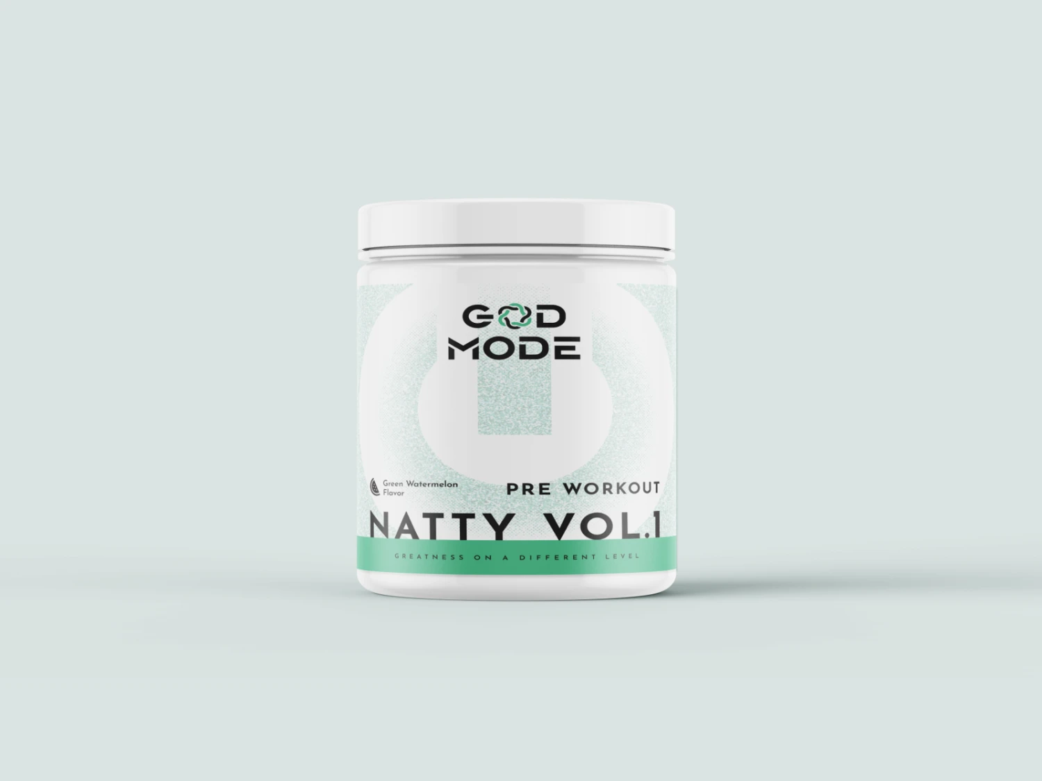
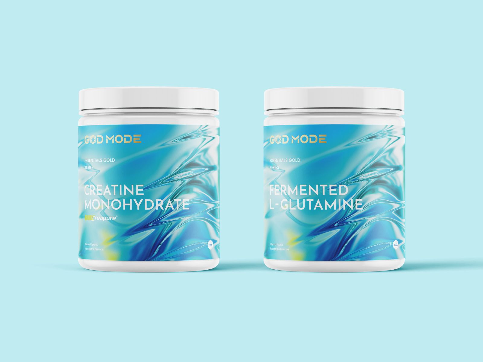
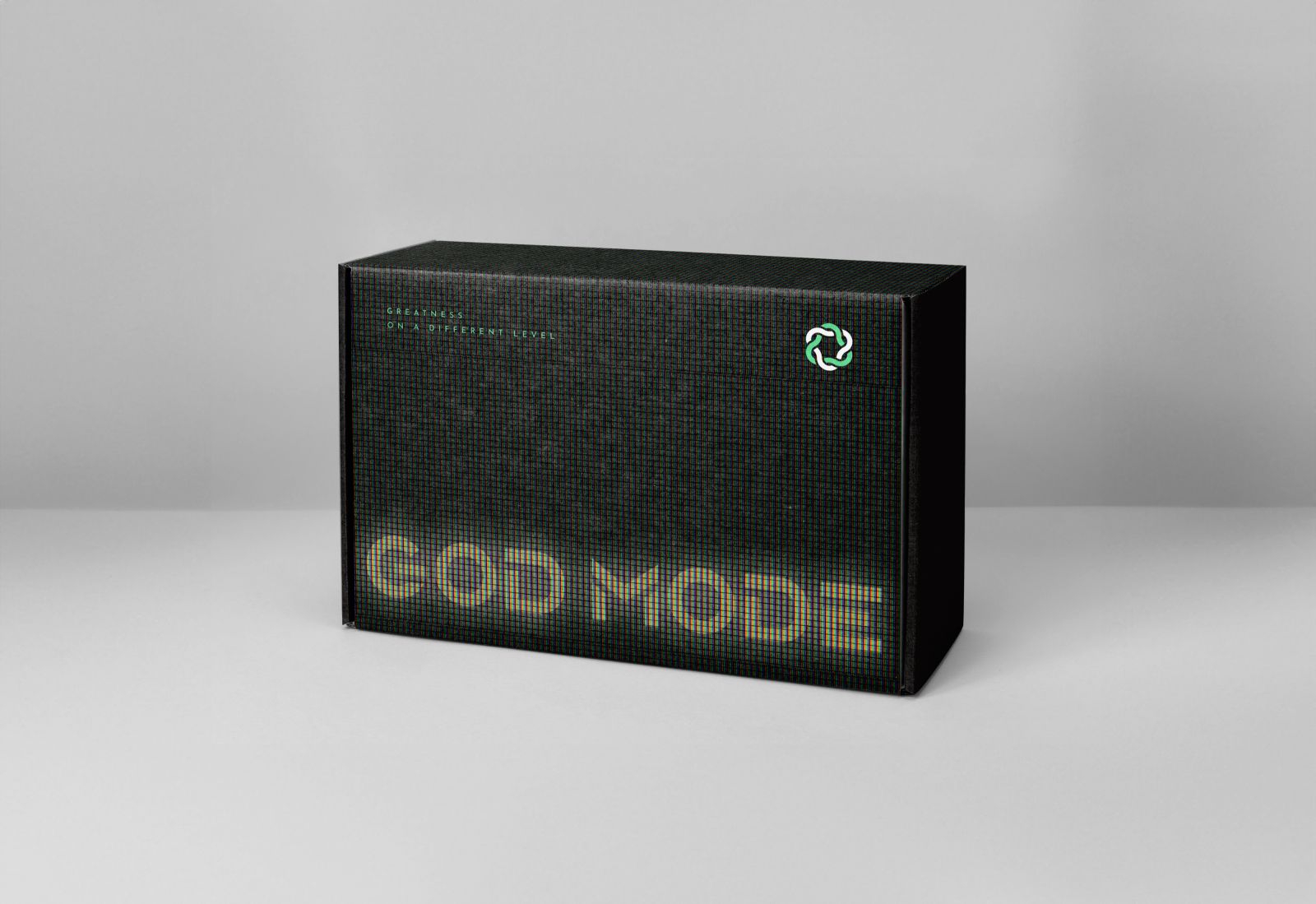
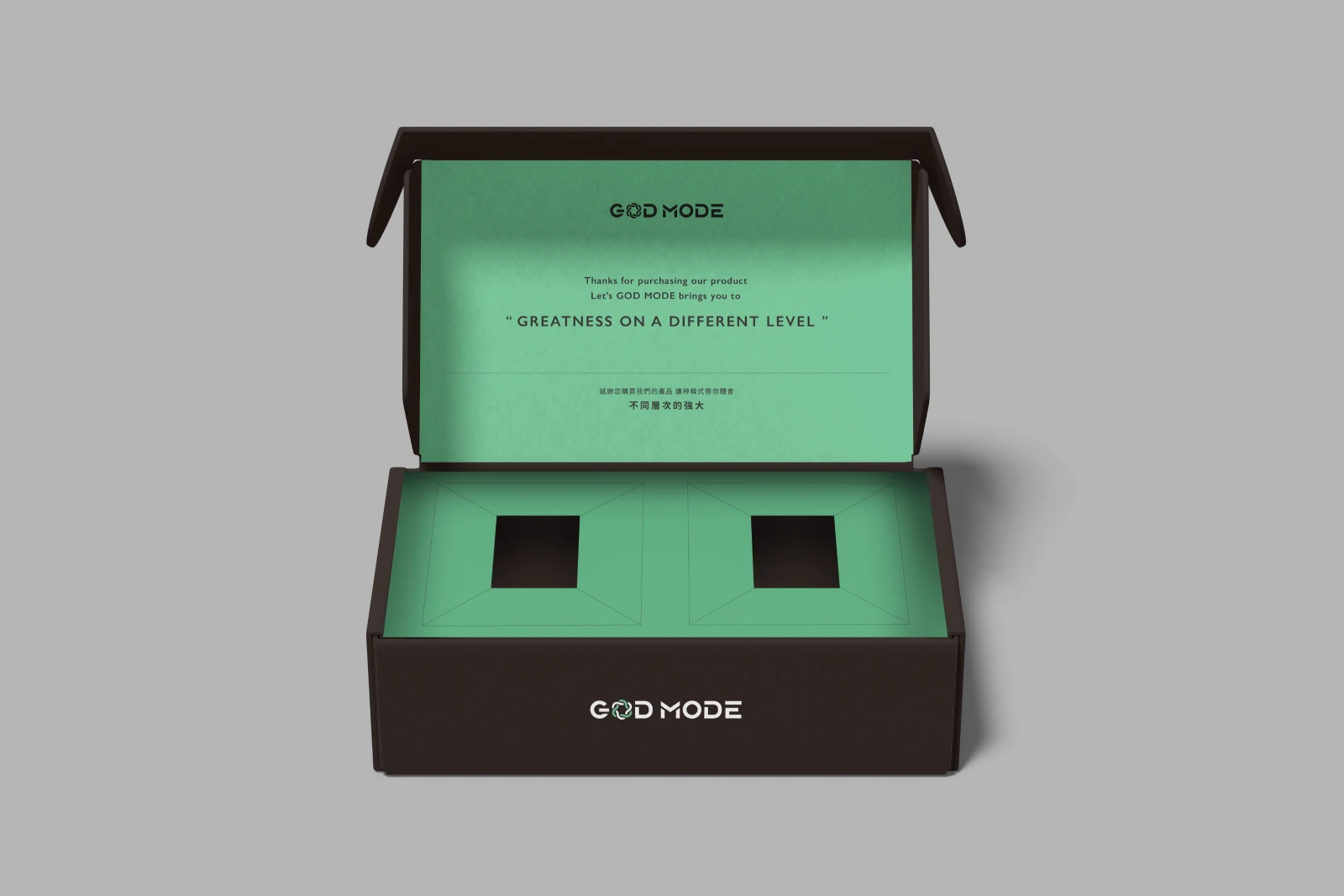
圖標整體以品牌理念作為設計主軸。品牌理念中的「讓人們的生活變得更好」,是以一個循序漸進的方式進行,訓練帶來進步到心情愉悅帶來更好的生活品質這個過程也像是一個循環,擁有更好的生活品質後又能為訓練帶來更多能量與心情。所以將圖標設計為循環,為每位消費者帶來正向的循環,並加入DNA元素,象徵身體每個細胞帶來的改變。標準字以稍寬、方正、銳利邊角的黑體作為主架構,加入部分截斷創造簡約科技感,也帶出重量訓練的力量感。標準色以無彩色系搭配螢光綠,少量的點綴使整體風格現代國際簡約幹練。
The logo design is centered around the brand's philosophy, which is "making people's lives better." This philosophy follows a progressive approach where training leads to improvement, and enhanced moods result in a better quality of life. This process resembles a cycle, where better life quality provides more energy and positivity for further training. Therefore, the logo is designed as a cycle, representing a positive loop for each consumer. The inclusion of DNA elements symbolizes the changes brought about in every cell of the body.
The standard typeface is a slightly wide, square, and sharp-edged black font. It features some cut-off sections to create a minimalist, tech-savvy look, also conveying the power of weight training. The standard colors are achromatic tones paired with neon green, with minimal accents to impart a modern, international, and sleek style.