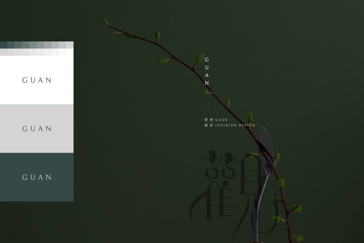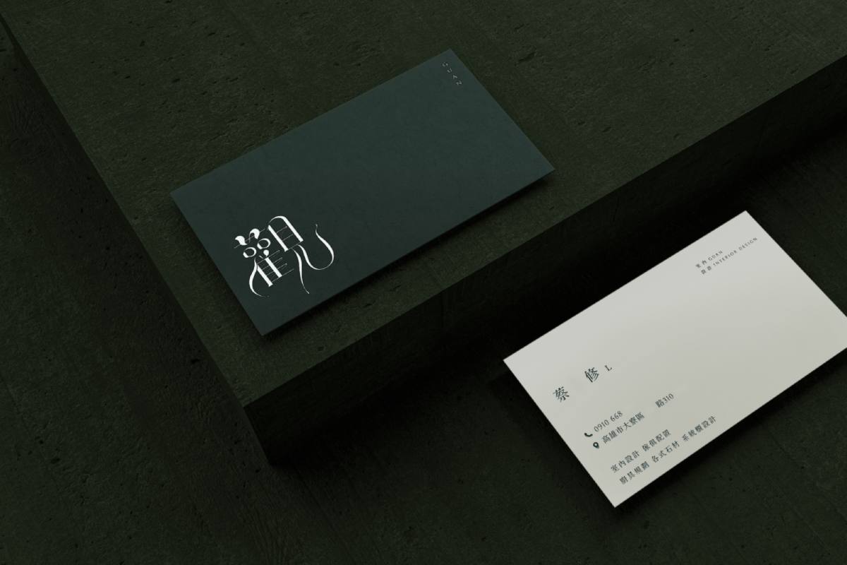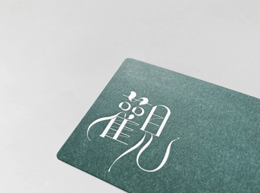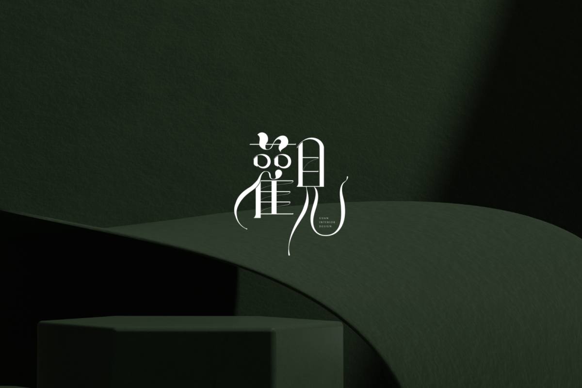
圖標以品牌名稱「觀」作為設計主軸,並融合禪風意象
字型以帶優雅古典的明體字作為整體骨架,橫細直粗的筆畫變化
並改變原有明體筆劃的造型變化,使字型更為精緻獨特
加入如被微風吹拂的曲線,增添輕柔、富生命力之感受
The icon uses the brand name "Guan" as the main design axis and integrates Zen-style imagery.
The font uses elegant and classic Mingti characters as the overall skeleton, and the strokes vary from horizontal to thin to straight to thick.
And change the shape changes of the original Mingti strokes to make the fonts more refined and unique
Add curves like those blown by the breeze to add a feeling of softness and vitality
