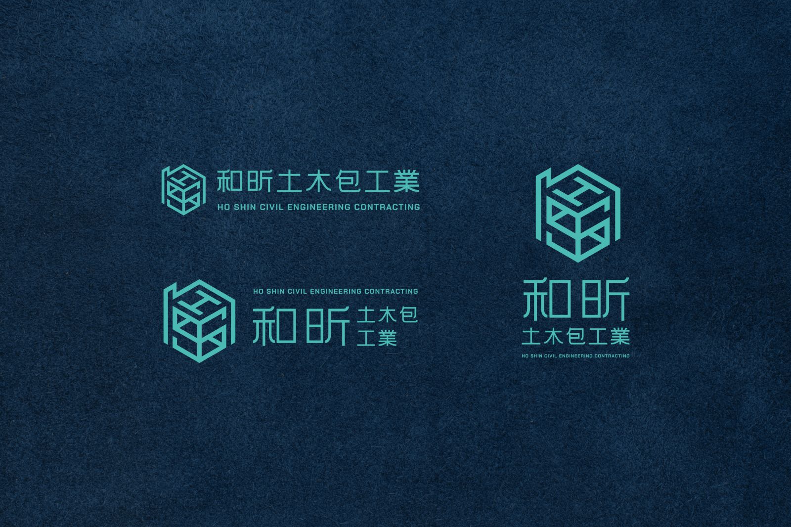
和昕土木包工業 HO SHIN CIVIL ENGINEERING CONTRACTING
圖標設計以品牌英文縮寫「H、S」結合房屋元素為核心概念
從房屋結構出發,營造簡約穩重的視覺風格
並在輪廓中融入大小寫 h、H 與 S 字母,展現層次感與空間意象
標準字採用黑體作為字體設計,整體筆畫粗細比例一致
並於轉折處加入圓角細節,使整體減少剛硬印象增添親和力
標準色選用靛藍色與亮湖水綠搭配,營造穩重且富有質感的視覺體驗,同時展現專業與現代感
The core concept of the logo design is the brand's
English abbreviation "H, S" combined with house elements.
Starting from the house structure, we create a simple and stable visual style.
The uppercase and lowercase h, H and S letters are integrated into the outline
to show the sense of layering and spatial imagery.
The standard characters are designed in bold, with the overall stroke thickness ratio consistent.
Rounded corners are added at the turning points to reduce the overall rigid impression and increase affinity.
The standard color scheme uses a combination of indigo blue and bright lake green to create a steady and textured visual experience while also displaying a sense of professionalism and modernity.