艾沐姸學
I MU YAN SYUE
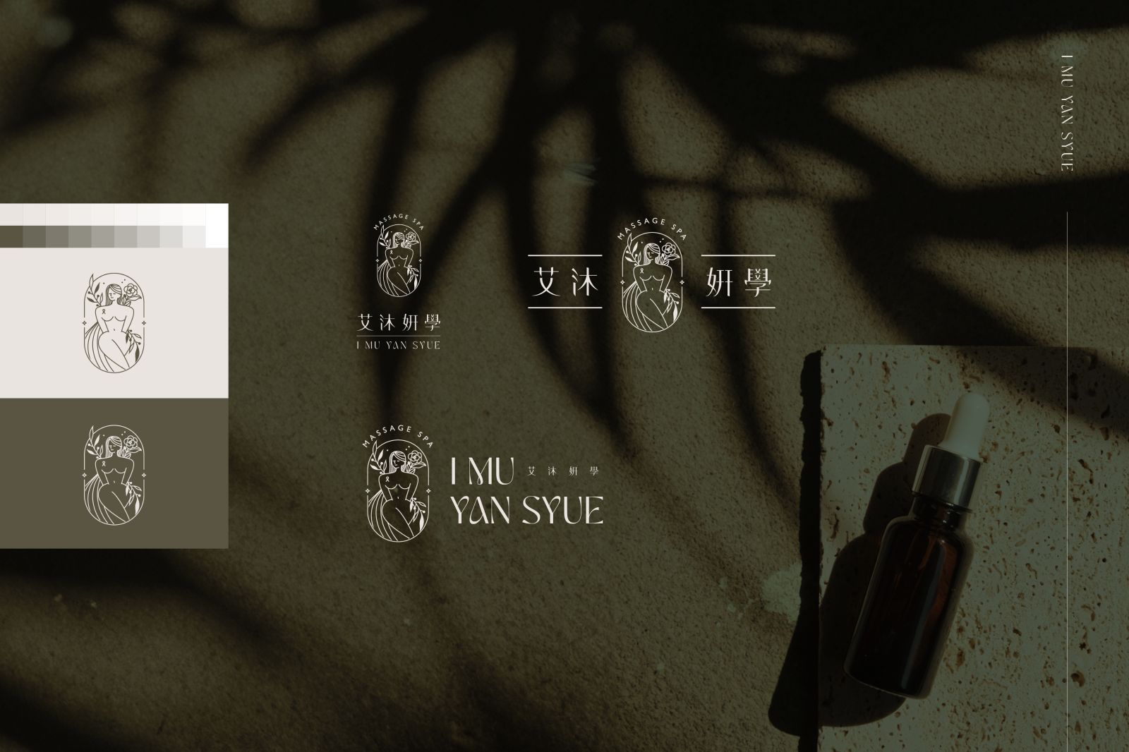
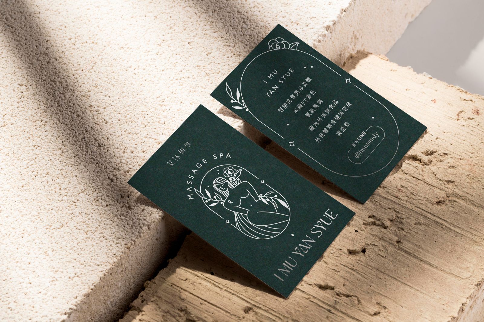
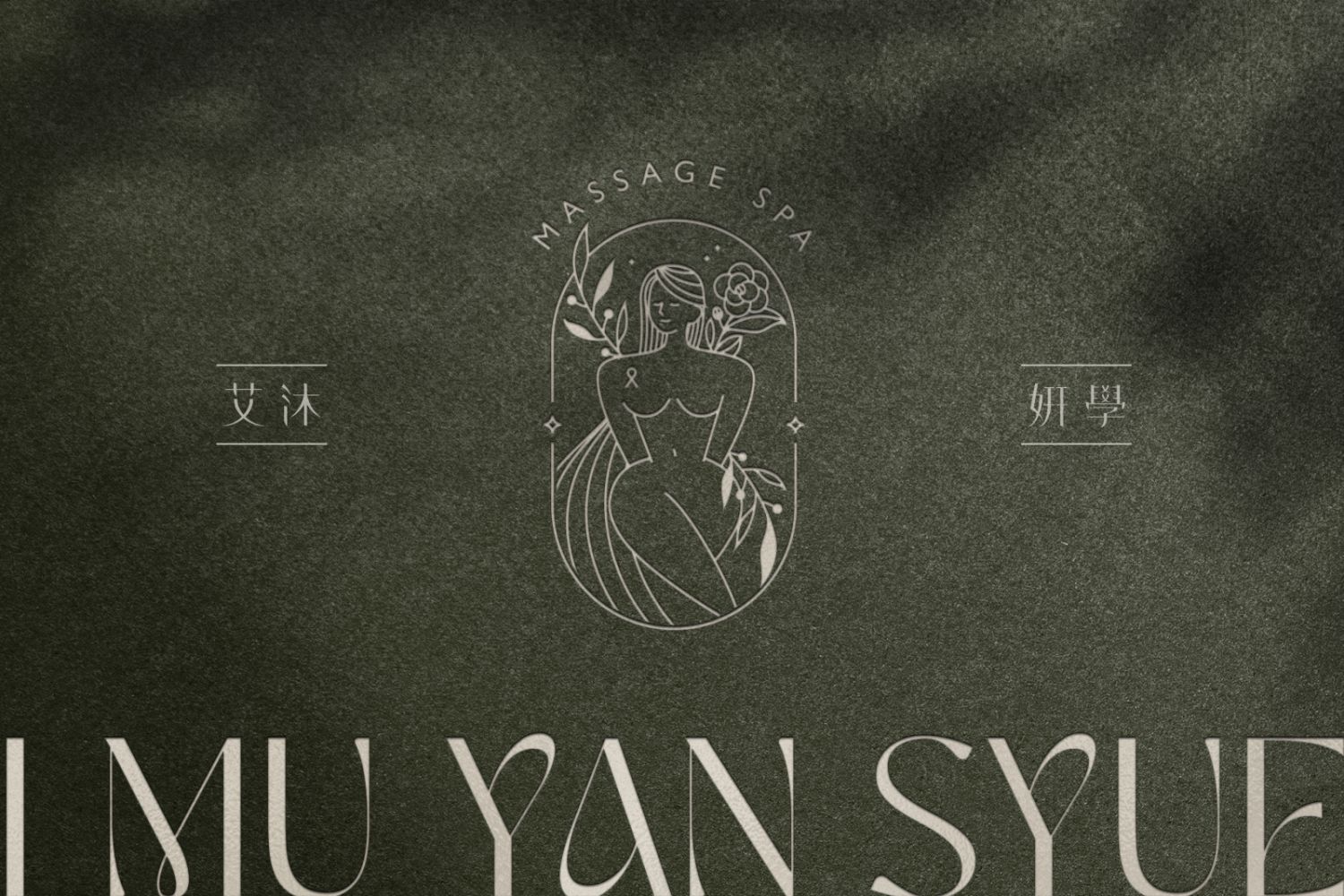
圖標整體以簡約優雅線條結合女性之美為設計主軸,凸顯女性身軀線條,以對比較明顯的身形曲線勾勒出女性多元且自然美好的身型。飄逸的長髮與星塵為圖標添增優雅神秘感,身旁兩側點綴橄欖枝與椿,呼應品牌自然、保健等品牌要素,並在外圍加入外框線,使設計元素更為統一整合,更為精緻典雅。英文標準字以具優雅曲線之襯線體呼應圖標之風格,中文標準字則以高瘦之明體作為字型架構,並簡化傳統筆畫造型,使字體更為簡約現代。標準色以杏米色搭配霧灰綠,柔和的莫蘭迪配色為視覺帶來柔雅療癒感。整體設計帶簡約現代優雅風格。
The logo design centers on combining elegant, minimalist lines with the beauty of women, highlighting the contours of the female body. The contrasting curves of the body illustrate the diverse and natural beauty of the female form. Flowing long hair and stardust add an elegant and mysterious touch to the logo. Olive branches and camellias adorn both sides, reflecting the brand's natural and wellness elements. An outer frame integrates these design elements, making the logo more cohesive, refined, and elegant.
The English standard typeface features a serif font with elegant curves, matching the style of the logo. The Chinese standard typeface uses a tall, slim Ming type structure, with simplified traditional strokes, giving the font a more minimalist and modern look. The standard colors are almond beige paired with misty gray-green, with soft Morandi hues providing a gentle, healing visual effect. Overall, the design conveys a simple, modern, and elegant style.