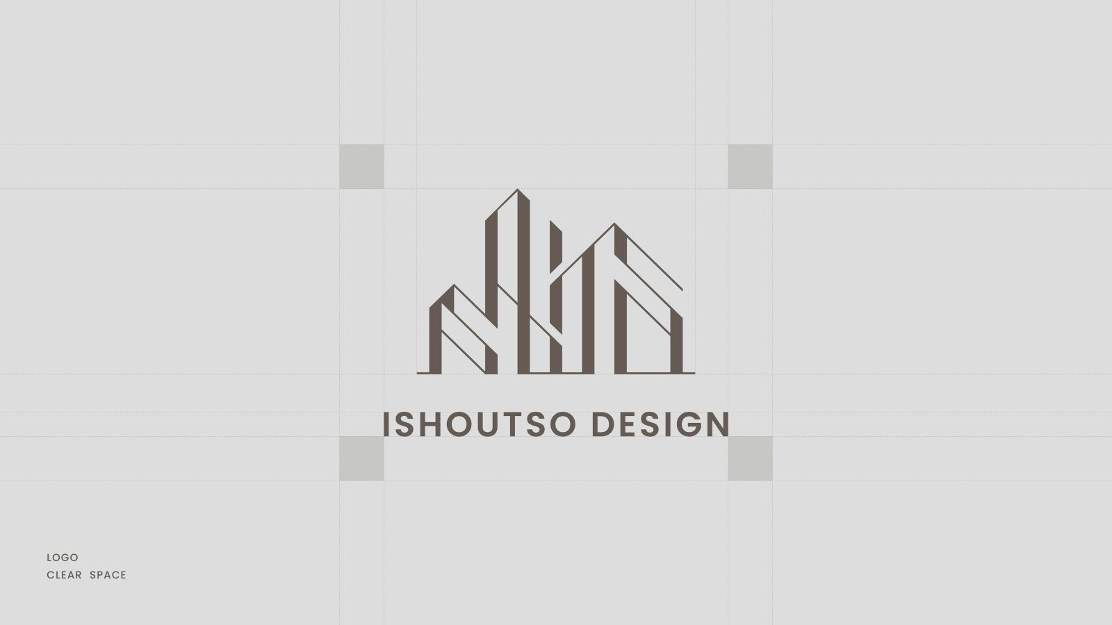
乙守祚空間設計 ISHOUTSO DESIGN
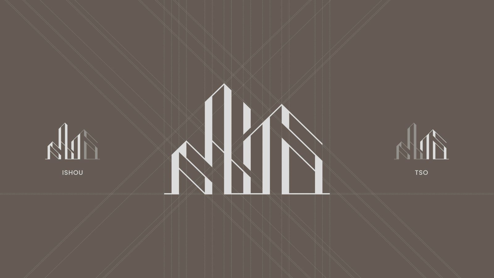
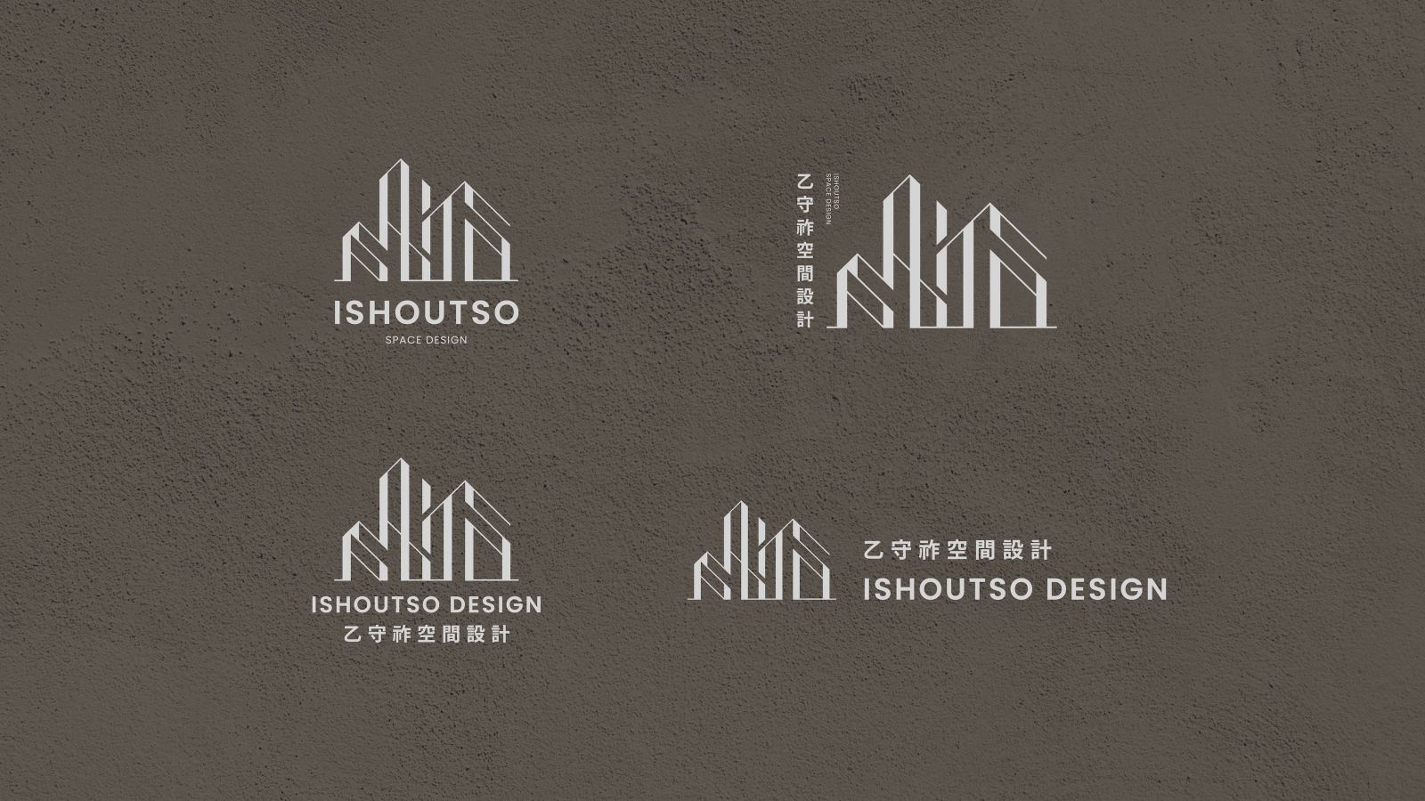
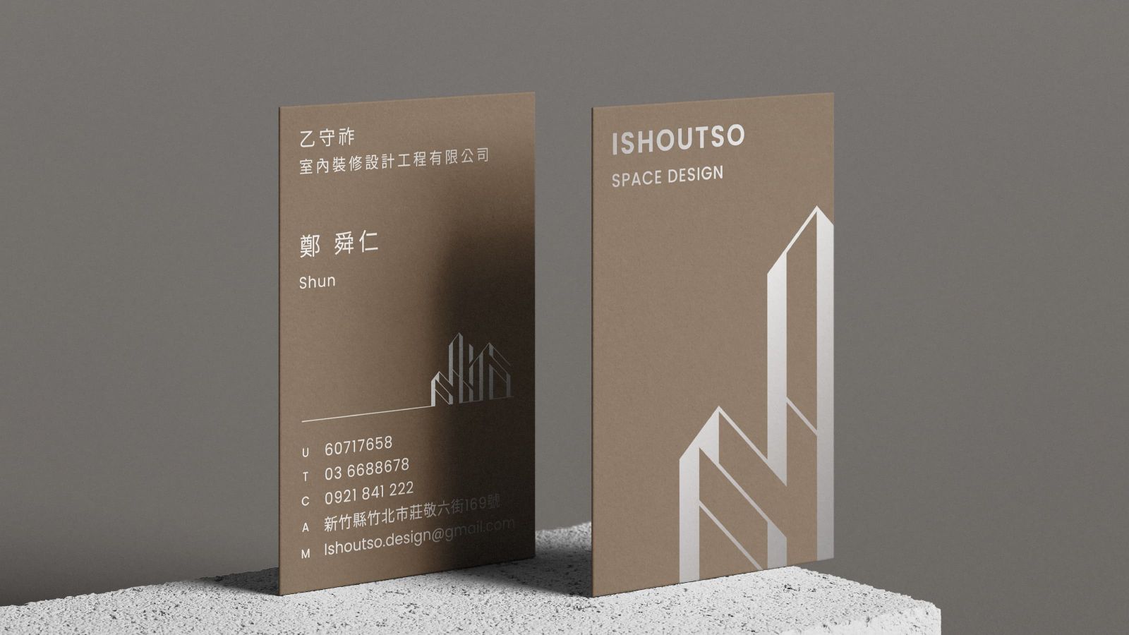
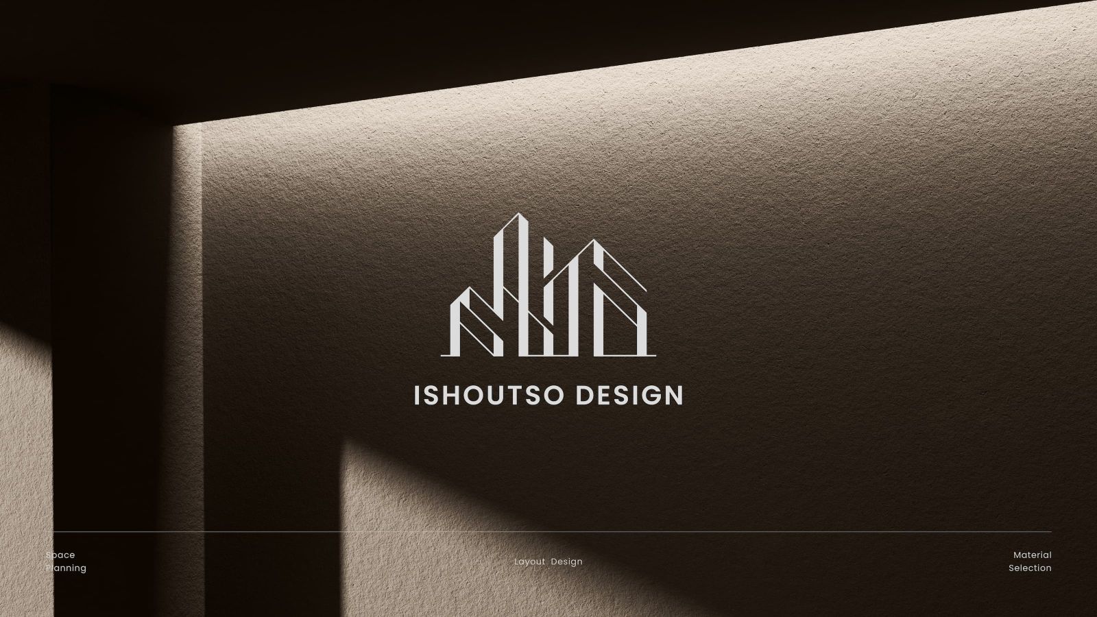
商標品牌英文名稱「 ISHOUTSO 」拆解與城市線元素結合,將字母轉化為簡約幾何感
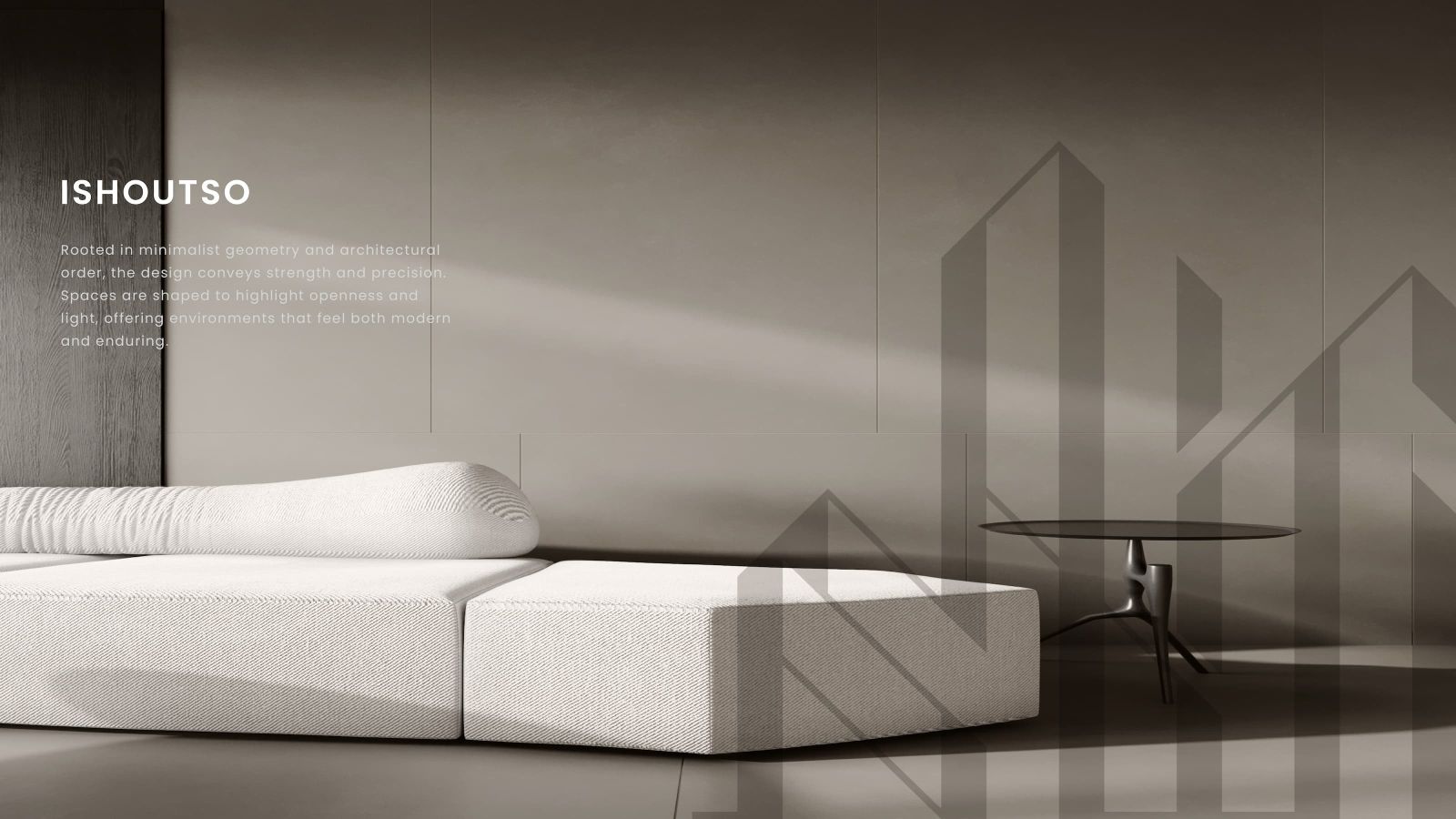
藉由字母結構的層次感和堆疊,呈現出建築物的雄偉輪廓,傳遞著品牌穩健的步伐與積極向上的企業精神
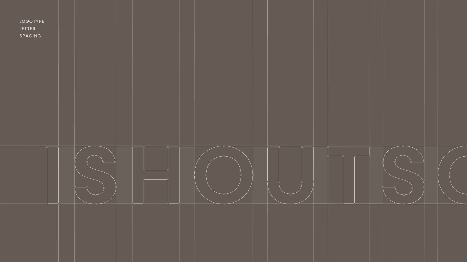
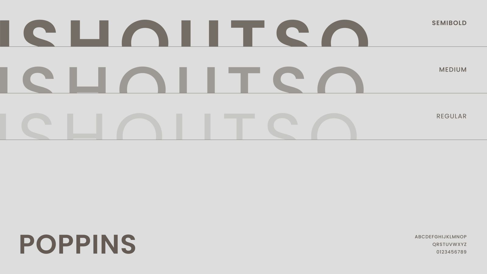
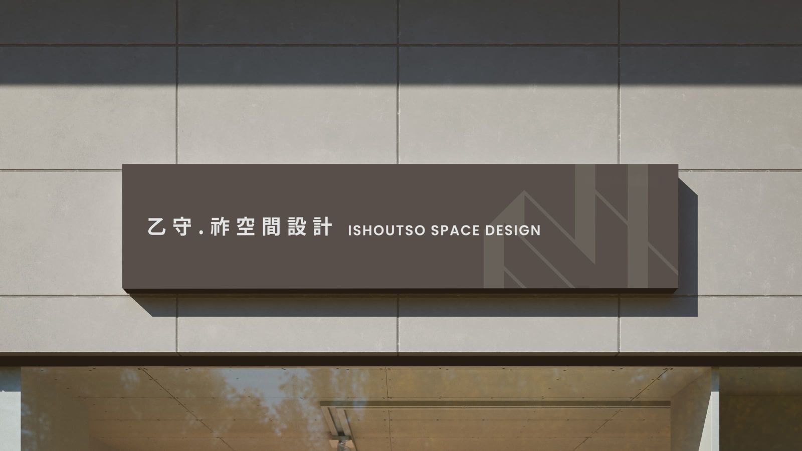
整體風格現代而俐落,標準字以黑體為主要字型架構設計,字型粗細比例一致,表現出大氣、穩重的風格
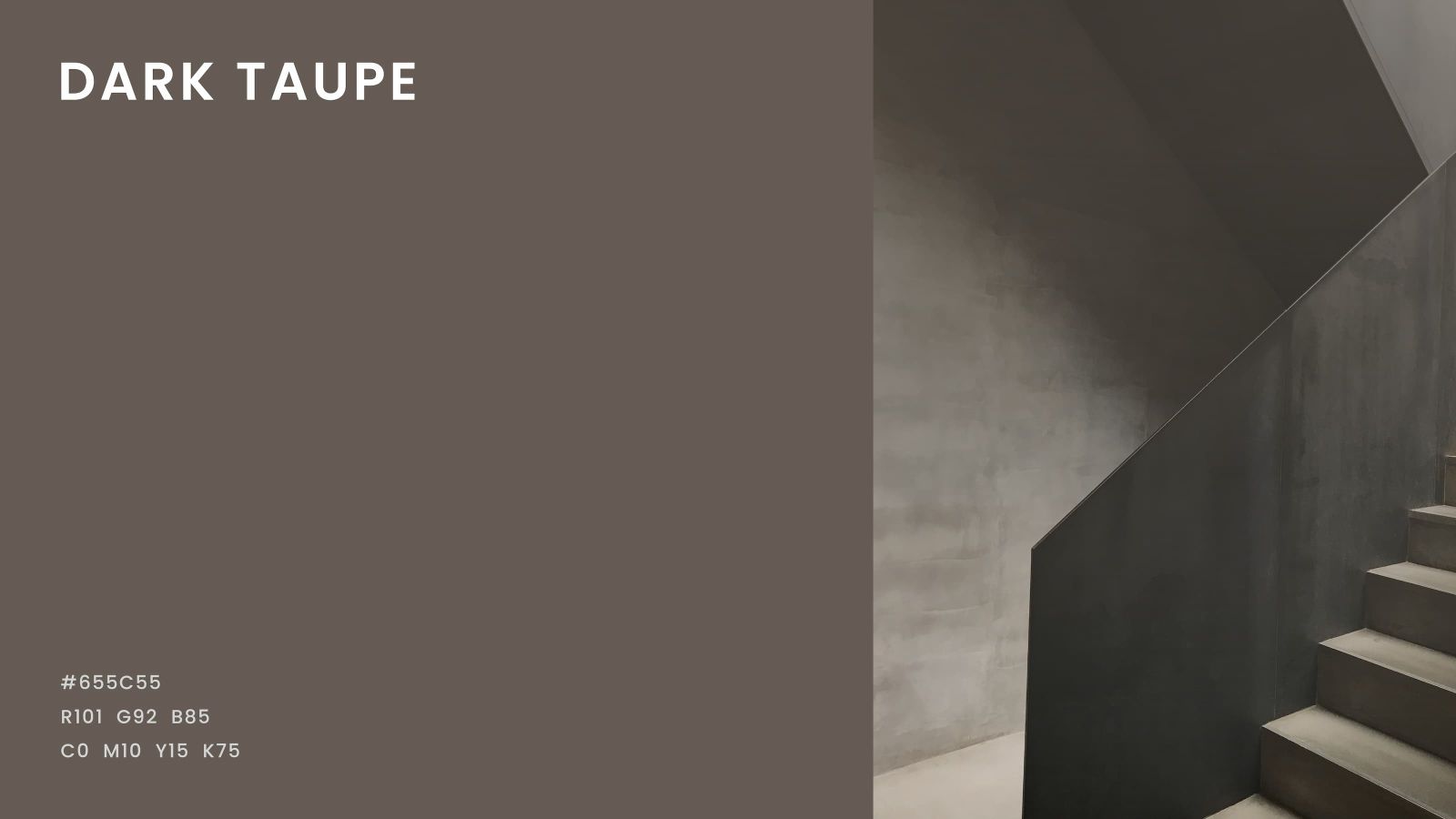
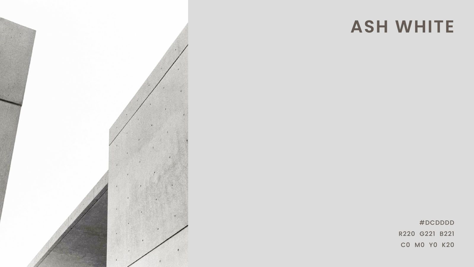
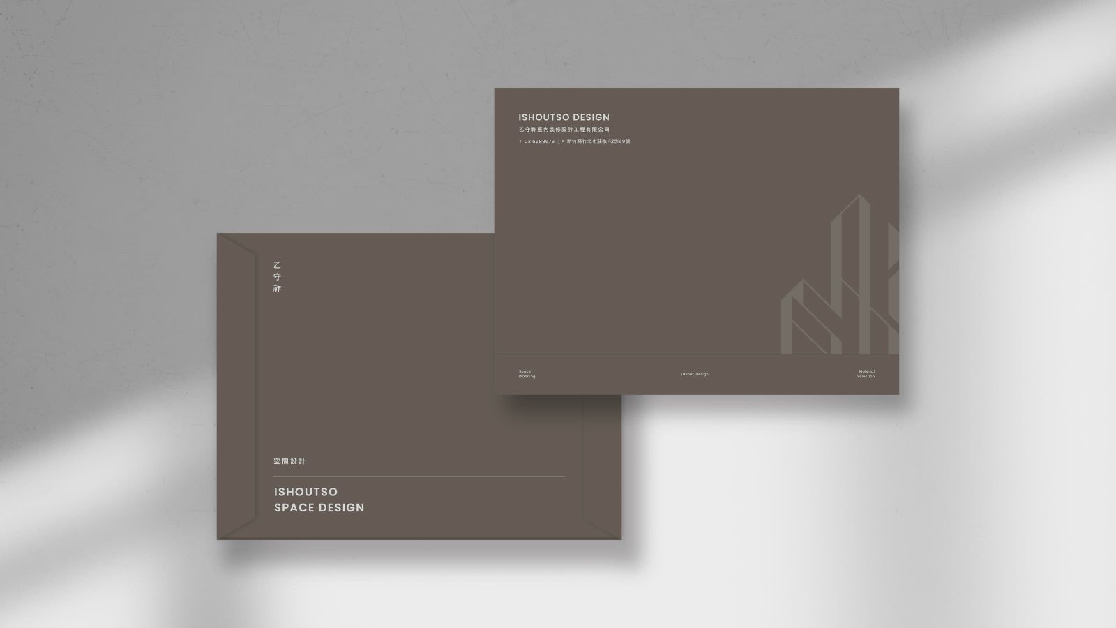
標準色以灰褐色與白色作為主色,營造穩重且現代的氛圍,呈現專業、質感的視覺感受
The English brand name "ISHOUTSO" is broken down and combined with city line elements, transforming the letters into a simple geometric sense. The layering and stacking of the letter structure presents the majestic outline of the building, conveying the brand's steady pace and positive corporate spirit. The overall style is modern and neat. The standard font is designed with bold as the main font structure, and the font thickness ratio is consistent, showing a grand and stable style. The standard color is gray-brown and white as the main colors, creating a stable and modern atmosphere and presenting a professional and textured visual experience.
