辣餃食舍識別設計專案

辣餃食舍識別設計專案
La Jiao Shih She Design
辣餃食舍 La Jiao Shih She圖標以品牌名結合水餃、辣椒元素作為設計主軸將品牌名稱「辣餃食舍」四字轉化為窗花風格型態 增添中式傳統美感
同時,加入夾起水餃的動作和辣椒元素,使圖標在沉穩中帶有活潑意象窗花外框採用由水餃皮堆疊而成的花形框架,象徵品牌所販售的水餃展現中式豐富的風格。
標準字以黑體為基本字型結構,整體呈現中式風格於字型筆畫轉折處導圓,讓標準字與圖標搭配更加協調標準色 選用復古紅和淺杏色為主,並以金色作為點綴,增加中式韻味營造穩定且質感的視覺效果。
The icon uses the brand name combined with dumplings and pepper elements as the main design axis.
Transform the brand name "Spicy Dumplings Restaurant" into a window grille style
The action of picking up dumplings and the element of chili pepper are added to make the icon calm and lively.
The flower-shaped frame made of stacked dumpling skins is used as the outer frame of the window grille, covering all the essence, just like the dumplings sold by the brand, showing the rich Chinese style!
Standard characters are designed in boldface as the basic font structure, and are presented in a Chinese style overall.
And guide circles at the turning points of strokes to make the matching of standard characters and icons more suitable.
The standard colors are retro red and light apricot.
Add gold embellishment to Chinese style to present a stable and textured visual experience
- Category
- 品牌識別設計 / 包裝設計
- Industry
- 餐飲食品
- Style
- 紅色系 / 東方美學 / 具象圖形 / 復古 / 溫暖親和


OTHERS
Yufeng Branding Design
玉峰製茶廠識別設計專案
Ishoutso
乙守祚空間設計識別專案
a Truth Design Branding Design
安厝室內空間識別設計專案
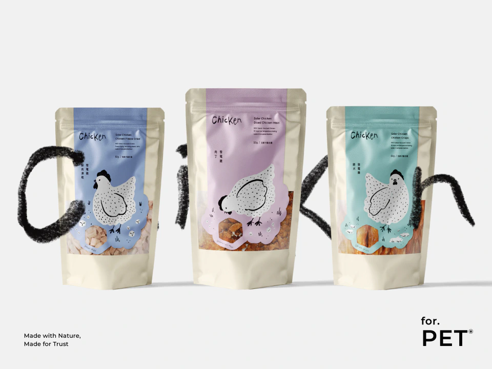
Pet Treats Design
發電雞寵物零食設計

BLANK3 Design Branding Design
方三空間制作識別設計專案
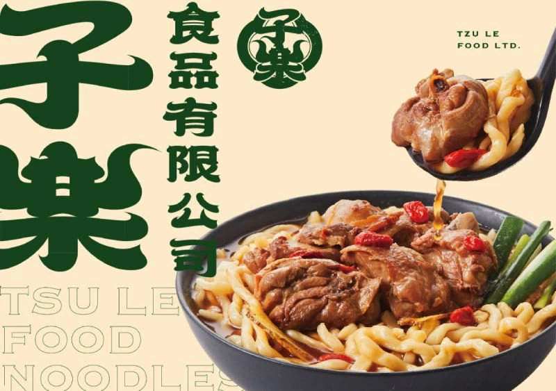
TZU LE FOOD LTD.
子樂食品識別設計專案
PI TIAO KE
皮苕客識別設計專案
Ming Cheng Design
明裎建設有限公司設計專案

Tong Han Electrical
同瀚機電工程識別設計

GOD MODE
GOD MODE 識別設計
HENG YU Brand Design
珩佑股份有限公司識別設計
SONSCAKES Brand Design