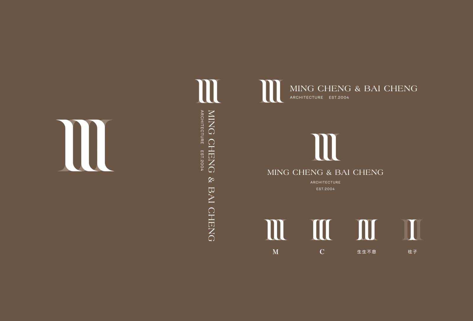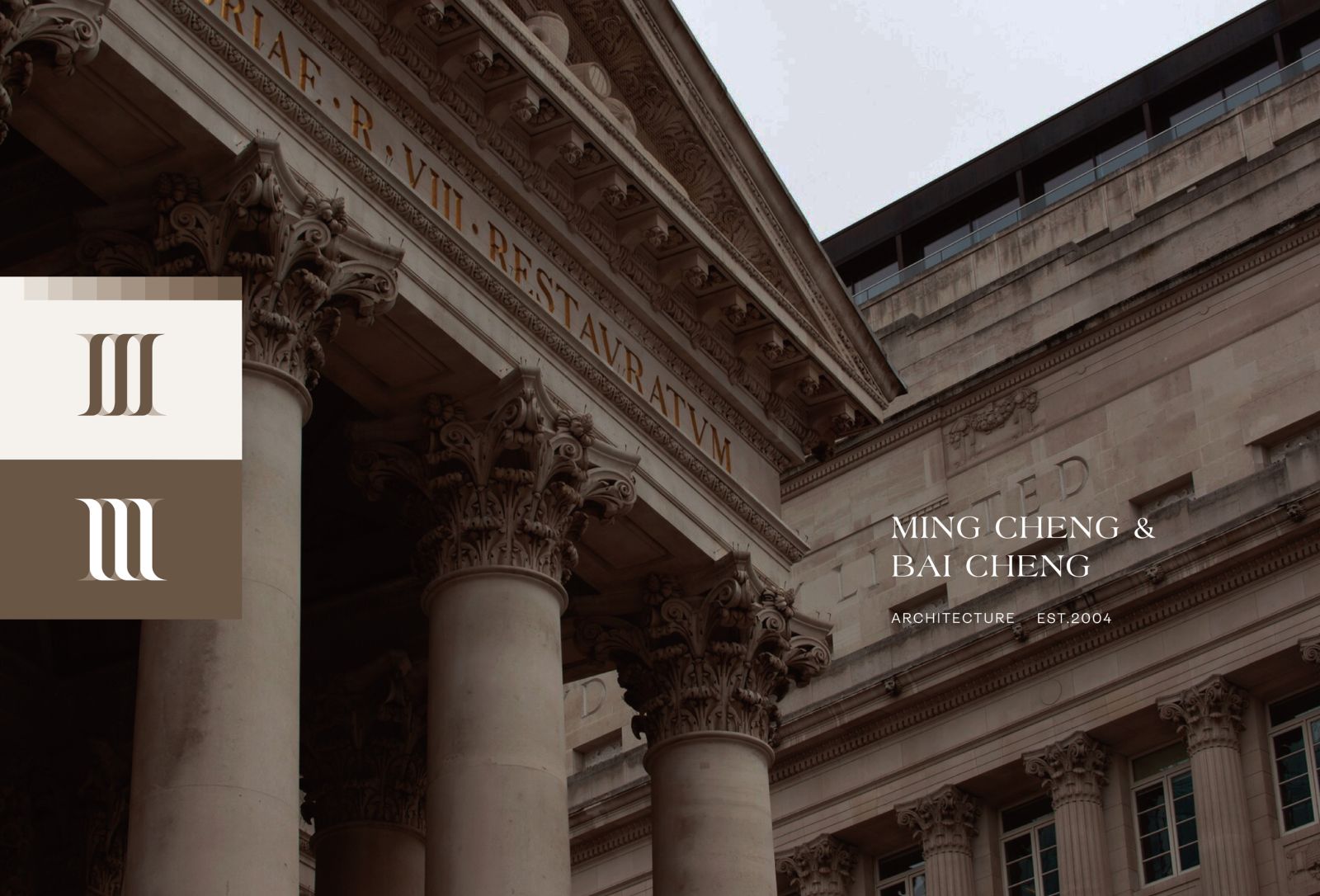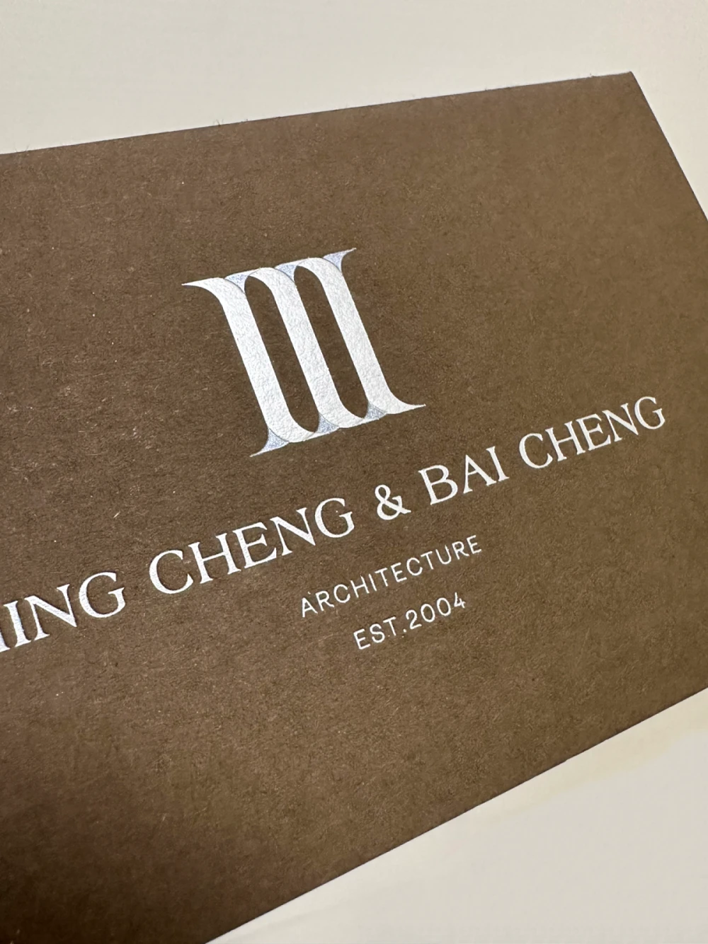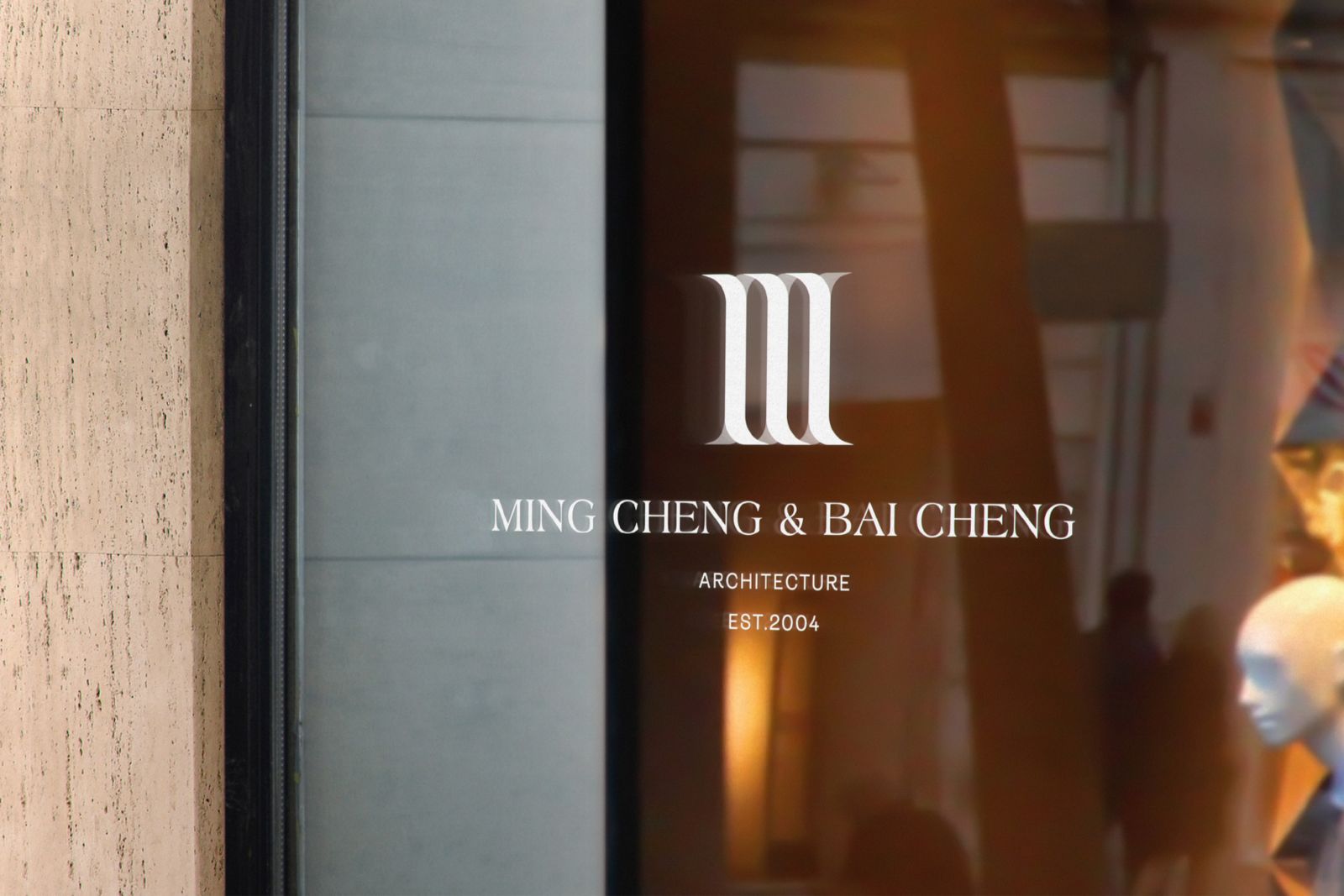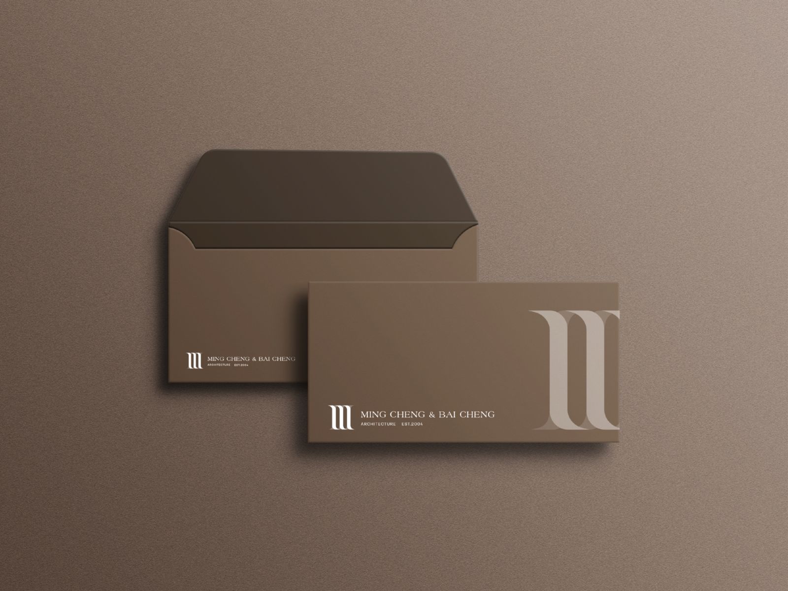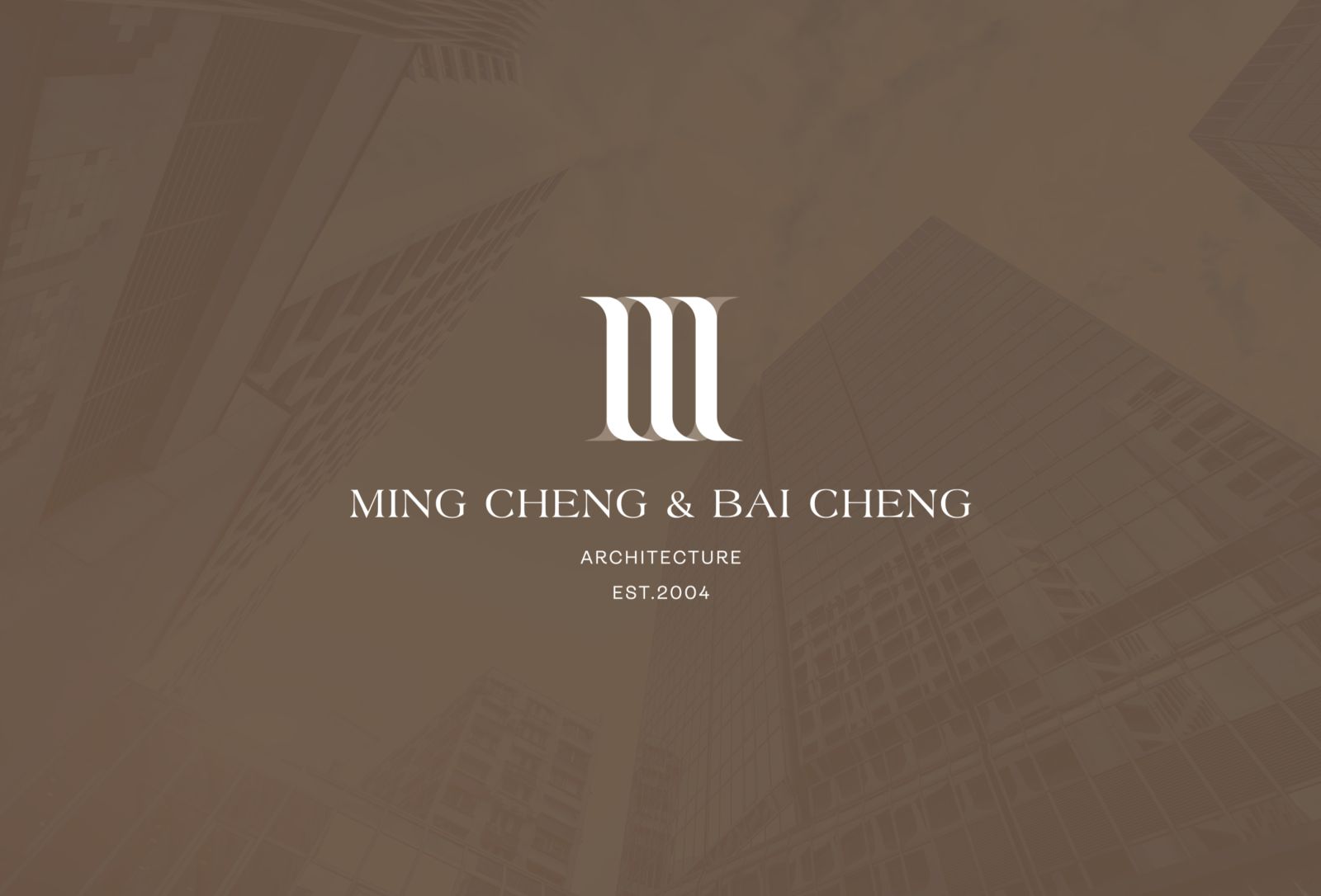
明裎建設 MING CHENG & BAI CHENG
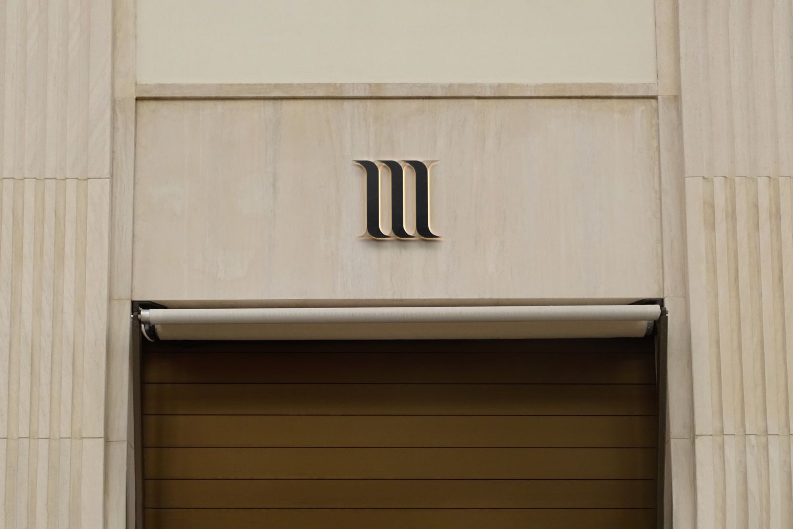
商標以MC重疊作為主體,使用深淺顏色區隔出前後層次感,
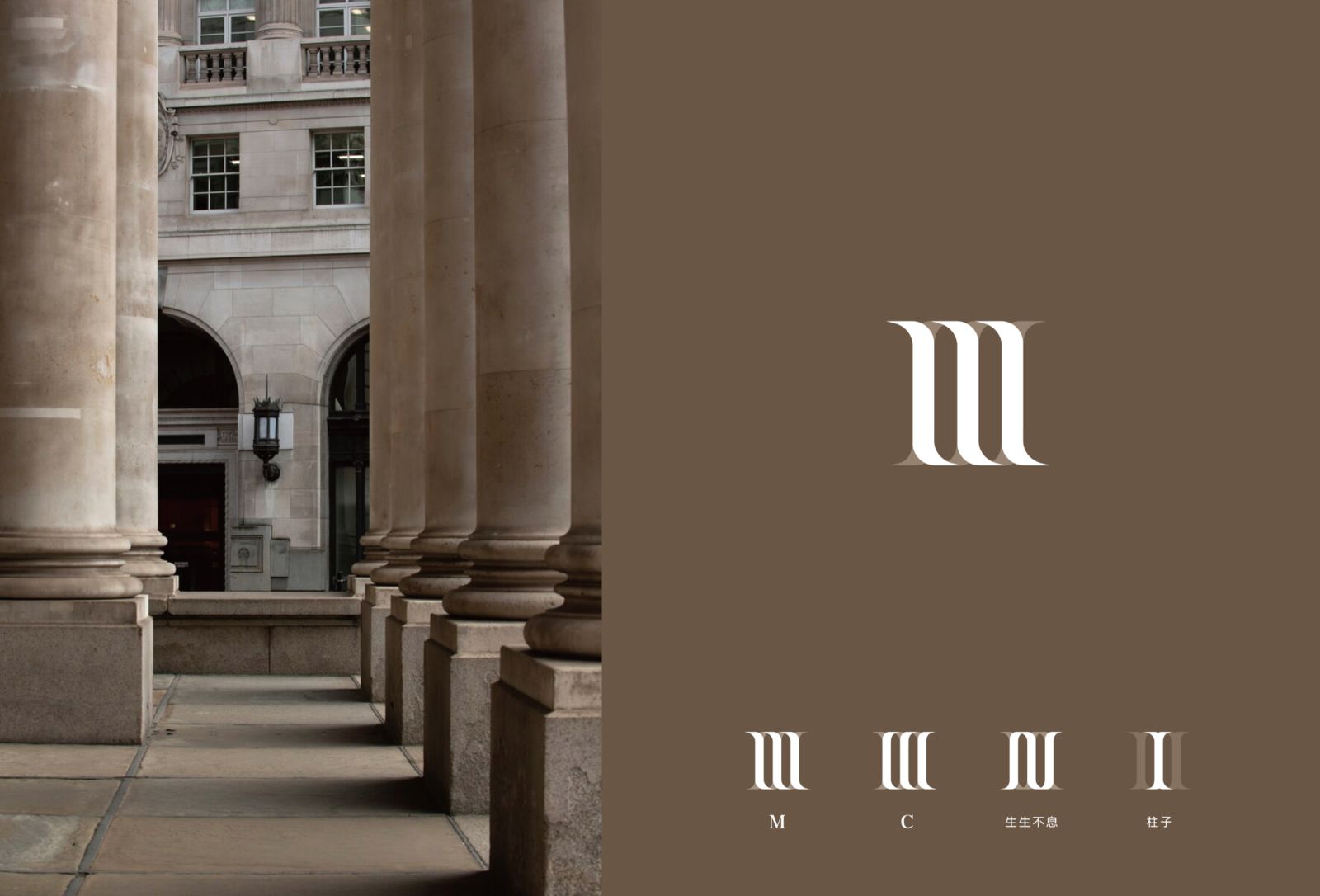
線條由下而上呈現柱子及建築的意象,
向左向右可無限延伸,亦有生生不息之意,
營造日式風格的國際飯店感。
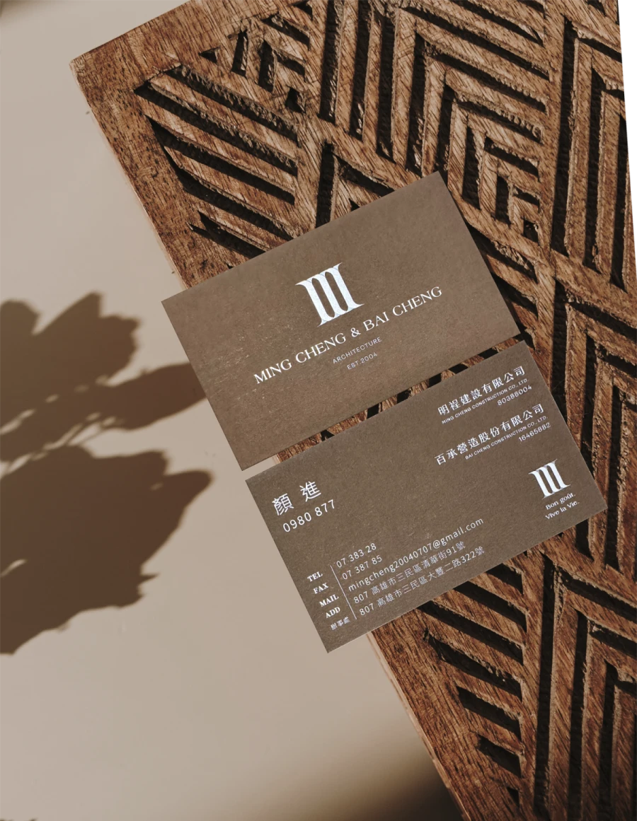
名片使用卡布奇諾紙+燙銀+珍珠箔,
印製出具層次感的商標。
The trademark uses MC overlap as the main body, and uses dark and light colors to distinguish the front and rear layers.
The lines present the image of columns and buildings from bottom to top.
It can extend infinitely to the left and right, and also has the meaning of endless life.
Create a Japanese-style international hotel feel.
Business cards are made of cappuccino paper + hot silver + pearl foil.
Print a layered logo.