森禾菓設計識別專案

森禾菓設計識別專案
SONSCAKES Brand Design
森禾菓 SONSCAKES
品牌中充滿爺爺對孫子疼愛的溫暖。品牌精神為生生不息的意義與傳承職人精神的態度,木成林,林成森。整體以三個木做發想,將木的外型融合葉片及葉脈。葉脈代表品牌精神脈絡的傳承,三片葉子排列成「森」,整體呈現日式質感,並搭配圓弧狀的英文及對稱的品牌標準字。
透過此次設計過程,期許能夠將森禾菓的溫暖、質感以日式穩重風格及色彩形象視覺呈現,並將品牌理念傳遞於客戶。
The brand is full of the warmth of a grandfather’s love for his grandson. The identity expresses continuity and the passing down of craftsmanship. The concept builds on the Chinese characters for a tree, a grove and a forest, using three tree forms to express growth and continuity. The whole design is based on the idea of three trees. The tree forms incorporate leaves and veins, with the veins symbolizing the passing down of the brand's values. The three leaves are arranged into a "forest", which presents a Japanese texture as a whole, and is matched with arc-shaped English and symmetrical words. The composition combines curved English lettering with a symmetrical Chinese logotype.
- Category
- 品牌識別設計 / 包裝設計 / 其他設計
- Industry
- 餐飲食品
- Style
- 金銀色系 / 具象圖形 / 自然有機 / 溫暖親和 / 復古


正在建立或更新品牌識別?
與我們聊聊設計用途、預計使用時間與需要製作的項目,一起確認適合的專案範圍。
OTHERS
Yufeng Branding Design
玉峰製茶廠識別設計專案
Ishoutso
乙守祚空間設計識別專案
a Truth Design Branding Design
安厝室內空間識別設計專案

BLANK3 Design Branding Design
方三空間制作識別設計專案
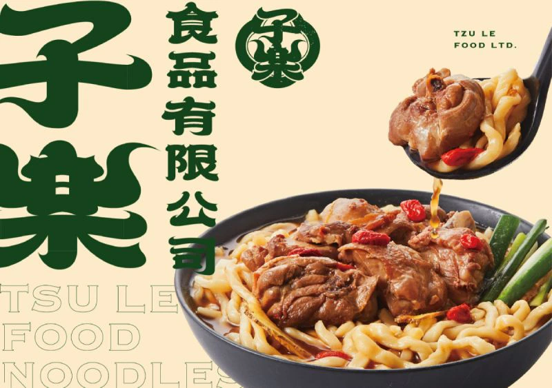
TZU LE FOOD LTD.
子樂食品識別設計專案
PI TIAO KE
皮苕客識別設計專案

Tong Han Electrical
同瀚機電工程識別設計

GOD MODE
GOD MODE 識別設計
HENG YU Brand Design
珩佑股份有限公司識別設計
IR & ANGELS ANIMALS
IR & ANGELS ANIMALS
Daisy Beauty In Living
黛絲生活美學識別設計專案

World Top