陽光生前契約
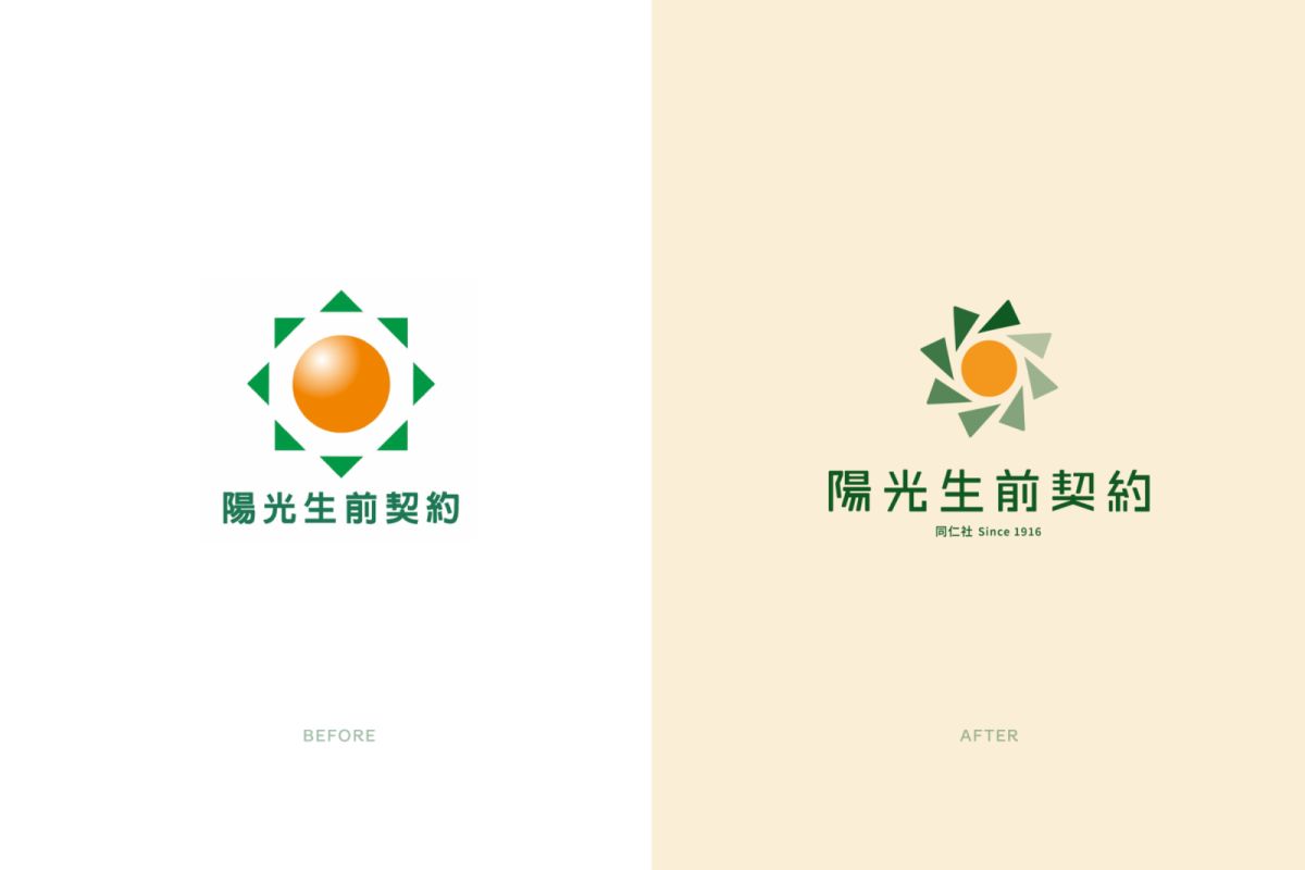
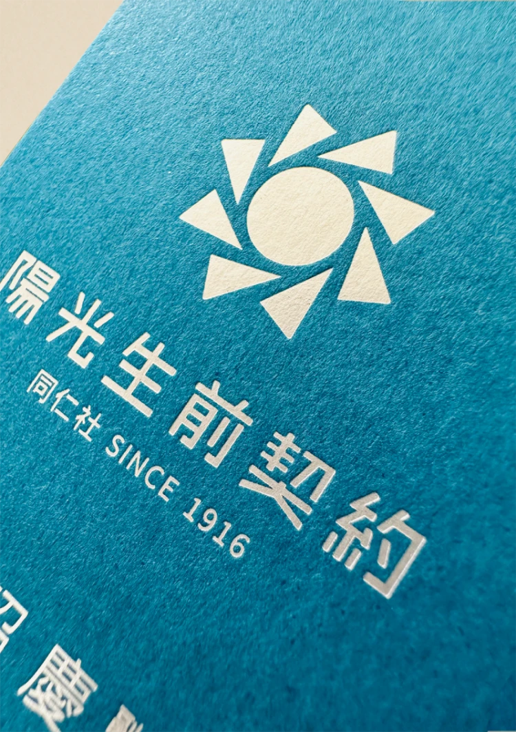
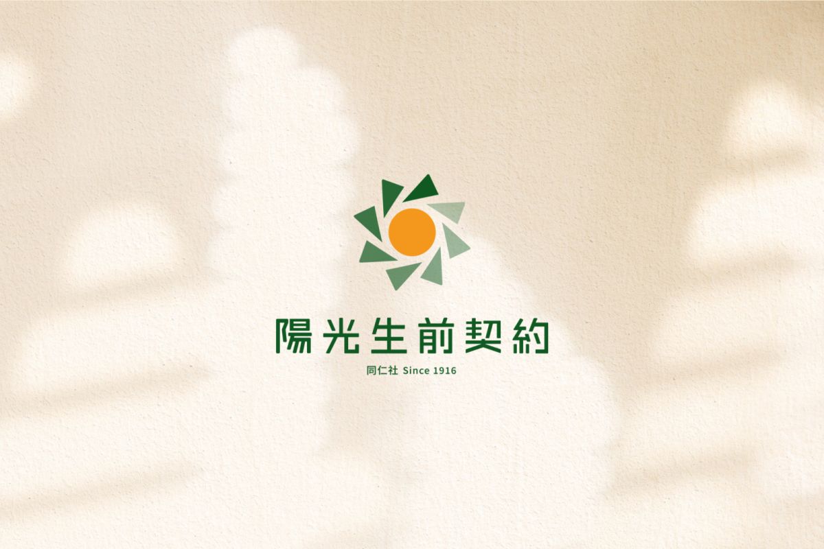
陽光生前契約於1916年成立,以提供專業親切的殯葬服務作為主要項目,品牌的核心感受為溫暖、親和力、信賴感,商標以太陽作為設計發想,保留原版的設計理念,再加上外圈漸變的八個三角形,隱喻品牌具有悠久的歷史及專業經驗,呈現溫暖的品牌氛圍。
LOGO保留原商標的太陽元素,以簡約幾何、扁平風格為LOGO再造。
既將品牌初衷理念傳承,整體風格也更符合現代流行趨勢,簡約的造型更易受眾記憶。
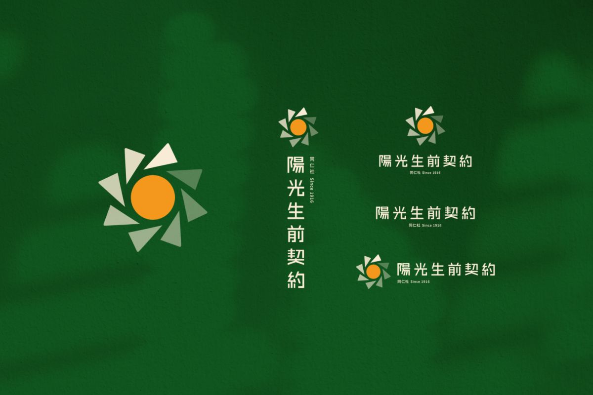
太陽的八道光芒則代表 安心 | 放心 | 溫馨 | 貼心 | 親切 | 包容 | 團結 | 用心
Sunshine Living Contract was established in 1916 to provide professional and friendly funeral services as its main project. The core feelings of the brand are warmth, affinity and trust. The trademark uses the sun as the design inspiration, retaining the original design concept, plus the outer ring The eight gradient triangles imply that the brand has a long history and professional experience, presenting a warm brand atmosphere.
The LOGO retains the sun element of the original trademark and recreates it in a simple geometric and flat style.
It not only inherits the original intention of the brand, but also the overall style is more in line with modern fashion trends. The simple shape is easier for the audience to remember.
The eight rays of the sun represent peace of mind | peace of mind | warmth | caring | cordiality | tolerance | unity | attentiveness