
同瀚機電工程有限公司 Tong Han
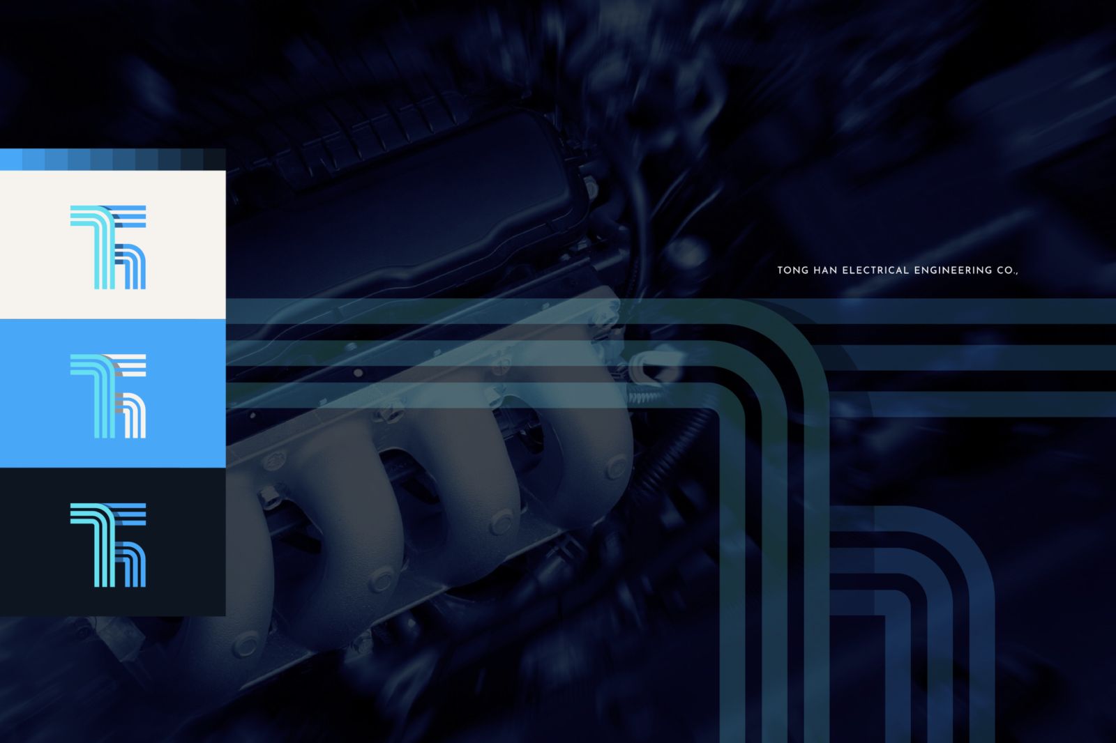
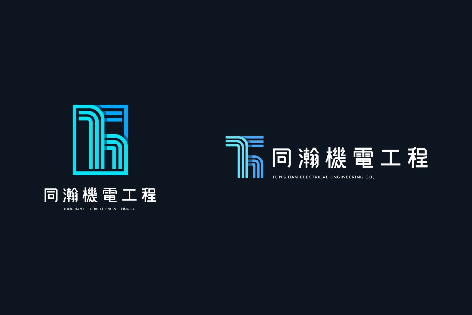
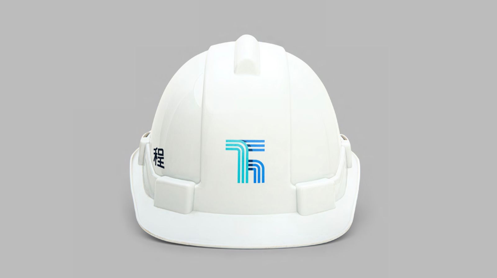
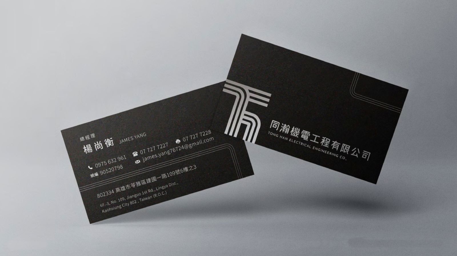
商標設計將工程電路板意象化,轉換為幾何線條,
並以數條線將品牌名稱縮寫TH連接,製造線條間的堆疊效果,
使整體圖標更具層次,乾淨利落的線條富含國際大氣感,給予客戶能夠信任及交付的企業形象。
The logo design visualizes the engineering circuit board and transforms it into geometric lines.
And connect the brand name abbreviation TH with several lines to create a stacking effect between the lines.
It makes the overall icon more layered, and the clean lines are full of international atmosphere, giving customers a corporate image that they can trust and deliver.