World Top
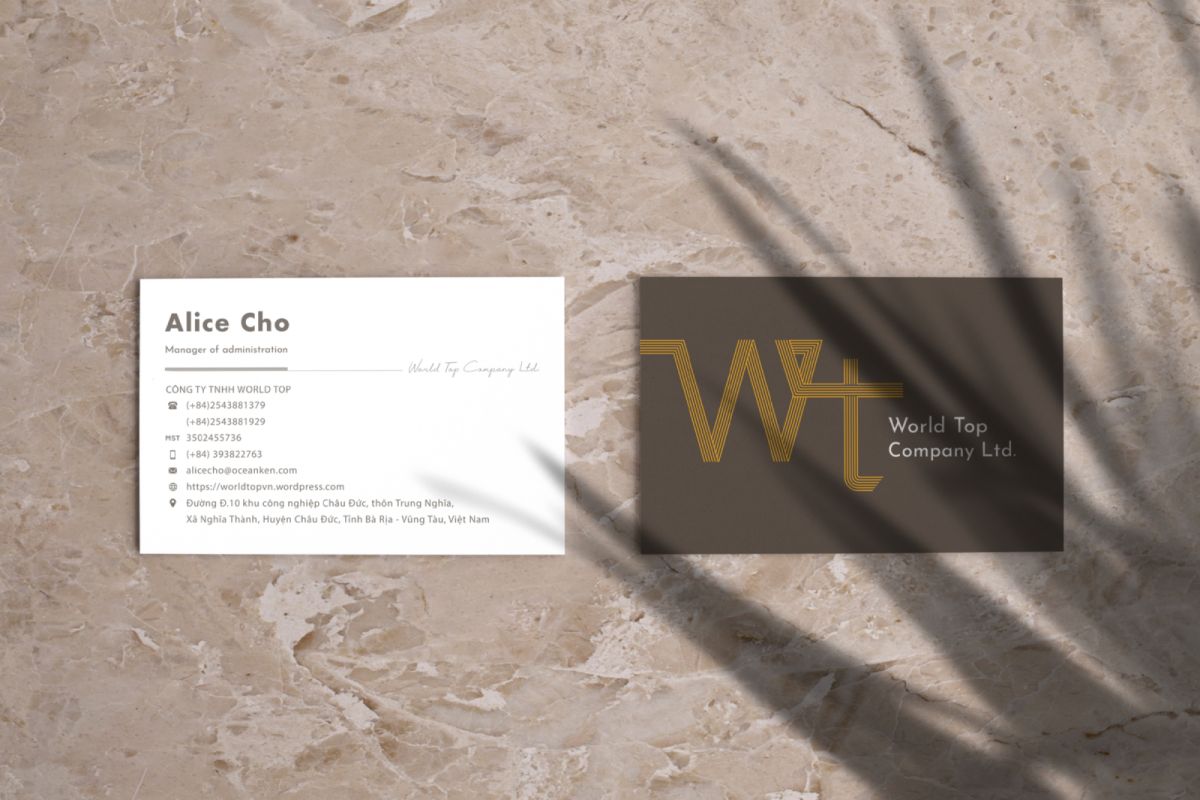
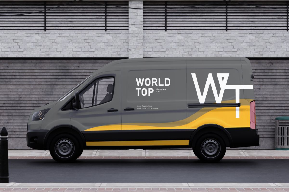
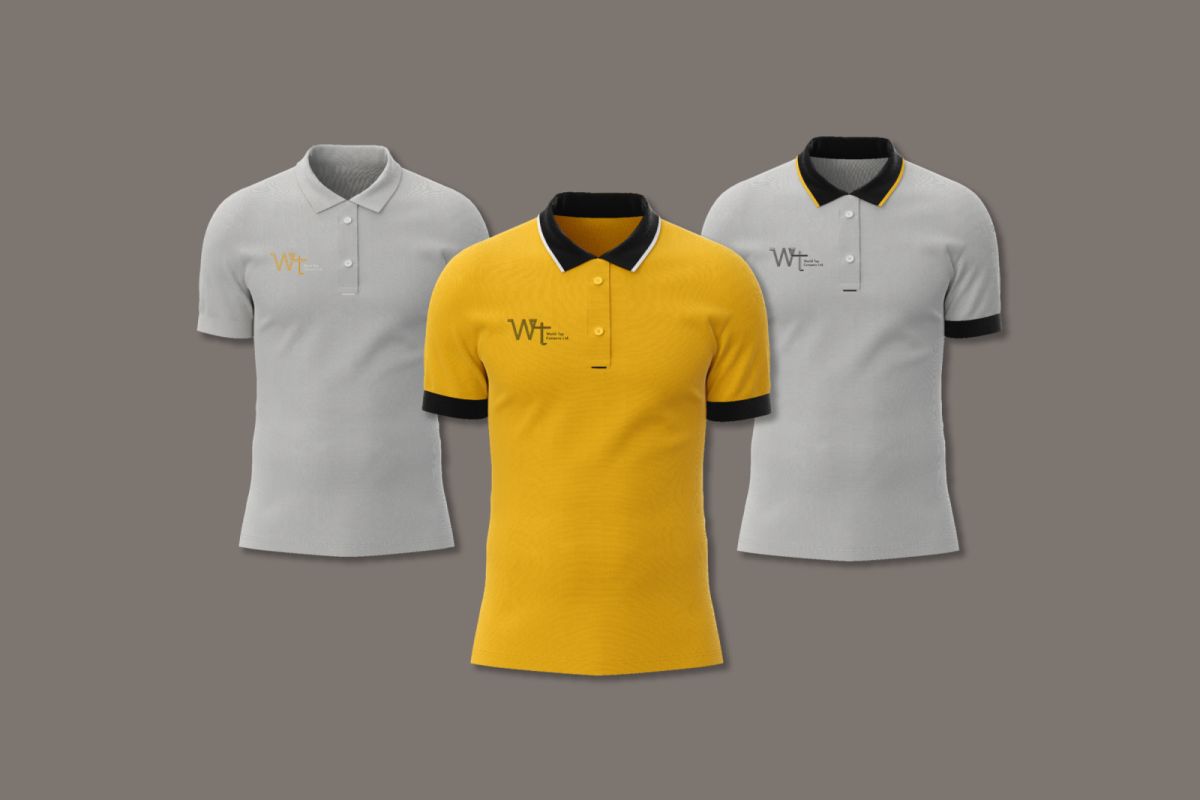
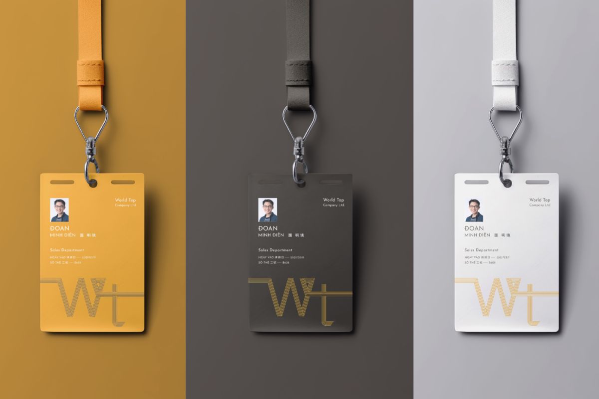
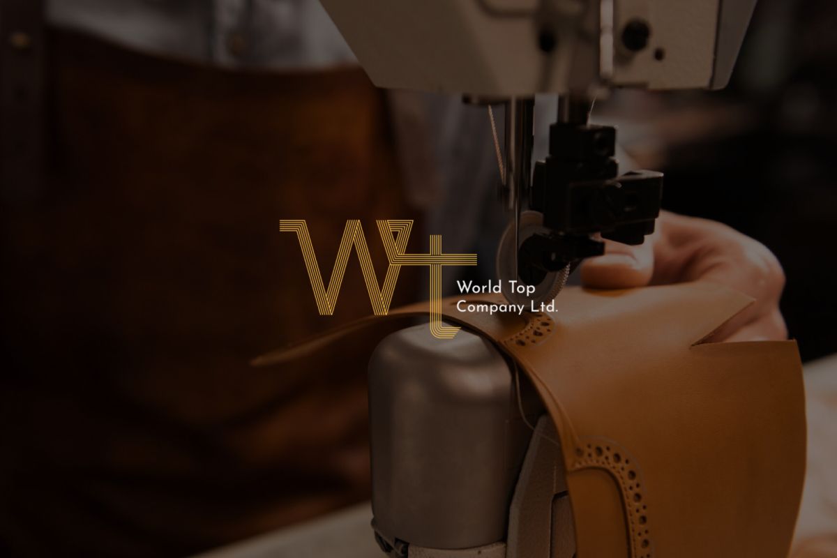
World Top以簡寫WT做為Logo的主體,線條從左方開始延伸,無斷點連接至右方,如同皮帶一體成型、彈性柔軟多變的質地,W高於T也意味著World Top能夠立足於世界頂端,成為首屈一指的皮具品牌,配色以大地色系棕色為底,黃色為主,棕色既為皮革顏色,更包含了沈穩溫暖之感受,淺色系黃色及白色即為對比色,更是賦予品牌活潑年輕之意象。
商標整體風格以簡約、不受拘束、年輕做為品牌設計發想,期許在同業市場中,能夠賦予消費者一個全新的、具高度彈性且傾聽客戶需求的頂級皮具品牌。
World Top uses the abbreviation WT as the main body of the logo. The line extends from the left and connects to the right without a break point. It is like a belt that is formed in one piece and has an elastic, soft and changeable texture. The W being higher than the T also means that World Top can stand on At the top of the world, it has become the leading leather goods brand. The color scheme uses earthy brown as the base and yellow as the main color. Brown is not only the color of leather, but also contains a sense of calmness and warmth. The light yellow and white are contrasting colors, which give the brand The image of liveliness and youthfulness.
The overall style of the trademark is simple, unrestrained and youthful as the brand design inspiration. It is hoped that in the same industry market, it can give consumers a brand new top leather goods brand that is highly flexible and listens to customer needs.