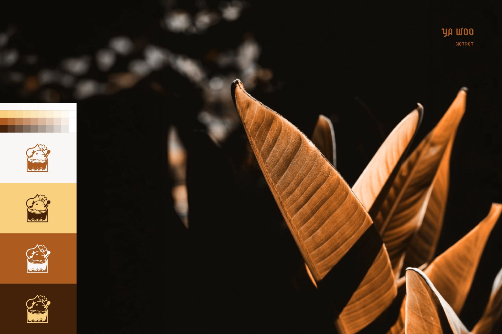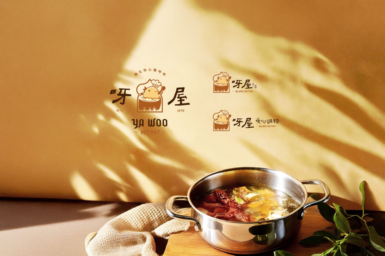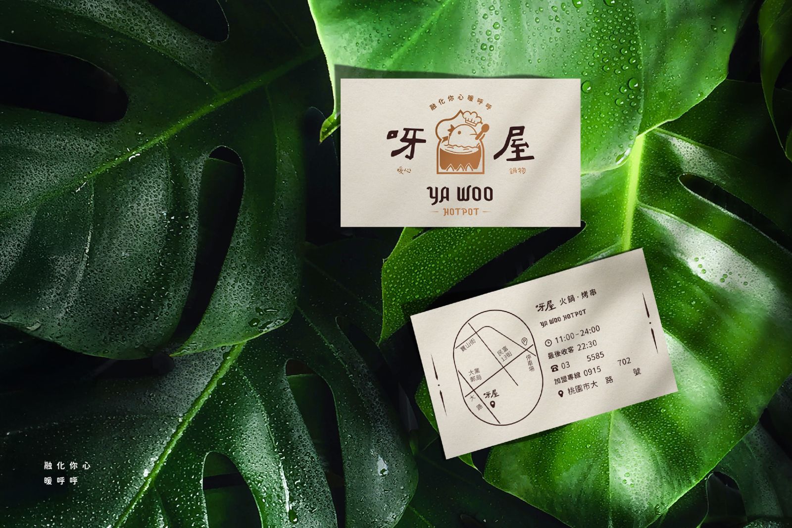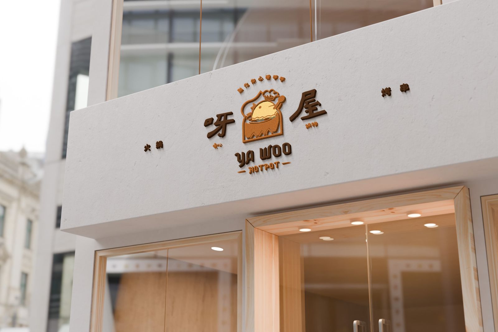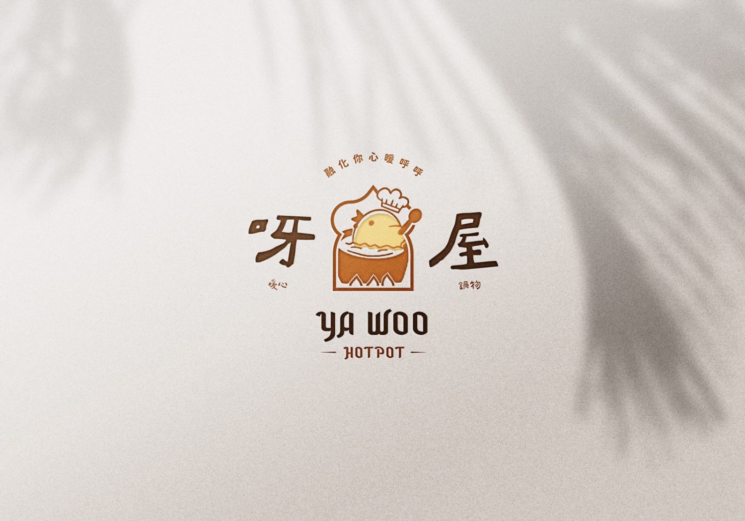
呀屋暖心鍋物識別設計專案 Ya Woo Branding Design
圖標整體以小雞把自己煮成湯作為設計主軸。以趣味的方式呈現品牌主打的雞湯火鍋,湯的水波紋化為一個笑臉,象徵品牌溫暖親切為客服務。圖標邊框以東南亞建築特色的大圓頂和拱門呈現。英文品牌名稱則使用帶東南亞異域風格的筆畫造型勾勒,凸顯品牌東南亞鍋物的特色。標準字配合圖標也以手繪方式呈現,以字級大小區分使品牌名稱主副關係更為明確,並在圖標上方以圓拱形呈現slogan。標準色以焦糖棕、深褐、小雞黃、淺米色做搭配,豐富的暖色系配色帶來像是喝熱湯時的溫暖。
The logo design is centered around a playful concept of a little chicken cooking itself into soup, humorously representing the brand's signature chicken soup hotpot. The ripples of the soup form a smiling face, symbolizing the brand’s warmth and friendly service. The logo’s border incorporates Southeast Asian architectural elements, such as grand domes and arches.
The English brand name features stylized strokes inspired by Southeast Asian aesthetics, emphasizing the brand’s regional hotpot specialty. The typography aligns with the logo’s hand-drawn style, with distinct font sizes clarifying the primary and secondary elements of the brand name. Above the logo, the slogan is elegantly curved in an arch.
The standard color palette includes caramel brown, deep brown, chick yellow, and light beige, creating a rich and warm visual identity reminiscent of the comforting feeling of drinking hot soup.