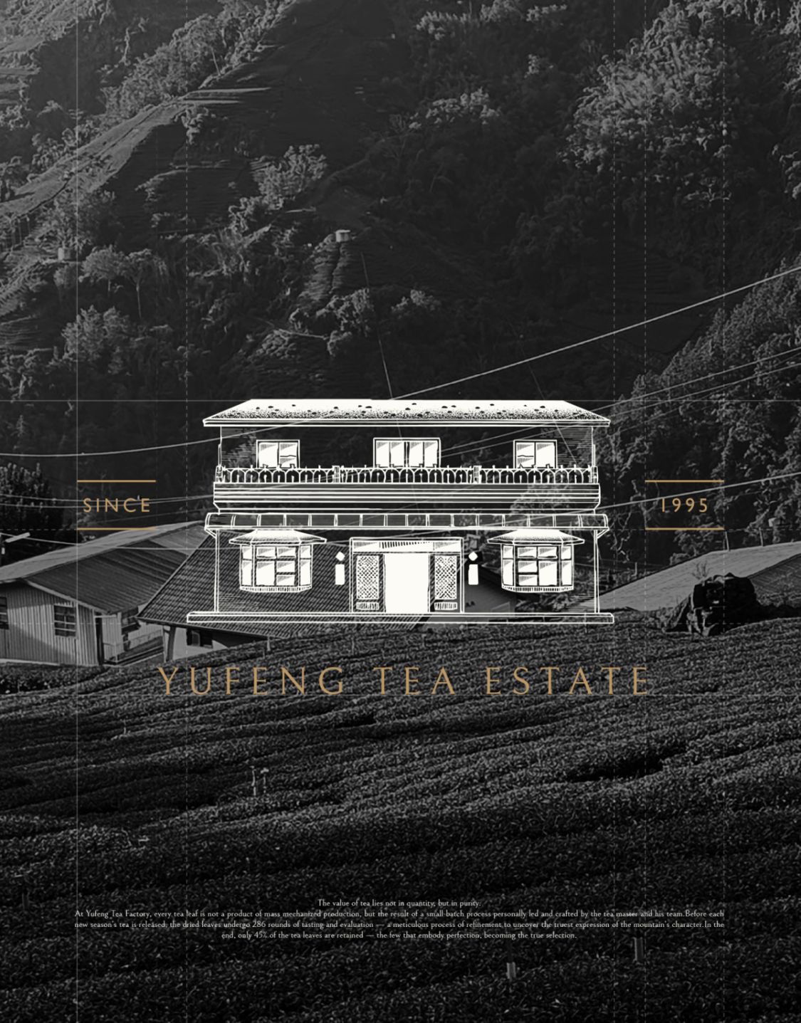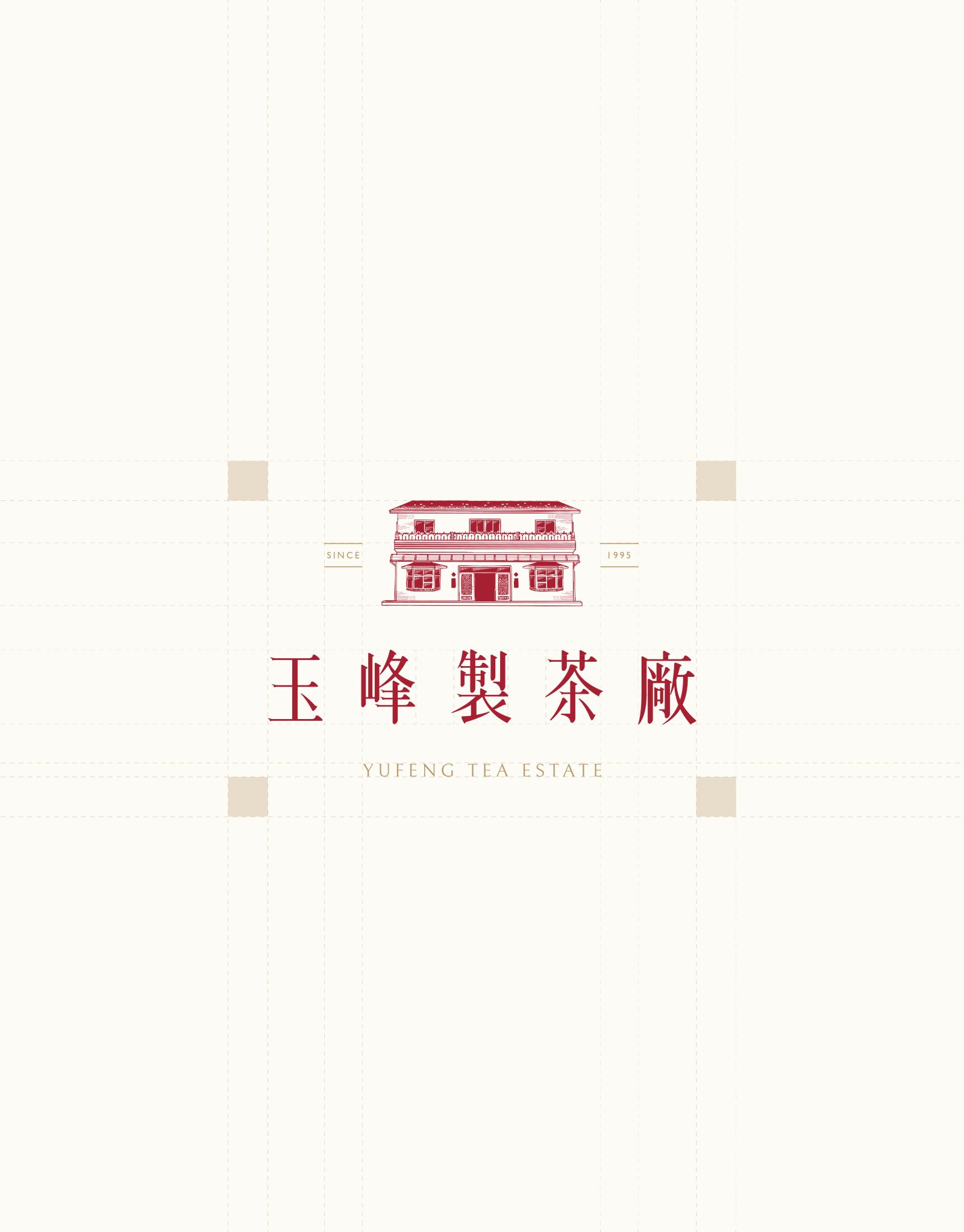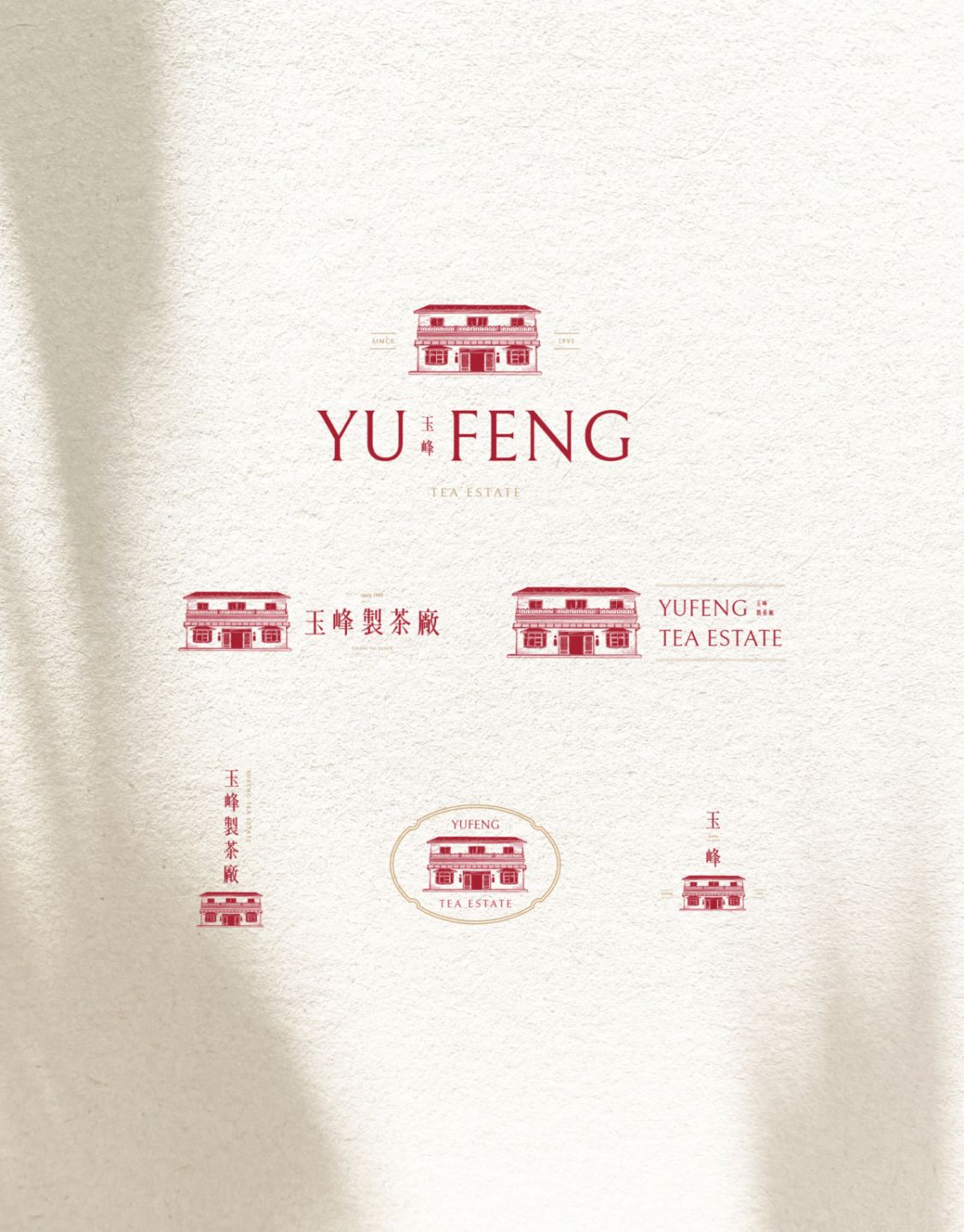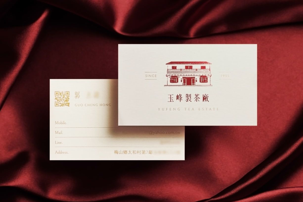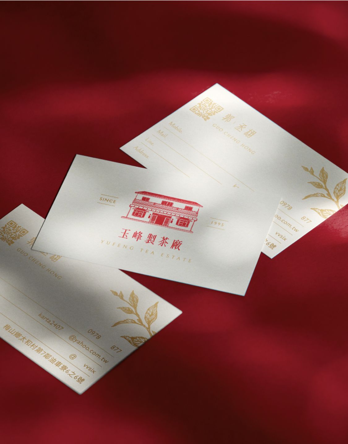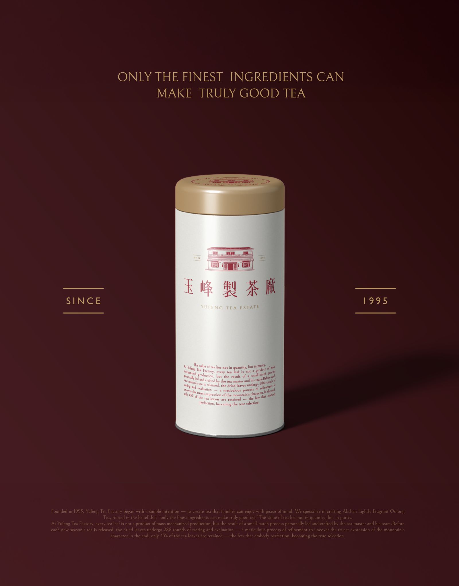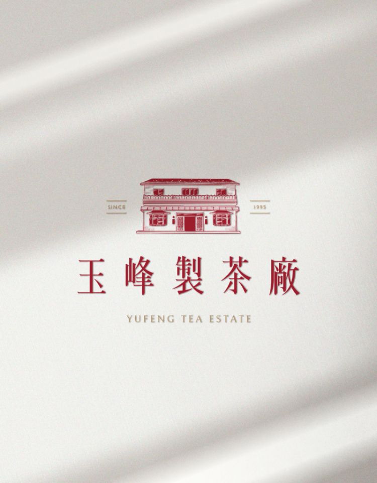
LOGO整體以「茶廠建築」為核心設計主軸。結合山坡與茶園的延展線條,象徵玉峰自土地孕育而生的茶文化精神,傳達品牌深耕在地、扎根自然的穩健基礎。建築以品牌實際廠房外觀為造型原型,透過細緻線條刻畫磚瓦層次與屋頂結構,呈現職人級的精緻工藝感,呼應品牌在製茶過程中「專注細節、不假他人」的態度。屋頂以品牌指定的紅色作為視覺焦點,代表茶湯的溫潤與熱度,也象徵職人心意與傳承的溫度,為整體視覺注入溫暖氛圍下方以層層推展的茶園形成穩定的基底構圖,帶出不假他手自產自銷的職人精神,同時帶出土地與時間淬鍊的深厚感。
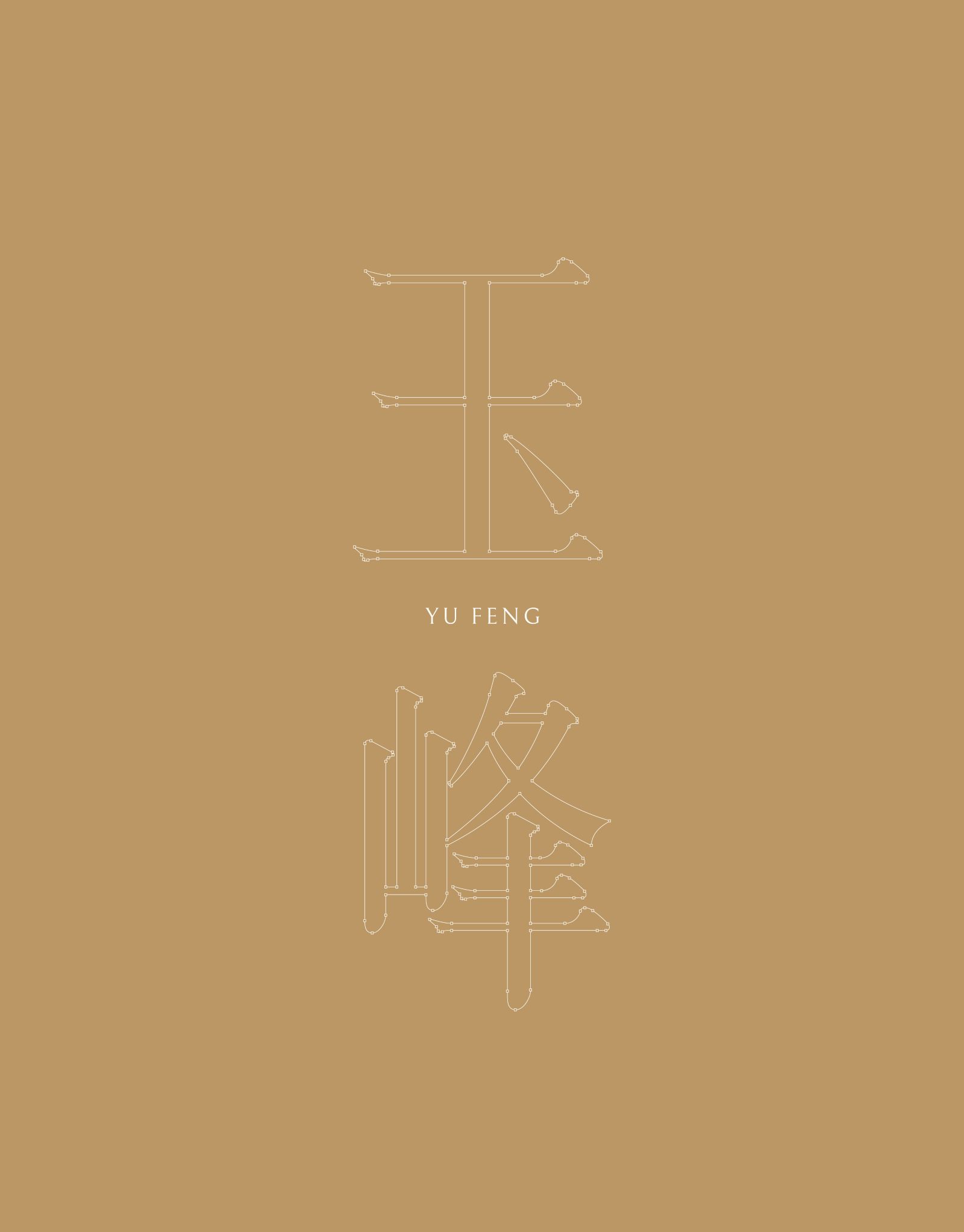
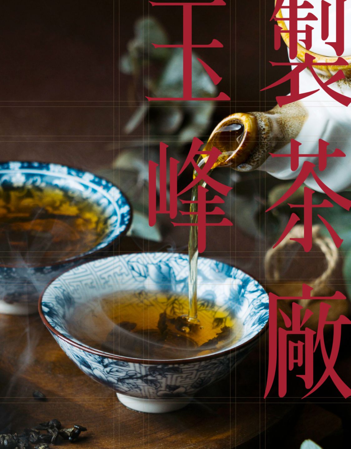
整體造型採細緻插畫風格,結合英文字體的現代比例與中文標準字的穩重結構,融合東方茶文化與西方精品美學的平衡氣質,打造專業且具國際識別度的品牌形象。標準色以「茶紅」為主調,搭配柔和米白襯底,展現玉峰製茶廠「溫暖、專業、質感、天然」的品牌形象,營造如威士忌酒莊般的優雅與深度印象。
The logo design centers around the architecture of the tea factory, serving as the core visual concept. The composition integrates the flowing lines of the hillside and tea terraces, symbolizing Yufeng’s deep-rooted connection to the land and its tea culture — a brand grounded in nature and local craftsmanship.
The architectural form takes inspiration directly from the actual Yufeng factory building, meticulously illustrating the layers of tiles and roof structures through refined line work. This level of precision evokes the spirit of artisanal craftsmanship, reflecting the brand’s philosophy of “attention to detail and hands-on dedication.”
The roof, rendered in the brand’s signature red tone, becomes the focal point of the composition — representing the warmth and vitality of tea, as well as the heartfelt passion and heritage behind the craft. Beneath it, the layered tea fields form a stable foundation, conveying the spirit of self-sufficiency — from cultivation to production — and the quiet depth that comes from time and the land’s nourishment.
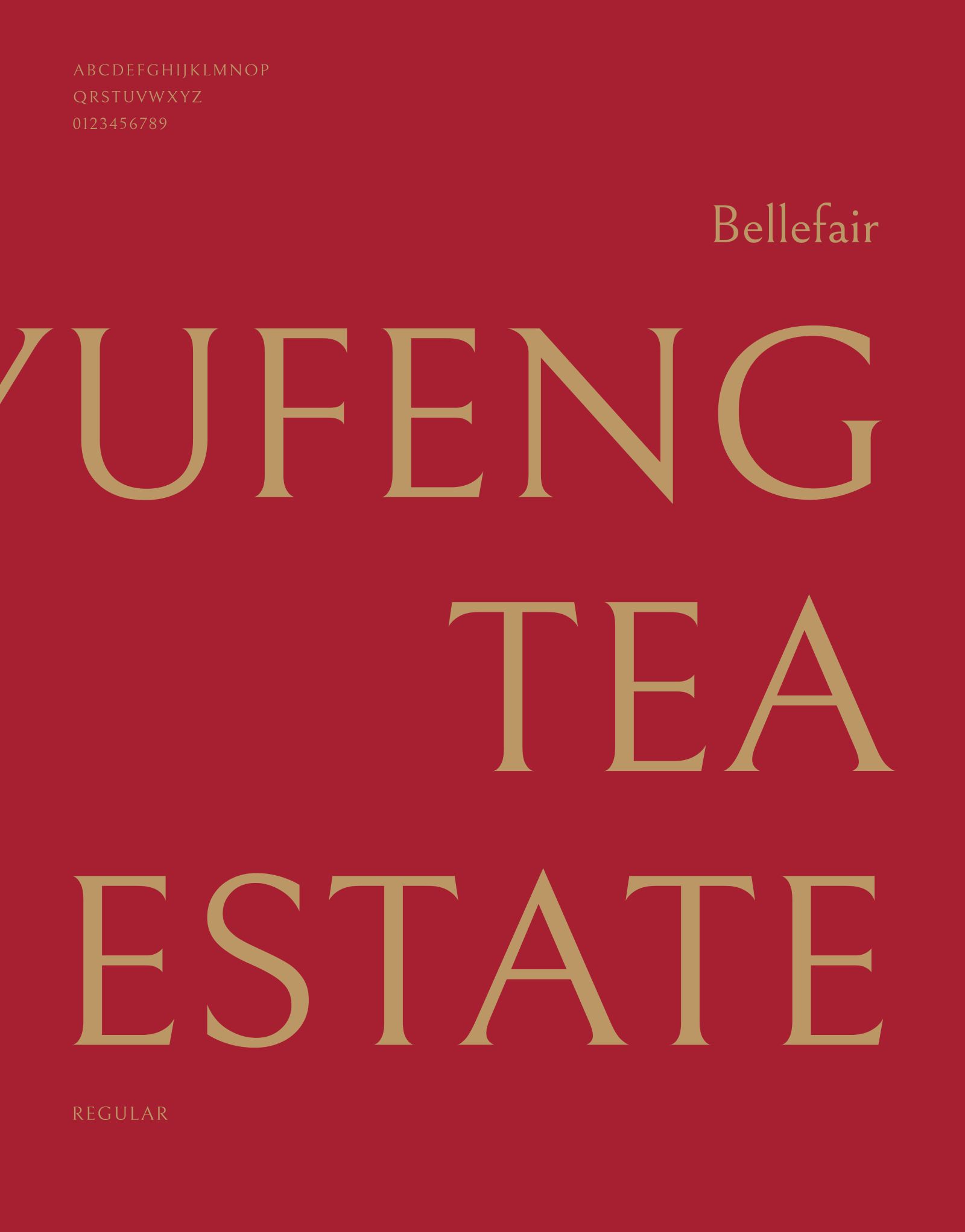
The overall design adopts a delicate illustrative style, blending the modern proportions of the English typography with the solid structure of the Chinese characters, achieving a refined balance between Eastern tea culture and Western boutique aesthetics.
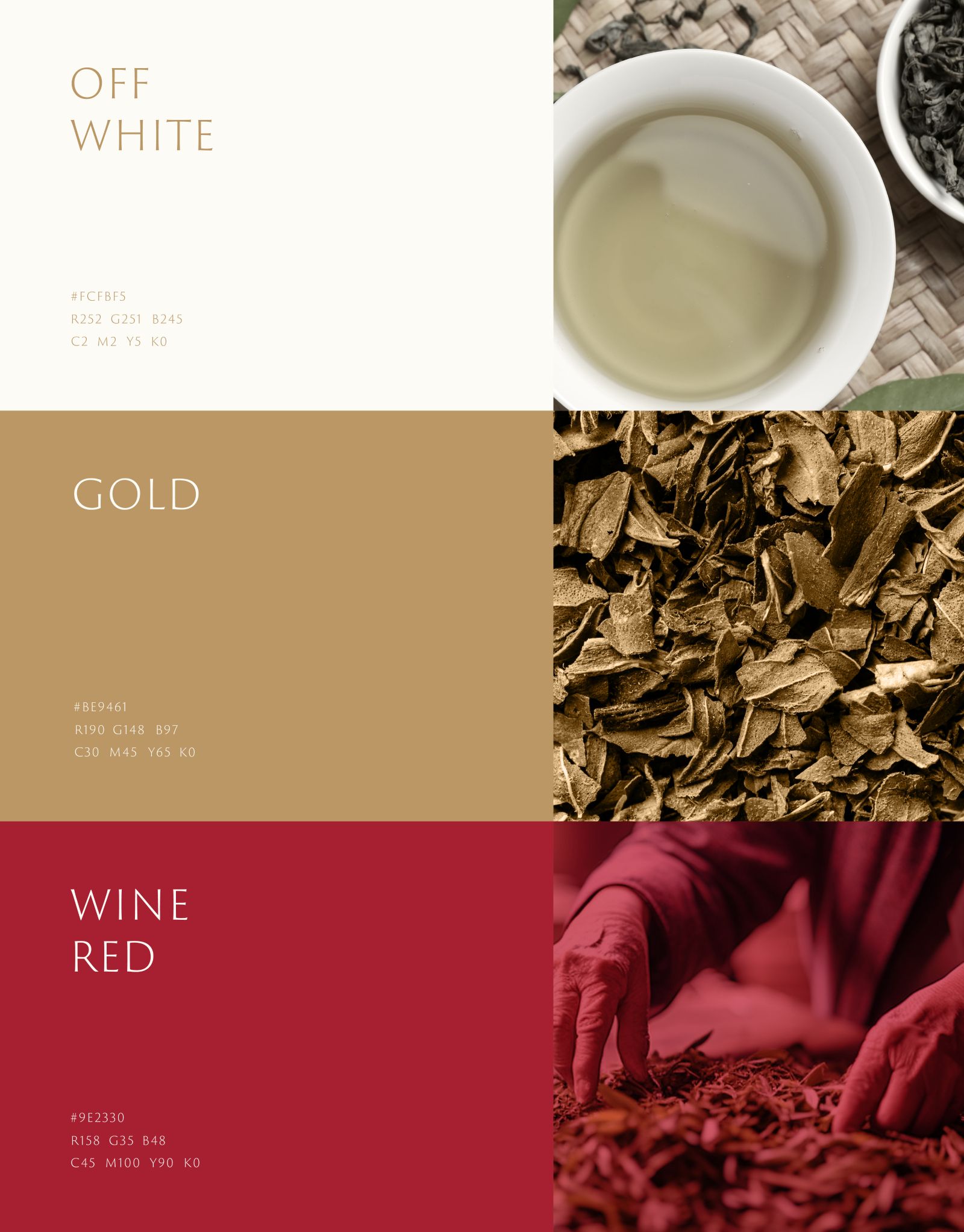
The primary color palette features Tea Red paired with a soft Ivory White background, expressing Yufeng Tea Factory’s brand essence of warmth, professionalism, quality, and natural purity. The result is a logo that embodies both elegance and depth, reminiscent of a whisky distillery’s timeless sophistication.
Design Agency | Fecina
Art Director | Evelyn
Executive Director | Evelyn
Project Manager | Yu Chun
Graphic Design | Hsin Tung