花甜依露識別設計

花甜依露識別設計
HUA TIAN YI LU Branding Design
花甜依露 HUA TIAN YI LU以手繪花卉插畫為主軸,融合兒童鬱金香與滿天星插畫,營造溫暖氛圍標準字採用粗黑體,筆畫飽滿生動,展現活潑可愛風格
標準色以奶白和淡粉紫為主,呈現輕柔溫潤的視覺感受
The logo design centers on hand-drawn floral illustrations, incorporating children's drawings of tulips and baby's breath to create a warm atmosphere. The standard font uses bold black type with full and lively strokes, showcasing a playful and cute style. The color palette features off-white and light pastel purple, presenting a soft and gentle visual impression.
- Category
- 品牌識別設計 / 名片設計 / 彩色印刷名片
- Industry
- 其他
- Style
- 紫色系 / 綠色系 / 手繪插畫 / 柔和優雅 / 溫暖親和


OTHERS
Suo Jai
所在室內設計識別設計專案
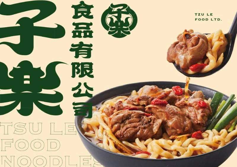
TZU LE FOOD LTD.
子樂食品識別設計專案
Yun Chuan Yuan Roast Meat
云川苑識別設計專案
YONG SHENG Branding Design
永聖有限公司識別設計專案

World Top
品牌識別設計專案
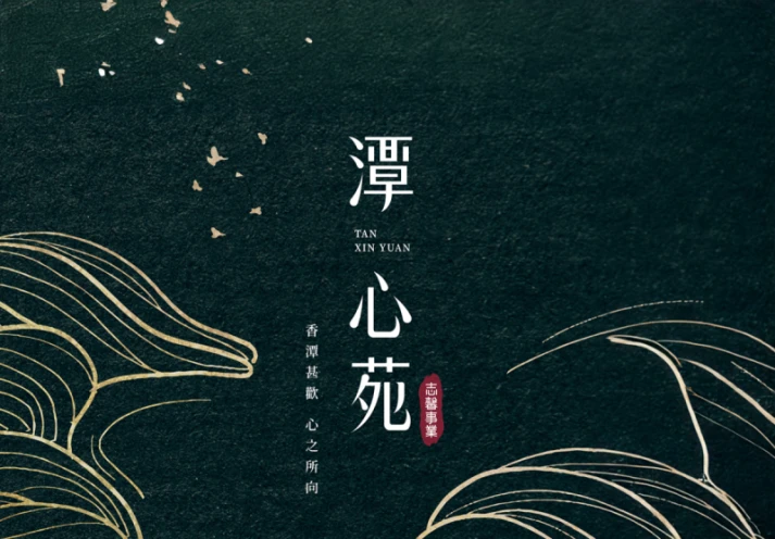
Tan Xin Yuan Design
潭心苑建案主視覺設計專案
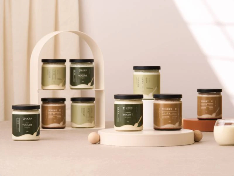
Yougi Fazenda Brand Design
有紀莊園品牌識別設計
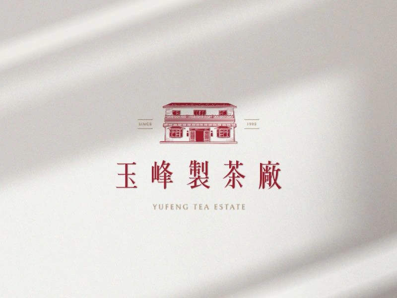
Yufeng Branding Design
玉峰製茶廠識別設計專案
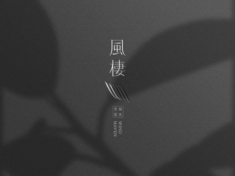
Wind Heaven Interior Design
風棲空間制所識別設計專案
Ishoutso
乙守祚空間設計識別專案
a Truth Design Branding Design
安厝室內空間識別設計專案
Fang Yu Branding Design