永聖有限公司識別設計專案

永聖有限公司識別設計專案
YONG SHENG Branding Design
永聖有限公司 YONG SHENG圖標設計融合了永聖的英文縮寫Y、S與倉儲概念。將Y字設計成堆高機的形態,S字的下方則作為堆高機的把手,並延伸出完整的S字,營造前後層次感,傳遞出穩定且有質感的視覺效果,整體展現品牌的業務範疇及專業服務。
The trademark design integrates the English abbreviations Y and S of Eternal and incorporates the concept of warehousing. The Y is designed to resemble a forklift, with the bottom of the S serving as the forklift's handle, extending into a complete S shape, creating a sense of depth, conveying a stable and textured visual effect, and overall showcasing the brand's business scope and professional services.
- Category
- 品牌識別設計 / 名片設計 / 彩色印刷名片
- Industry
- 物流|倉儲
- Style
- 藍色系 / 橘色系 / 抽象幾何 / 專業穩重 / 現代


OTHERS
Suo Jai
所在室內設計識別設計專案
TZU LE FOOD LTD.
子樂食品識別設計專案
Yun Chuan Yuan Roast Meat
云川苑識別設計專案
HUA TIAN YI LU Branding Design
花甜依露識別設計
World Top
品牌識別設計專案
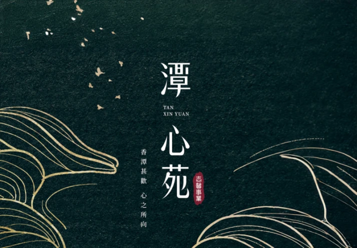
Tan Xin Yuan Design
潭心苑建案主視覺設計專案
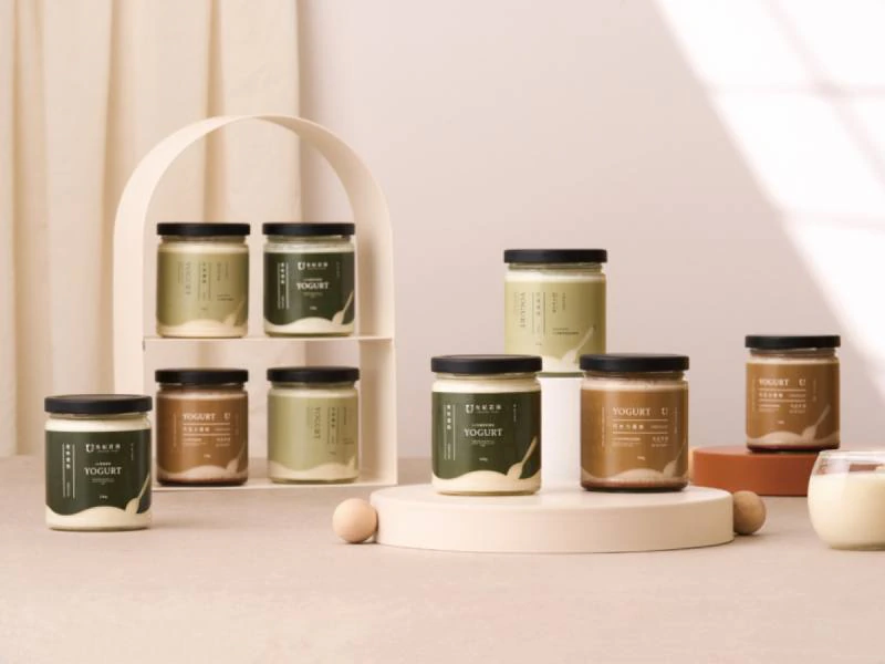
Yougi Fazenda Brand Design
有紀莊園品牌識別設計
Yufeng Branding Design
玉峰製茶廠識別設計專案
Wind Heaven Interior Design
風棲空間制所識別設計專案
Ishoutso
乙守祚空間設計識別專案
a Truth Design Branding Design
安厝室內空間識別設計專案
Fang Yu Branding Design