森與光美學名片設計

森與光美學名片設計
mori-and-hikari
森與光美學特殊刀模名片設計森與光美學名片以柔和純淨的視覺語言為核心,透過特殊刀模造型打破傳統名片的制式輪廓,讓整體更具記憶點與品牌辨識度。
外型以圓潤曲線構成,呼應品牌名稱中「森」與「光」所傳遞的自然、柔和與流動感,展現細膩而富有美感的品牌氣質。紙材選用新百代雪地白300磅,具備厚實手感與溫潤細緻的紙面質地,使名片在視覺與觸感上都更顯精緻。正面以淺金與珍珠白燙印呈現主視覺層次,在光線照射下展現低調優雅的細膩光澤;背面則以黑色燙印資訊內容,提升閱讀性與整體平衡感。
透過刀模、紙材與燙印工藝的整合,使名片不只是傳遞資訊的媒介,更成為品牌風格與美學理念的延伸。
Mori & Hikari Aesthetics Die-Cut Business Card Design
The business card design for Mori & Hikari Aesthetics is built around a soft and pure visual language, using a custom die-cut form to move beyond the standard rectangular format and create a stronger sense of identity and memorability. Its rounded silhouette echoes the brand name "Mori & Hikari," suggesting the natural, gentle, and flowing qualities of forest and light, while expressing an elegant and delicate aesthetic. Printed on 300 gsm New Age Snow White paper, the card offers a solid feel and a smooth, refined surface that enhances both visual and tactile quality. The front side features light gold and pearl white foil stamping, creating subtle layers and a graceful shimmer under changing light. The back side uses black foil stamping for the information layout, improving readability while maintaining overall balance. Through the integration of die-cut shaping, paper selection, and foil craftsmanship, the card becomes more than a medium for contact details-it extends the brand's visual character and aesthetic philosophy.
- 紙材
- 新百代 雪地白300磅
- 後加工
- 特殊刀模、正面燙淺金+珍珠白、背面燙黑

OTHERS
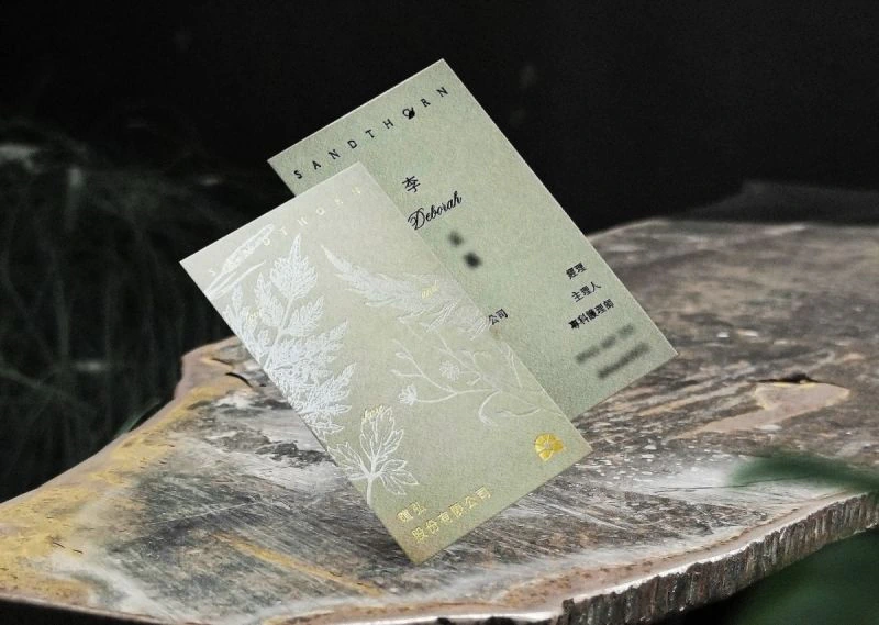
Sandthorn Business Card Design
暄弘股份有限公司燙印名片設計
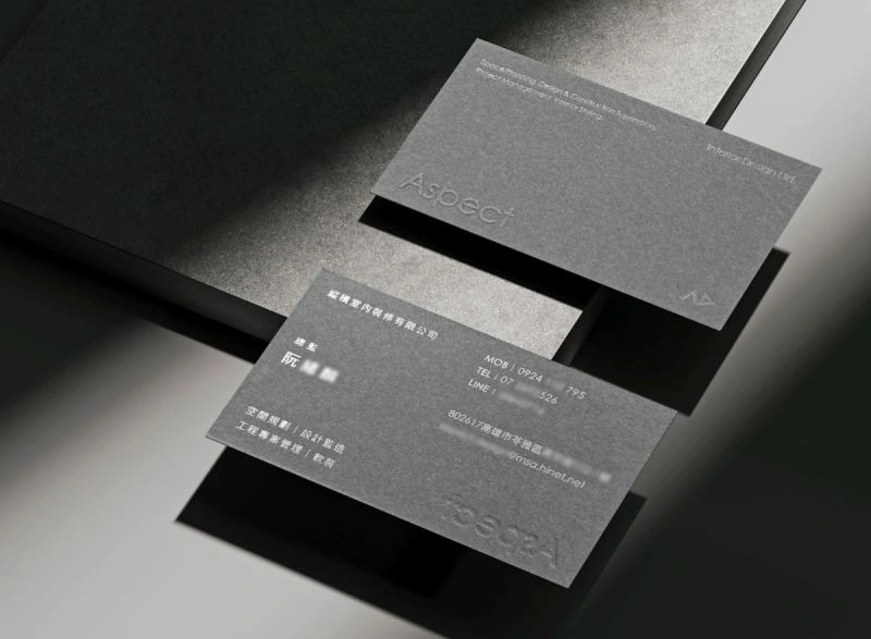
Aspect Interior Design
縱橫室內裝修燙印名片設計
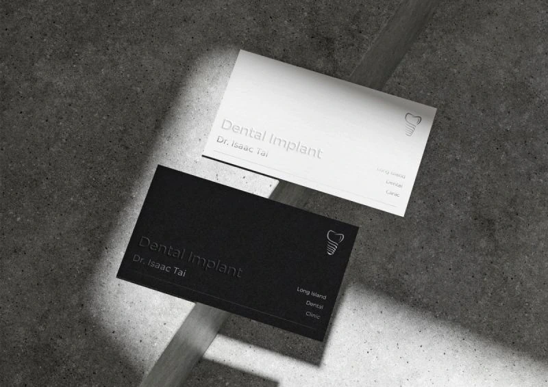
Long Island Dental Clinic
長島牙醫診所燙印名片設計
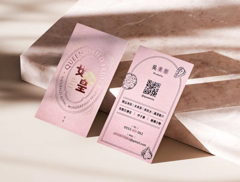
Queen Dried Fruit Card Design
女皇果乾燙印名片設計
Yufeng Branding Design
玉峰製茶廠識別設計專案
Wind Heaven Interior Design
風棲空間制所識別設計專案
Ishoutso
乙守祚空間設計識別專案
a Truth Design Branding Design
安厝室內空間識別設計專案
Fang Yu Branding Design
方域空間制作識別設計專案
Ya Woo Branding Design
呀屋暖心鍋物識別設計專案
BLANK3 Design Branding Design
方三空間制作識別設計專案

Ho Shin Branding Design